Ikea Rast Hack

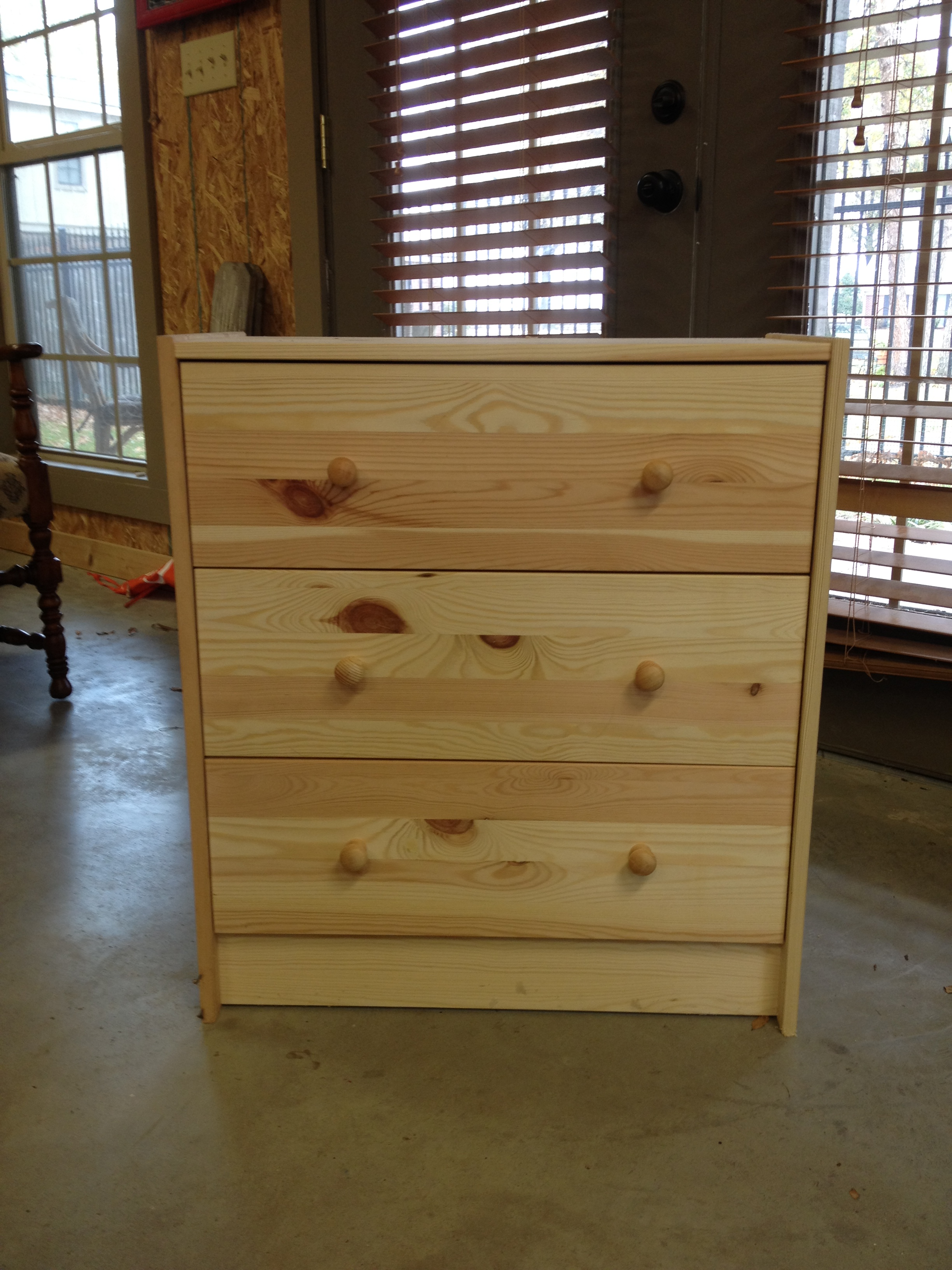
Do you know about the awesomeness that is the Ikea Rast Dresser?  It's the most perfectly-sized little 3-drawer dresser that comes in unfinished solid wood so that you can finish it any way your little heart desires.  And the very best part?  It costs a whopping $34.99.  You can't beat that with a stick! (Actually you can - it used to cost just $29.99.  I usually get upset when prices go up, but even with the $5 increase, it's still a heck of a deal!)
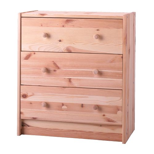
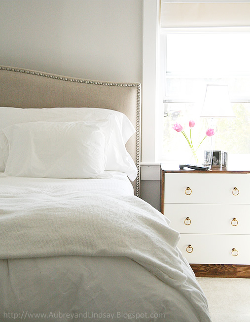
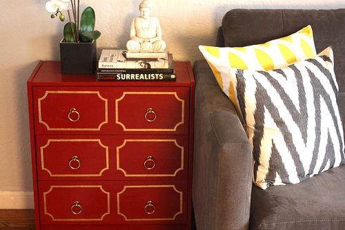
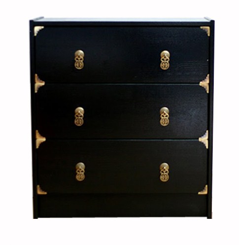
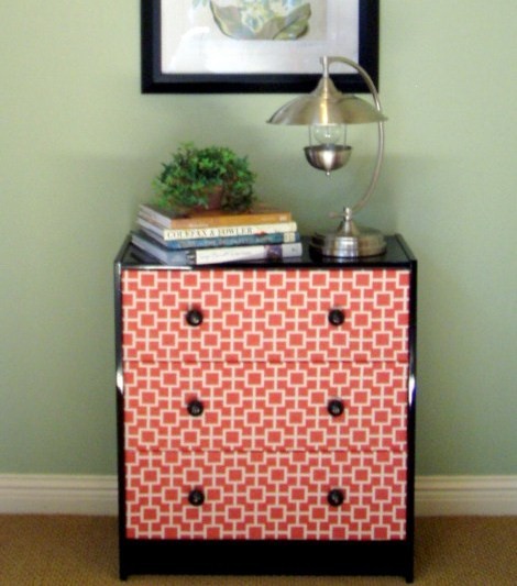
News of this gem of a piece of furniture has been catching on, and pictures of freshly made-over Rast Dressers have been popping up all over blogland. Some people manage to turn these simple little drawers into something that looks like it belongs in a fancy schmancy home decor magazine.  Like this one, for example, from Little House Blog.

There are so many awesome takes on this project!  Here are some more that I found...

From Nothing But Bonfires:

From Design Manifest:

From Nouveau Stitch:

And finally, this one from A Charming Nest that I think is my personal favorite.  Can you believe this started as the same $30 piece of furniture?  Insane!

If you wanna see some more takes on this project, google Ikea Rast Hack and lots of results will pop up.  Or click on this blog to see a few more ways its been done.

So...seeing as how we're in the middle of trying to furnish a whole beach house and could use some bedside tables, I decided I better jump on the Rast Dresser train.  I placed my order a few months ago (back when they cost $29.99 - woot!) and my flat pack box arrived in no time.  Even with shipping, it was still a good deal (but it'd still be nice to have an Idea nearby!).  I had my dad put it together a while ago, but then it just sat.  I was itching to work on it, but we weren't quite sure yet where it would go and therefore couldn't decide on a paint color.

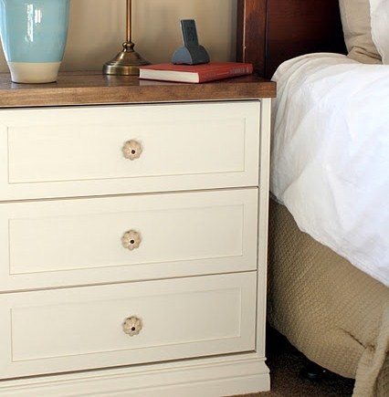
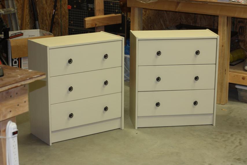
Recently we began nailing down furniture for the rooms and it became clear that we would use this as a bedside table in the master bedroom along with this dresser that I'd already repainted.  I gave it the exact same paint treatment so it'd match the dresser.

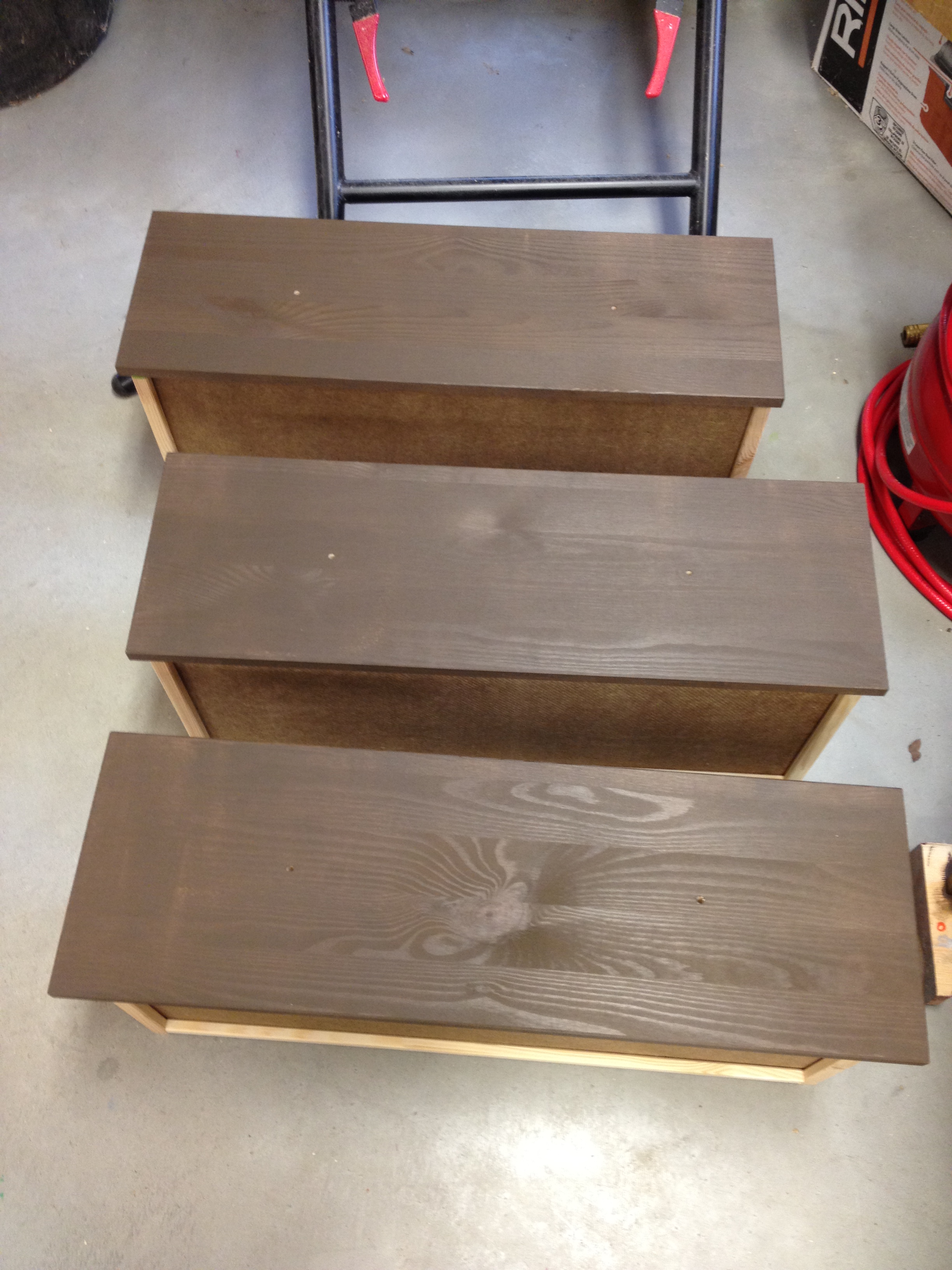
First, a coat of brown, but not before I taped everything off.  Like always, I just wanted to paint the drawer fronts and the outsides of the base.

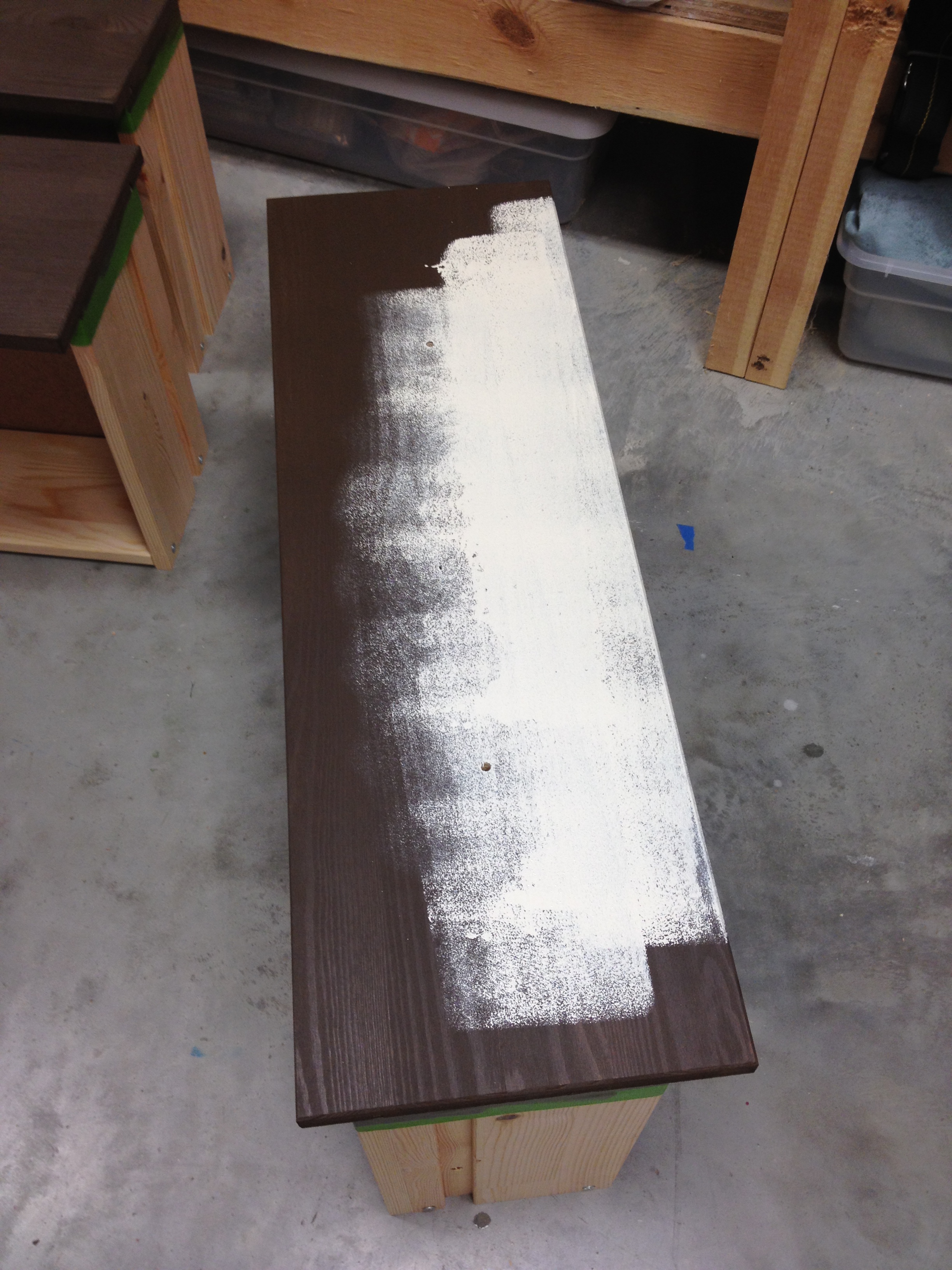
Then I covered over that with two coats of the cream paint.

Just like with the dresser, I sanded the edges ever so slightly so that some of the brown would peek through.

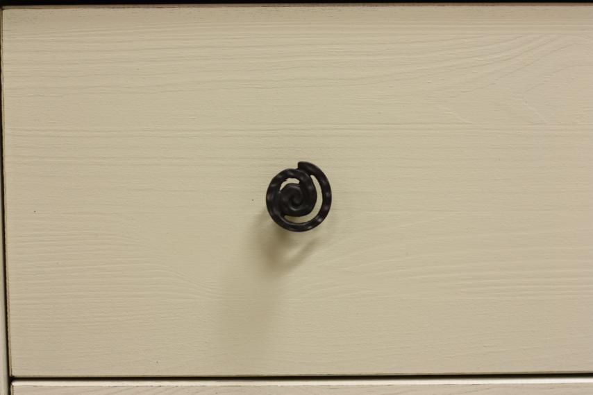
The color was pretty bland so I tried to jazz it up a little with the hardware.  Well, as much as you can jazz it up with hardware that's still neutral in case we redo the room.  I opted for these fun little spiral knobs.

Ready for the end result?  You may need to sit down for this...

I know, I know...BORING!  Try not to yawn in my face, ok?  I wanted to go all out on this, but since it's going to be in a rental house and we don't know how often things will need to be switched, it had to be something plain.  Something safe in case all the bedding and room colors have to change.

Oh wait, I completely left something out...I actually did this whole process twice.  Two bedside tables for the master bedroom.

That really doesn't make it any more exciting, huh?  Then how 'bout I tell you this: after my dad assembled these first two and saw how solid and sturdy they were, we decided to order two more.  That means I'd have two more chances to go crazy on the Ikea Rast Dresser.  And ya wanna know something else?  I've already finished one of them and I totally broke out my pack of stencils to fancy it up.  Can't wait for you to see it!  Pics soon...

Beach House Update

It's that time again...time for another Beach House Update! [applause]

(That was done in my TV announcer voice.)

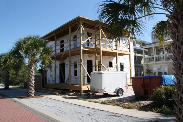
Yeah.  Moving on.  The last time I updated you, all we had was a big ol' wooden box of a house.

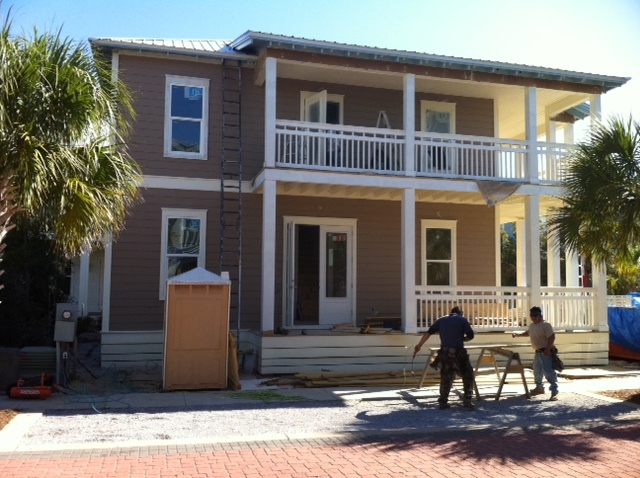
I am pleased to say we've come a long way since then.

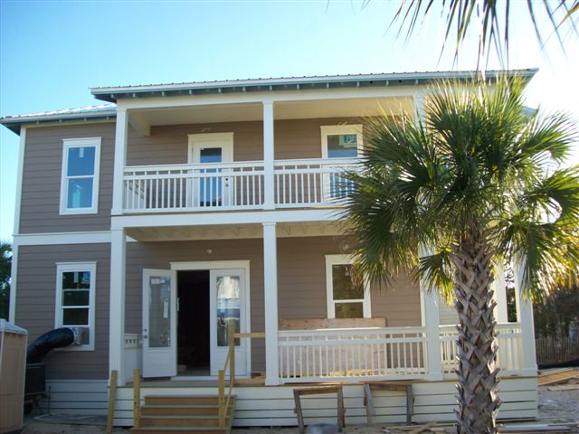
Now THAT looks more like a house!  The hardy plank is up and has been painted a nice shade of brown.  The double-doors on the lower level will eventually be painted a nice shade of red.  Fun fact about the neighborhood: the designer made a bylaw that says no house can have "plain" railing.  I guess that would be just one horizontal rail with evenly spaced vertical slats.  As you can see, ours is not that fancy - just two horizontal rails at the top with different spacing between the slats.  Some houses in the neighborhood have gone all out - I've seen diamonds and squares - and even fish! - in the railings.

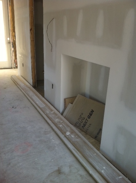
The picture above is from when my brother and his wife were in town checking on things a few weeks back.  They got some interior shots too.  This wall below is in the middle of the house and faces the living room and kitchen.  The square cutout is a game niche that will have shelving and the door right next to it leads to the half bath.

Here's a picture of the upstairs.  Still not much to see, but at least the drywall's up.

And here's a peek into the master bedroom.

Those pictures were all from oh, I don't know, the week before Halloween, maybe?  Obviously I've been a little behind on the updating.  But the good news is we got more pictures again last week.  The builder sent us a new invoice and attached some pictures.  Funny how he felt the need to prove progress was being made so he could get some money. :)

The exterior still looks pretty much the same.

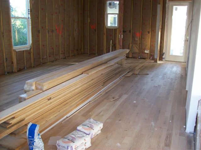
Look!  The hardwood floors are in!  They haven't been stained yet - that will happen near the end - but they'll eventually receive a nice coffee stain.  This is the living room and kitchen and the wall pictured above with the game niche is to the right.  The stacks of wood are for the planked walls.  It'll be hung on the two walls pictured that don't have drywall.

Another shot of the upstairs hallway.  This one's from the opposite end of the hall as the picture above, and obviously the floor has been added.

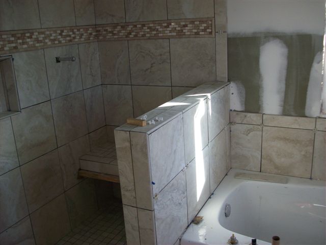
While Nick and Beth were in town, they were given the task of picking out the tile for all the bathrooms.  It's already been installed in the master bath, even though the grout wasn't done when this picture was taken.

Sadly, that's all the pictures I have right now.  I'm getting very excited to see the house.  The countdown to it being finished is on!  My parents are making a trip next so maybe I'll have even more progress pics soon.

Oh, and I'm staying very busy trying to get things ready for when we can finally move-in.  I have lots of projects going on right now that I can't wait to share.  They're all in different stages and I want them to be completely done before I post pics.  Hopefully I'll wrap some of them up soon!

Beach House Won'ts

  I'll admit that, with my southern accent, a lot of times my wants sound like won'ts and vice versa.  I can't help it, they just kinda come out the same.  When it comes to the beach house, I can talk about my wants all day long.  I want a vacation house (check!), I want plenty of bedrooms (check!), I want horizontal paneled walls (check!).  But by no means do I get everything I want.  I want a house on the beach (not in this lifetime!), I want a third floor (not with our budget!), I want dark hardware (vetoed by everyone else!).

But the wants aren't what this post is all about.  Today, I'm here to write about the won'ts...the things you won't see in our beach house (at least not as long as I have a say-so in the decorating!).  When Doc and I were in Florida last, the condo we stayed in had lots of things that won't be in our beach house, so I was able to snap pictures for examples.  The condo was perfectly fine and lovely for us to stay in, it's just very different from what we're planning.

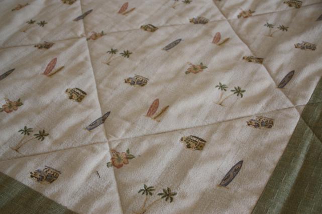
Our bedding purchases have already been made, so I can tell you for certain, there won't be any beach-themed bedspreads.  This one, as you can see, was polka-dotted with palm trees, surfboards, flowers, and dune buggies.

We don't quite have all the artwork picked out or made, but I do know that there won't be any surfers hanging above any beds.

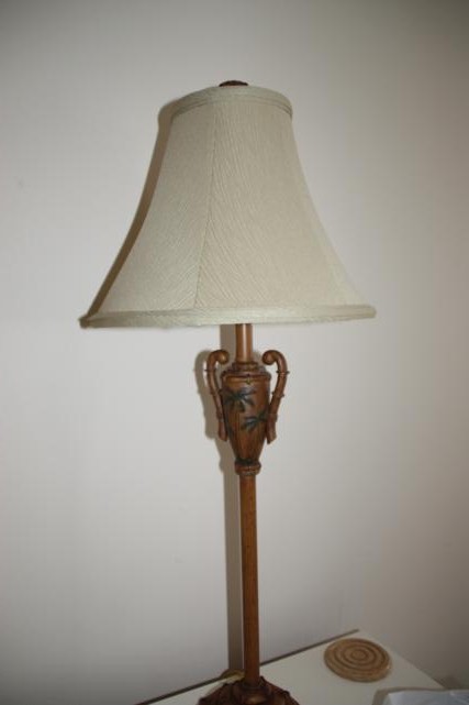
You won't be able to find palm trees on any of the lamps in our beach house.

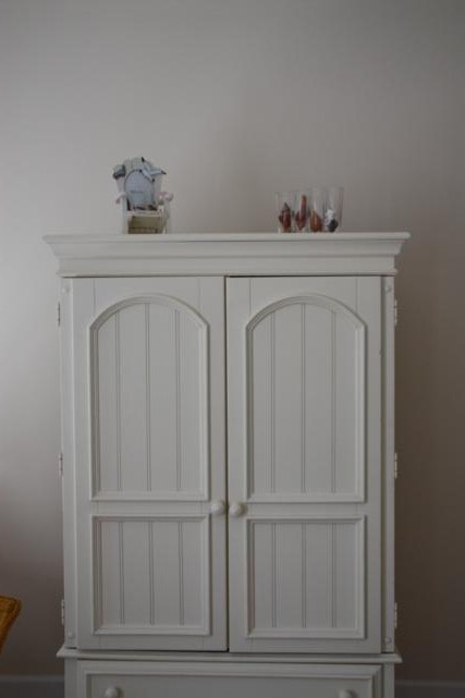
In the living room, we won't decorate the top of the entertainment center with just two tiny knick-knacks.

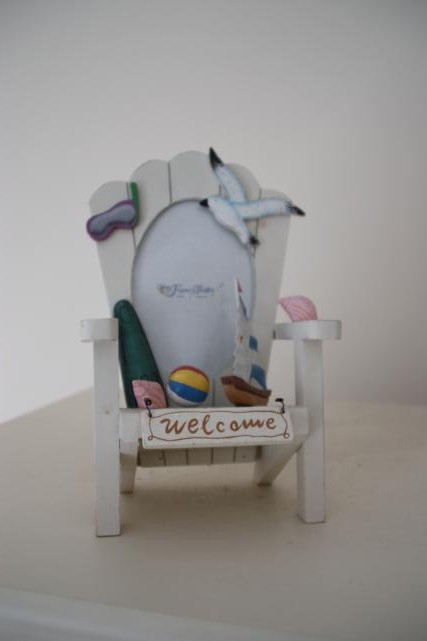
We won't have any beach chair picture frames, and any picture frames that we do have won't be left empty.

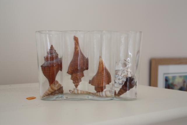
I'm not 100% sure, but I'm pretty certain we won't stick seashells in any short, clear vases.

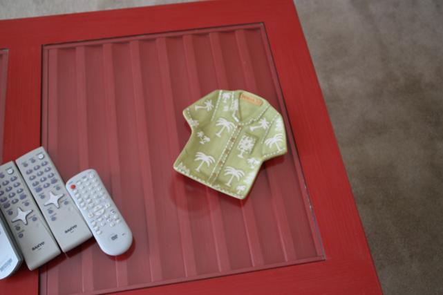
Any dish we set out on the coffee table won't be shaped like a Hawaiian shirt.

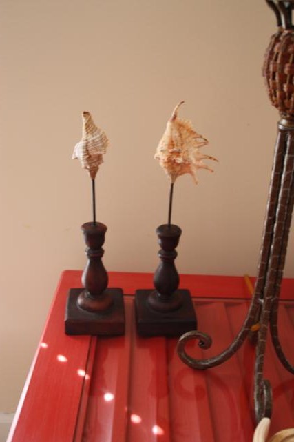
Sadly, in our house, we won't have any seashells-on-a-candlestick.

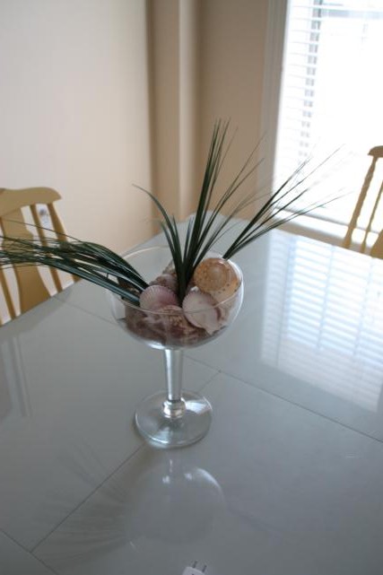
And finally, for the dining table, our centerpiece won't be an oversized margarita glass filled with seashells and faux grass.

I hope I haven't disappointed anyone too much.  Is there anything else we should add to the won't list?

My brother and his wife are going to check on the house this weekend.  They'll be giving our paint color choices, picking out tile for the bathrooms, and selecting our hardwood for the floors!  Hopefully I'll have updated pictures soon.

Beach House Update

Who wants a mid-construction house tour?! If you raised your hand, you're in luck.  Cause I'm gonna give you one.  And if you didn't raise your hand, well then you can just go visit another blog now. :)

We were so excited about getting to see the construction progress in person that we headed over to the beach house our first morning in town (and ended up walking back to it every day we were there).  Here's how she looked as we approached.

I'm sure a whole lot has happened since our last update, but all I can really tell is that she's been wrapped in white paper.  Oh, and the windows have been put in, too.

Since our first full day in town was a Sunday, no construction workers were in town.  Doc and I walked on in like we owned the place and scoped everything out.  You may want to check out the floorplans here so my pictures make more sense.  It's hard to get good pictures when everything's wood and you can still see through the walls into the next room.

Here is Doc standing in what will be the dining room.  The table (hopefully farm-style, possibly this one) will go right where he's standing.  Our plan is to have benches on both sides for two reasons: 1) so we can cram as many people in for a meal as possible, and 2) because it's a pass-through room.  Having a bench tucked under the side of the table is a lot easier to maneuver around than lots of bulky chairs sticking out.  At least those are our thoughts. The door behind Doc leads to the screened-in porch (and the "driveway" is just passed the porch so there will likely be lots of ins and outs through that door).

On the other side of the downstairs are the living room and kitchen.  They're really just one big room.  I was standing pretty much in the same spot to take this picture as the one above, I just turned around.  Doc is standing in the middle of the living room, and the bar from the kitchen will come out right past that window behind him.

Here's a view of that same room, but this time I was standing in the kitchen.

Ok, let's head upstairs.  This is the view from the top of the stairs.  That's the laundry room and just past it is the owner's closet.  (See what I mean about the see-through walls and lots of wood?)

Here's the upstairs hallway.  The door at the end leads to the upstairs balcony.

Speaking of balcony, here 'tis!

The picture below taken in one of the jack-and-jill bedrooms (two bedrooms joined by a bathroom).  You can see through the bathroom and into the other bedroom.

And here's the master bedroom.  Doc's standing in the master bath, and that other opening is the walk-in closet.

That's about it for our mini-tour.  I have lots more pictures but they're kinda confusing unless you really know what  you're looking at.  And I'm guessing you all haven't studied the floorplans as much as I have.  :)

Beach House Update!

Our builder emailed us am updated picture of the progress being made on the house.  Check it out!

We've got porches and balconies!  Woo hoo!

I don't really know what else might be going on in that picture.  The builder said they passed the nail inspection.  Yay!  (I really have no idea what that means but it sounds like something worth celebrating, right?)  Next up, I think, is installing windows.

For those of you that might be interested, I've also got some floorplans ready to share!  I drew the downstairs layout about a month ago and then got busy.  I didn't get around to doing the upstairs until last night.  Just in case anyone is curious, no, I don't have fancy software to use to draw this up.  I did these in excel.  What can I say?  I'm an accountant; I've got mad excel skillz.  Oh, but I should note that nothing about these drawings is to scale.  I'm not that good.

Here's the floorplan for the downstairs.  (You can click the picture to view larger.)

Let me help you out here.  The bottom of the picture is the front of the house.  Those double-doors are the front doors.  There's a porch on most of the front of the house and it wraps around to the right, but the porch on the right is screened in. Everywhere the black perimeter line turns blue  indicates a window.  The doors are in green and my curvy lines show which way they open.

As you go through the front doors, the staircase is right in front of you.  The dining room is to your right and the living room is to the left.  The living room and kitchen are one big open room, separated by the kitchen bar.  There's a half bath under the stairs.  And finally, at the back of the house, there's a bedroom with a full bath.

The downstairs will all be hardwood floors, but we haven't officially picked that out yet.  The walls that I have in red (one in the dining room, the far left wall in living room and kitchen, and the back wall of the kitchen) are the ones that will have horizontal paneling.  And it's the side of the bar (peninsula) that faces the living room that we're considering putting the corrugated metal on.

Ok, let's mosey on upstairs.  (You can click the picture to view larger.)

Same story as the downstairs: the bottom of the picture is the front that will face the street.  The balconies are over the downstairs porches.  It looks like the edge of the balcony got cut off in the picture below, but you can probably figure it out.  It's the same size as the screened porch in the picture above it.

When you come up the stairs you're towards the back of the house.  The laundry room is right at the top and through the laundry room is the owner's closet.  This is where we'll be able to store our stuff that we don't left out when renters are there.  On the left side of the upstairs are two bedrooms that share a full bath.  The master bedroom and bath are on the right side of the house.  The door to the balcony is at the end of the hall.  The upstairs will all be carpeted, and we haven't picked that out yet either.

So that's our house!  Four bedrooms and three and a half baths.  A kitchen, dining room, living room, and lots of outdoor spaces.  I don't think I mentioned the tiny patio off the back of the house (through the kitchen).  The stairs off that patio will lead to where the pool will be.  If the pool were drawn in, it'd be in the top right corner of the pictures.

Whaddaya think?  Anyone else as ready for it to be done as I am??