Monogram Knife Art

Remember the putty knife art I did after reading Katie Bower's tutorial?  Well, I did it again.  Times three.  Only this time, I did it just a tiny bit different...I added a monogram. We've been busy re-doing the kids' rooms for Christmas - more on that later - and I needed some quick and easy art to go above Anna's bed.  There's no real "theme" to her room other than blue, pink, and purple, so doing something with her monogram seemed like the best idea.  I'll walk you through my steps in case you want to do one for yourself - it was really pretty easy!

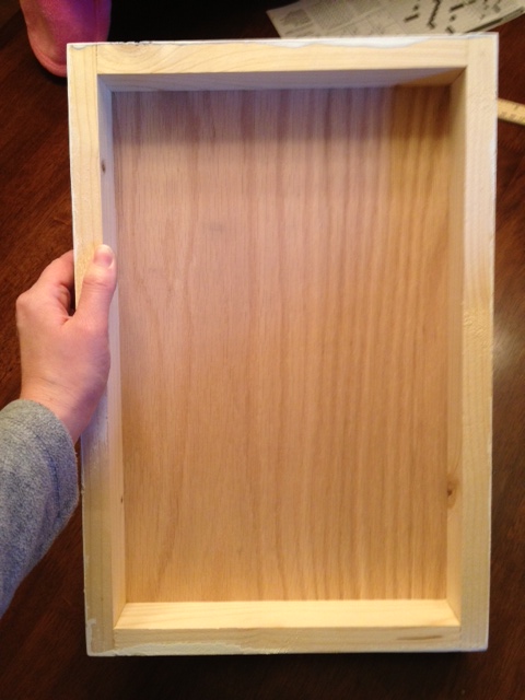
First, I started with three wooden canvases that my dad had already assembled for me.  Since I was doing her monogram, we made the center canvas a little bit bigger than the other two.  To make it out of wood, my dad built a simple frame out of 1x2 pine boards and then nailed a piece of plywood on top.  Easy peasy.

(This is the view from the back.)

Obviously you could just use regular canvases - I just like to use these because I'm cheap and we make them out of our scraps.

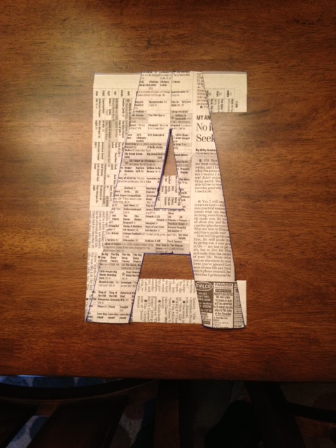
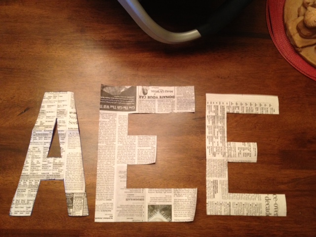
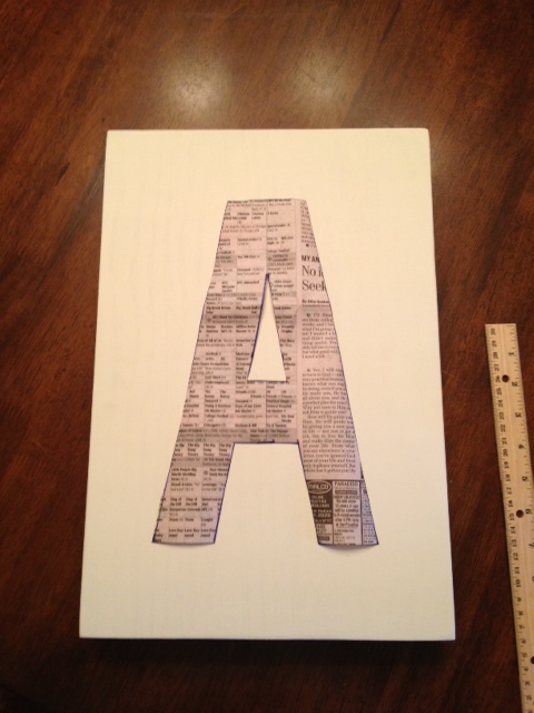
My first step was to paint the fronts and sides solid white so I could have a blank slate.  While that dried, I pulled out an old newspaper to make a template for her initials.  Now, I got really lucky because Anna's initials are AEE - all straight letters.  Not gonna lie, I probably wouldn't even attempt this if she had an S or an O in her monogram, because curves could get tricky.

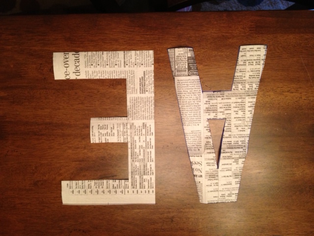
I'm a bit of a perfectionist when it comes to things like this, so I pulled out an old wooden ruler from grade school to make sure my letters were uniform in size and proportional.  Here are the A and the little E.

I kept thinking the E looked a lot wider than the A even though I'd used the same measurements and it was making me furious.  I stacked them on top of each other to double check, though, and they're exactly the same size.  I guess it's just the shape of the letters that make the E look bigger.

I had to do a bigger E for her last name.  I tried to keep it the same scale as the littler E.  (I actually ended up making it a little bit bigger than this one pictured.)

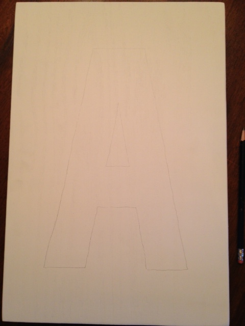
Now, like I said, these were just templates for me to use on my canvas.  I knew I wouldn't be able to paint over them, so I was going to need to trace them and tape them off.  Below you can see how I centered my template onto the canvas and then if you look closely on the right, you can see where I've faintly traced around the A.


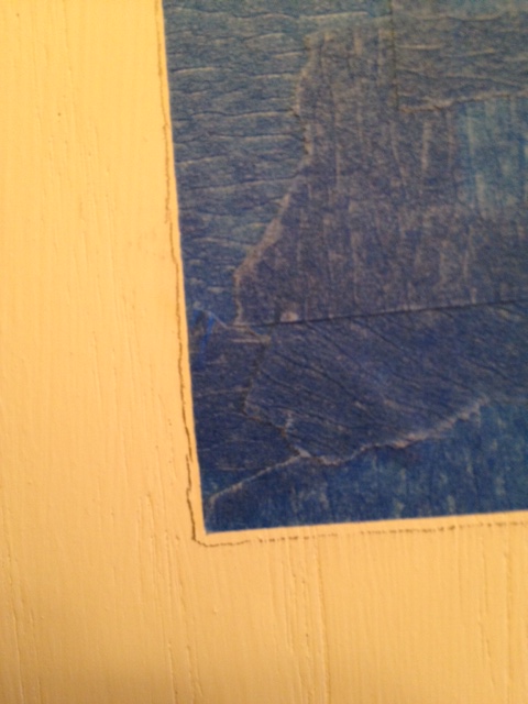
Next, I took some heavy duty painter's tape (don't get the cheap stuff for this!) and taped off my A.  I taped on the inside of the pencil lines so that I could try to erase them some.


I had painted the white with a low sheen paint and my lines actually erased off really well.  Not sure how well it would work on a regular canvas since you can't push down as hard.

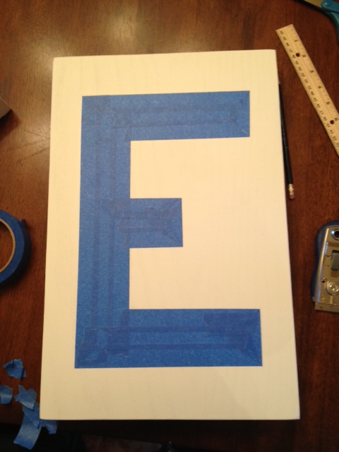
Here is how the E looked after being completely taped off.  Crisp edges and corners were key and took a little patience to do but it really wasn't that bad.  An exacto knife came in handy for the corners - something else that might not work as well on a regular canvas.

I taped off all three letters at one time while I was in the groove.  They didn't take nearly as long to do as I was afraid they might.

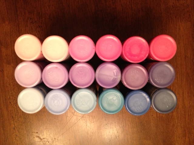
Next up - paint!  I planned to do each letter a different color - one pink, one blue, and one purple.  I had already gathered all my craft paints, making sure to have several shades in each color, from very light to pretty dark.

I interrupt this tutorial to bring you a picture of the little lady that was cheering me on during this project!  She was sitting in her carseat up on the kitchen table while I worked...we chatted a lot about what I was doing. :)

Ok, back to it.  Usually when I am using blue, pink, and purple together, I like to put the pink in the middle to separate the blue and purple since they can sometimes be very similar in color.  That's just a weird little quirk about me, I guess.  But this time, I didn't do that.  I knew Anna's walls were going to be blue so I thought it might be better to make the bigger letter in the center blue too.

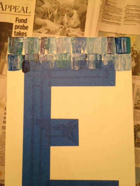
And that's the one I started with...the big E.  I applied the paint exactly like last time, dipping my putty knife in several different shades of blue and then scraping it down onto the canvas.  The only difference is that occasionally I scraped over tape.

Here's how the E looked when I was finished painting.

I think the normal rule is to pull off your painter's tape while the paint is still wet, but because I had globs of wet paint from the scraping application, I decided to let it dry for a few minutes while I did the other two letters.

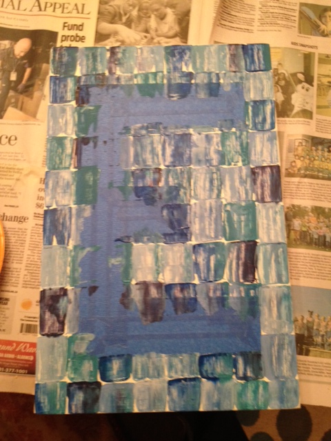
All three complete...

You better believe I held my breath when pulling off the tape - I had no idea how it would look!  Thankfully, I'm more than pleased with how they turned out!

I did get out my white paint and a tiny paint brush to touch up two tiny spots where the paint bled through.  I'm sure no one else would've noticed, but I'm anal about things like that and it didn't take more than a second to do.

I hope you'll give this a try if you need some easy and unique art.  I think it's perfect for our little tween's room!  But with different colors and maybe a different taped off design, you could do something that would look good in any room.  I'll be back soon with pics of these hanging on her freshly painted blue walls!

Birthday Sign and a Giveaway

Alternate title for this post:  The Craft Project That Tried To Kill Me. Seriously, I started this "simple" little craft project of making Family Birthday signs last spring.  They were supposed to be Mother's Day gifts.  Mother's Day came and went and they sat unfinished.  I finally completed them sometime around August and I'm just now getting around to blogging about it.  After finally finishing them, I just needed to step away for a while.

But now I'm ready to share them with you!  And, in all honesty, now that I've completed three of them, they really aren't that hard at all.  I just tried to make it really hard.

Before I start with the tutorial, let me make one thing clear: nothing about this is my own original idea.  In fact, the whole idea was found via Pinterest right here. (I would post a picture of her Family Birthdays sign, but don't want to use it without permission.)  I thought it looked really cute when I saw it on Pinterest, clicked over to her blog and read through her short and sweet list of steps, and figured I could knock out a couple of them as gifts in no time.

Ha.  Hahaha.

I'm gonna show you everything I attempted, just so you don't try to get extra fancy and waste your time trying some of the ideas I tried.  Now let's get started.

Step one is to cut a piece of 1x8 to roughly 2 feet long.  No need to get extra picky on this length, just somewhere in that ballpark.  If you have a router, feel free to fancy up the edge a little bit.  I used an ogee bit and went around the edge for a little detail.  Paint your plaque of wood any color you'd like - this will be the base of your Family Birthdays sign.  Here is where I'd show you a picture of my painted plaques if I hadn't deleted it.  D'oh!

This next step doesn't necessarily have to come next, but it makes it easier.  Flip your plaque up on its side so that the bottom is up on top.  Measure the length of your board so you can calculate your spacing...you'll want to divide by thirteen to come out with 12 marks, one for each month of the year.  Here's the pic where I measured one of mine and lined another up with it to cheat and use the same marks.  Hopefully this will make it make more sense.

Here's a helpful tip: use chalk to mark your lines.  It shows up better than pencil and is much easier to wash off when you're done.

With your spacing marked, go ahead and drill holes using a tiny drill bit.  You won't need to screw the eyehooks in until later, but this way you'll already have your holes made if your chalk lines get smudged away while you're working on the rest of it.  Make the holes in the middle of the board so it doesn't split.

To put the writing on the plaque the way I did, you'll need access to a Silhouette machine, or something similar.  I already had a roll of black adhesive vinyl that I planned on using for this project, but you could cut the letters out of paper and modpodge them on or even freehand them with paint.

If you'd like to follow along with my method, here's what I did.  First, I downloaded the free font (Teeny Boppin FN) and laid out my letters on my computer.  I'm self-taught when it comes to using the Silhouette, so I have no idea if I do this the correct way or not.  I prefer to keep as many letters grouped together in one text box as I can while minimizing the amount of wasted vinyl at the same time.  In the picture below, you can see that "Family" fit in one text box and "Birthda" fit in another, but I had to just squeeze in the Y and the S at the end.

I like to keep as many letters together as possible so that they spacing between them is correct and they're lined up the way they should be.  For the Y and the S, I'll have to manually line them up on their own.

For those of you unfamiliar with a Silhouette machine, it looks a lot like a small home printer but instead of printing out your image, it uses a small blade to cut it out.  Here it is being fed into the machine.

And here is the vinyl when it's finished cutting.

The vinyl comes stuck to a piece of white paper, which obviously makes it much easier to work with.  I suppose you could start pulling off each letter one at a time and sticking them down, but I wanted to do them all at one time to keep my spacing and to keep them straight.  To do that, the first step is to pull off all the background vinyl, leaving only the letters.  Below, I've cut out the word Family and pulled off the background.  (I had already stuck down the initials for each of the 12 months using the holes I drilled earlier for my spacing.)

When I initially purchased my adhesive vinyl, I also bought the recommended roll of...tape?  I don't really know what it's called; to me, it resembles a big roll of masking tape that's just not as sticky.  I pulled off a piece of it and stuck the word Family face down.

After pushing down the letters really well to make sure they've stuck down, you can pull off the white paper.  Now the letters should be backwards and have the sticky side out.

Now, I have one more trick that I've learned before just sticking it down.  I like to cut the tape off right below the letters, making a straight line at the bottom that I can use to line up on my sign.  With the font I used, I had to skip over the A, but I still had plenty of straight bottom to use.

Now the letters are finally ready to be stuck down.  I had already drawn a chalk line to line them up with - once you have the size of your letters figured out, just eyeball it to figure out the spacing.

Now, in my opinion, this is where things start getting a little bit tricky.  In a perfect world, you would just be able to make sure the letters have been mashed down and then pull the masking tape backing off, leaving the letters perfectly stuck to the sign.  Unfortunately, this world is far from perfect and it doesn't work that easily.  The stickiness of the masking tape is stronger than the stickiness of the vinyl letters, so if you peel it back the letters usually stay on the tape instead of on the sign.  Grr.  I usually just peel up a small corner at a time and try to hold it down while peeling off the rest of the paper.  It may defeat the purpose of doing this process in the first place, but the important part for me is that it helps keep the spacing between the letters.

With just a little bit of time and patience, they're eventually all stuck down and perfectly spaced.

After that I was able to stick down the bigger section of Birthday, but I still had to manually line up the Y and the S with the rest of the word.

After all the letters were stuck down, I still had one last step to do.  Because the vinyl is not incredibly sticky and can be pulled up, I opted to brush on a layer of a clear polyurethane to kinda help seal them in.  And with that, the sign part of this project was complete.  That was the easy part!

For the wooden discs, I originally tried to take a large dowel rod and slice it into thin pieces.  That didn't work well because I couldn't get them the same thickness.  And let's face it, I really didn't want to have to sand all the slices either, so I was fine with that not working.  Thankfully, I was able to find pre-cut wooden circles at Michael's.  I believe they are about an inch and a half in diameter (give or take a little, it's been a while since I looked at them) and have a nice rounded edge.  They came in packages of 12, I think.

Painting them was not hard at all, just more of a nuisance since they had to be painted on both sides.  Because I wanted the discs of each family to be the same color, I had to do a little bit of prework and figure out how many of each color I needed.  I was also working on three Birthday signs at one time so things got a little confusing!

And now we've reached the part where it all went downhill.

Here's why: I needed to somehow write the names and birthdate of each family member on the discs and the original sign that I was copying had handwritten discs.  So I grabbed two different pens - one a regular sharpie and one a sharpie pen - and gave them a try.  Holy kindergartener handwriting!  They looked terrible!  The thin pen was bumpy on the wood grain, and the fat pen bled too much and got to thick to read.  Imagine if I tried to do a name longer than three letters!

I had come too far in this project to junk it up with some terrible writing, so I set out to figure out a way to print my names and birth dates using the same font from the sign.  After doing some googling, I discovered that I could actually print the text on paper and then transfer them to the wooden discs using elmer's glue and mod podge.  I followed these directions to a T.

The first thing I had to do was get all of my text laid out in a format that would be easy to use.  Being an accountant, I consider myself to be pretty handy in excel, so I used it to set up a nice little grid.  It's uber important to remember to print your text in reverse, or as a mirror image.  I hadn't done that before so I had to click around a bit to find it...I think it's in the Print Setup options.

I got my file set up, painted my white card stock with Elmer's Glue like the directions said, and then printed my text onto the sheet.

After printing, I modpodged the discs facedown onto the print.  According to the tutorial I read, all I had left to do was run the page under water until the disc lifted off, pulling the text off with it.

I got busy sticking the discs down, being careful to put the right colors on the right names.

I cut off the top one in the corner so I could go ahead and see if it was going to work.  I was able to rinse the paper off and the text did transfer to the disc.  Yay!  The print was a little light and slightly spotty, though, so I carefully traced over it with the sharpie pen.

Admittedly it's not the most perfect looking thing in the world, but I liked that the font matched the main part of the sign and it sure as heck beat my kindergartener handwriting.  Onward I went.

I'm not really sure how this went wrong, but after sticking all of the discs down and letting them soak in water for a fair amount of time, I got very splotchy results when I pulled them off.  I got an average of about 2 full letters per name and some of them could've been salvaged, but not all of them.  Whomp, whomp.  Why did I glue down every one of them??  Now I had to start all over again...

I cleaned out the bags of wooden discs at the first Michael's I had gone to, so this time I had to go to a different location.  Luckily they had just enough for me to try again.  This time, after more researching, my plan was to use transfer paper to iron the text onto the discs.

From what I'd read, I pretty much just had to do the exact same thing you'd do if you were ironing a design on to a t-shirt.  Seemed easy enough.  Once again, I got all my text laid out and printed in reverse onto the transfer paper.

I grabbed a handful of painted wooden discs and headed to the ironing board.  I placed the transfer paper print-side down and got to ironing.  This was even worse than the other method!  The discs were slightly cupped, not perfectly flat, so the transfer paper wasn't sticking to the middle.  In fact, it was leaving a bubble in the middle of each disc.  You could also see the clear plastic it was leaving.  I guess I didn't take a picture but trust me, they had to be trashed too.

By this time, this project had already spanned a couple of weeks since I had to keep going and buying supplies and reprinting things.  I was getting majorly bummed out and decided they would not be Mother's Day gifts afterall.

I had one more idea that I thought I would try - Transfer Artist Paper.  For whatever reason, though, I pushed this project aside and gave up on it for a while.  At some point I did order a bulk box of wooden discs since I had already ruined so many and Michael's apparently wasn't planning on restocking them any time soon.

Fast forward to the end of July when we were packing up our house to move and I ran across these things again.  I decided rather than packing them up I might as well try to finish them up.  And, of course, I'd never gotten around to ordering the Transfer Artist Paper and I didn't feel like waiting on it to arrive now, so I had to go on without it.

There was no choice left but to go back to my original method and just handwrite them on.  Grr.  I did make a few improvements, though.  First, I added a layer of clear polyurethane to each of the painted discs (the third set of painted discs at this point, ugh).  I also looked at every different kind of pen and marker that Michael's had before settling on one that had a good tip to use.  It actually had two tips - a thin one and a fatter one - so surely one of them would work.

Thankfully, the pen worked much better and the coat of poly kept the ink from bleeding into the wood grain.  Much better this time!

The last steps went pretty quickly.  I screwed the eyehooks into the 12 holes I drilled at the very beginning.  I also drilled tiny holes in each of the wooden discs.  This required a little bit of planning because some discs needed holes at both the top and bottom and others just needed one at the top.  I used jump rings to hang them from the eyehooks.

The finished product...finally!

The sign above is the one I made for our house.  It has all of our birthdays on it, both of our sets of parents and living grandparents, and also our siblings and their spouses and children.  Each family is in a matching color (for example, my oldest brother's family is all in green).  With all the birthdays added, it just so happened that we only had one month with no birthdays in it...

(I see JASON every time I look at this...he's not even in our family!)

Thankfully, we were able to fill that little hole exactly one month ago!

And now our little sign of Family Birthdays is complete. :)

I told you I was working on three at one time, so here are the other two.  I did one for my mom and one for Doc's mom and I tried to use colors that would work well in their houses.

This one is hanging in my mom's kitchen:

And this one is in my mother-in-law's kitchen:

So, here's the deal.  When I started working on these three, I went ahead and cut out an extra piece of wood and routed the edges.  I also cut out another set of letters out of the vinyl and I have leftover wooden discs.  That means I have all the supplies for one more sign ready to go.  Anyone want one to hang in their house?  You can choose the color scheme and will, obviously, have to provide the names and birth dates, but I'll do all the rest!  I suppose if you don't like my handwriting I can send the discs blank so you can write them yourself.

To enter for a chance to win a Family Birthdays sign, just leave a comment on this post.  And to make it fun, why don't you tell me something that's on your Christmas wish list.  I'd love to see what you guys are hoping for and heck, I might even get some shopping ideas!  We'll be using the honor system here - please just one comment per person.  I'll close the comments Thursday evening at 8:00pm and will use Random.org to choose the winner.  Good luck!
Lamp Revamp

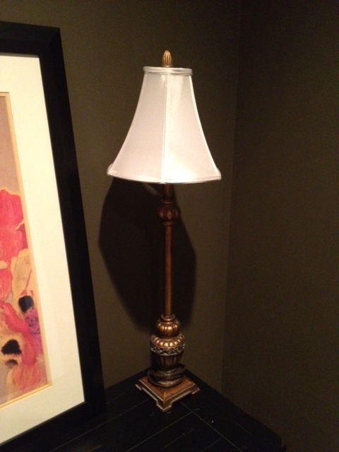
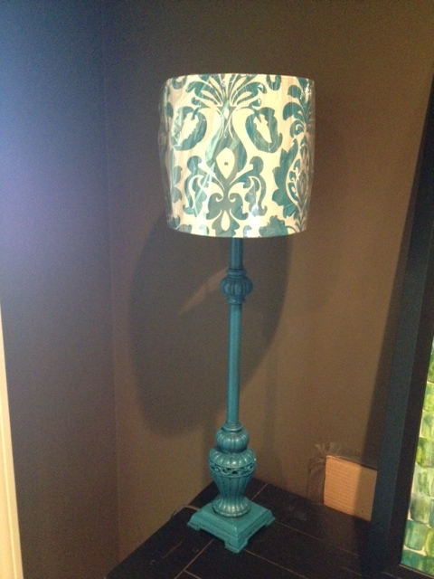
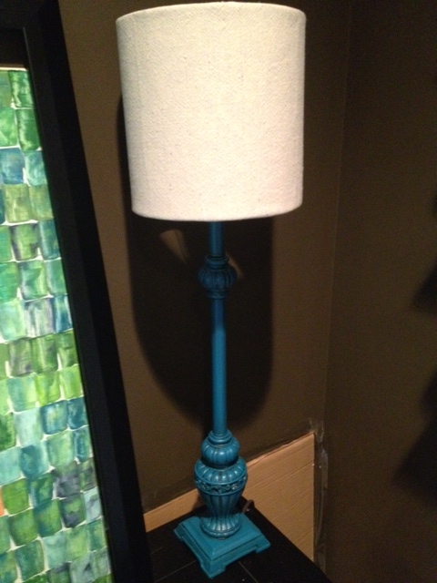
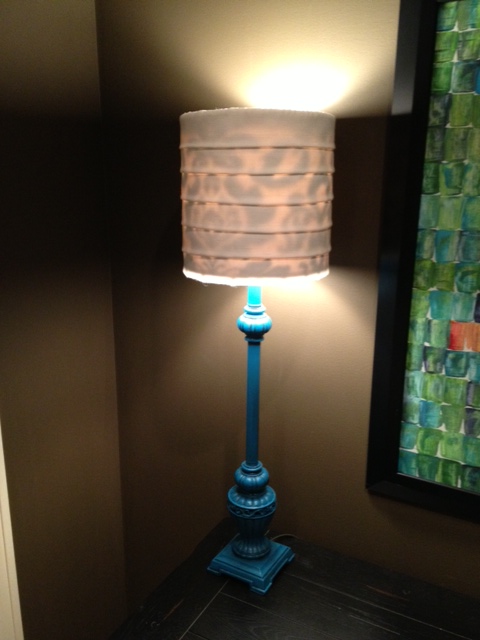
To go with the piece of art that I showed you yesterday, I had two buffet lamps from our old house.  The lamps were in good condition, they were just a little too...gold.  And formal-ish looking.  I was trying to make this space bright and fun and colorful, and obviously these lamps did not fit the bill.  So a little revamp was necessary. Here's how the lamps (purchased from Kirkland's years ago) looked in their original state.

I was kinda thinking turquoise for the base of the lamps, so one day while at Home Depot, I picked up a can of spray paint in "Lagoon."  It sat on the shelf next to the lamps for a week or so because I was too lazy to actually go outside and paint them.  One Saturday, Doc wasn't feeling well and spent the day laying around the house taking it easy.  Finally, around 7:00 that night, he got up and said "Ok, I'm bored and restless.  Do you have a project or something I can work on?"  And that's how he ended up in the backyard spraypainting two lamps turquoise.  In his underwear.  He probably won't ask me for any projects again.

I don't have pictures but the bases of the lamps - after taping off the cords and the tops where the lightbulb goes - each got a coat of spray primer and then two coats of Lagoon.  They seemed a little too bright to me after that so I also wiped on a quick coat of chocolate brown glaze (and then wiped it off so it only stayed in all the grooves).

Besides changing the color of the base, I also wanted to change the lampshades to something a little less fancy and a little less gold.  I picked up two solid white shades from Target and thought they'd be perfect.

When I plopped the new shade on top, my initial thought was that they didn't look long enough, but I was just going to let it go for the time being.  That is, until Doc walked by and said "The lampshades look too small."  Crap.  If he noticed, then they must really be too small!  So I kept my eyes open for better fitting shades.

One day while at Garden Ridge, I found the perfect-sized lampshade.  Surprisingly enough, the turquoise color of the design was also a perfect match.  Only problem?  I really didn't want a shade that was patterned like that.

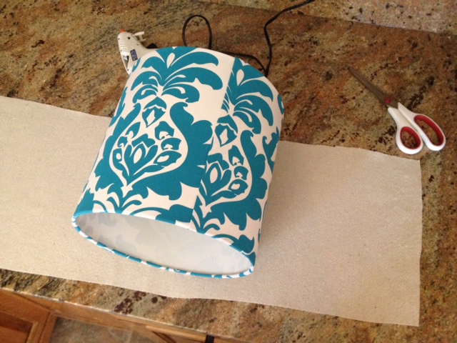
These shades were super cheap so I bought them anyway and devised a plan to make them work.  I wanted them to be solid white and planned to cover them with some fabric we (my mom) already had.

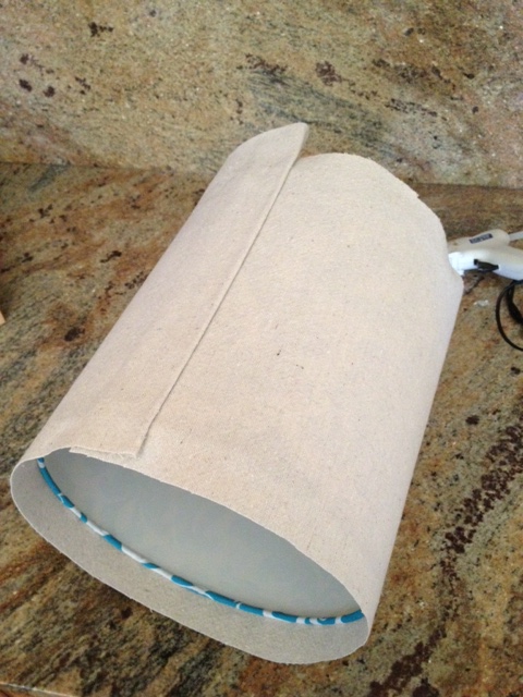
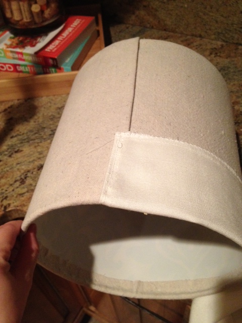
First, though, I completely covered the shades with some scrap material from a drop cloth I already had.  I cut two strips (one for each shade) slightly wider than the height of the shade.  I didn't even bother making my cuts very straight.

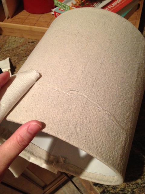
I used my hot glue gun to secure the drop cloth fabric around the shade.  I folded the last edge under so the back seam would look cleaner.

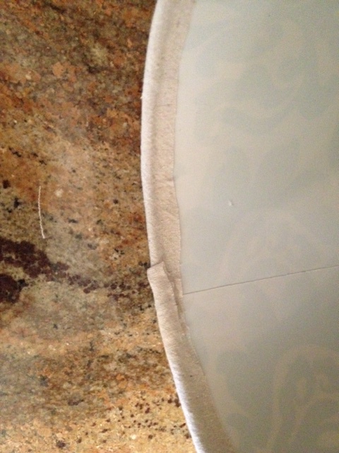
Next, I folded the edges up inside the shade and used more hot glue to hold them in place.

I plopped the freshly covered shade back onto the lamp to see how it was looking.  It really wasn't bad like this...

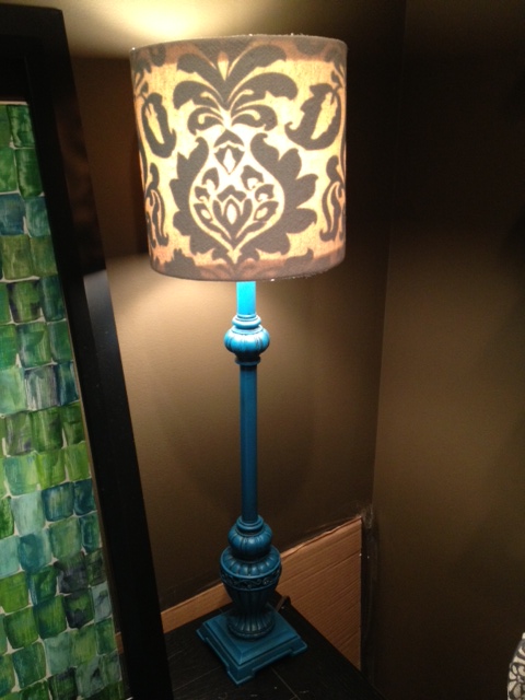
...until I turned on the lamp and the pattern showed through.

I wasn't too concerned because I was already planning on another layer of fabric anyway.  So I moved forward with my plan.

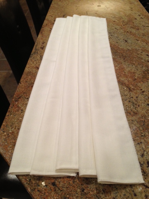
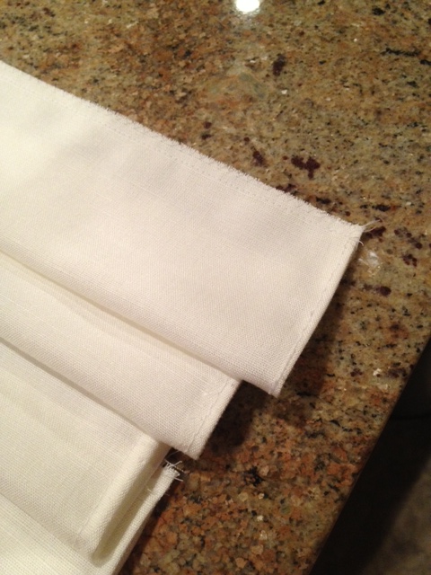
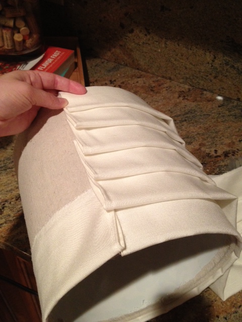
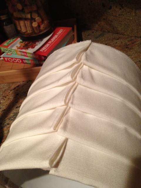
I wanted to add the next layer of fabric in strips made to look kinda like pleats (maybe?).  Using a textured white fabric, I my mom cut six wide strips for each shade and then folded them in half to make a bubbled edge on one side.

While I tended to the baby, she went the extra mile and hemmed the edges on the ends and quickly sewed the two raw edges together.  If you're not a sewer, this could've been done with hot glue.

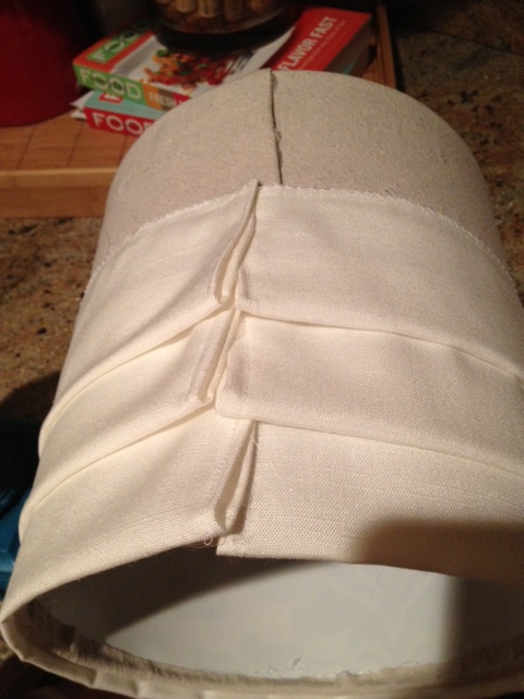
At this point, they were ready to add to the shade.  I started with the bottom edge, placed it so that the bubbled edge barely hung off the bottom of the shade, and glued the top edge down with hot glue.  I started in the back so that my seam would line up with the existing seam in the back.

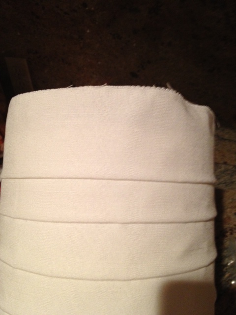
Once that one was down, it was just a matter of repeating the process 5 more times.  Before gluing the next one down, though, I figured out my spacing.  I didn't measure, just eyeballed it.

As you can tell from the pic below, I didn't stress about my seams lining up perfectly.  As long as they were all near the back, I was fine with it.

The second to last strip was glued right at the top edge of the shade.

That means to glue on the sixth and final strip, it had to hang off the top edge.

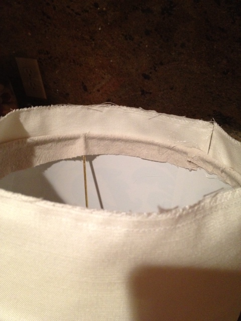
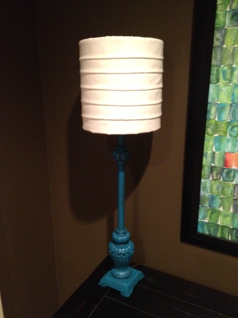
Just like with the drop cloth, I folded the top of the fabric over the edge of the shade and glued it down with hot glue.  And with that, my shade was done!  I plopped it back on top of the lamp base.

For a low-budget lamp revamp, I was pretty pleased with how it turned out!

There was only one thing left to test.  I held my breath and turned on the lamp...

Whomp, whomp.  That darn pattern!  In hindsight, I guess I should've sprayed the shade white before starting.  Rats.  Live and learn, I guess.  They definitely aren't "forever" lamps, but I'm ok with them being "right now" lamps.  We just won't be turning them on...

Putty Knife Art

We've officially lived in our new house for two months now and I still haven't even shown it to you!  My apologies.  I have big plans to show you pictures of each room - I want to photograph them in their current states so we'll have good "before" pictures.  There's still so much to do in every single room!  But, until I have all the pictures ready, let's talk about some quick and easy art I made... First things first: I cannot take credit at all for the genius idea of this type of art piece.  I 100% copied the idea from Mrs. Katie Bower over at the Bower Power Blog.  She did it first and posted her tutorial, and I pretty much followed it to a T.  I even used the same colors she did, but then I added in some yellow and red for my own twist on things.

So, feel free to go to her blog and follow her instructions, or you can see mine here.

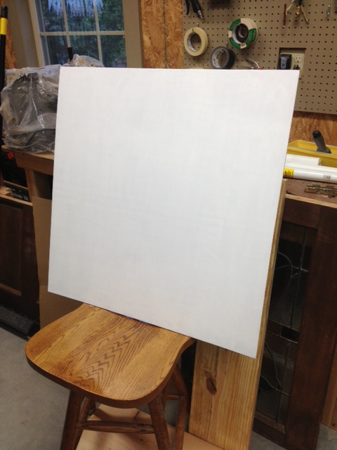
Katie used a canvas, but I didn't have one on hand and didn't want to go spend any money.  Plus, I had a frame already that I wanted this art to go in, so I needed my art to fit it exactly.  So instead of using a canvas, I cut a thin piece of plywood the size I needed.  First step was to paint it solid white.  Anna helped me with this part.

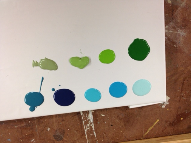
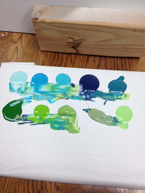
Then I squirted out the paint colors I wanted to use.  I just grabbed several blues and greens in craft paints that I already owned.  My main goal of this project was not to spend any money (and I succeeded!) so I didn't go buy any new colors.  I made sure, though, that I had both light colors and dark colors so there'd be plenty of contrast.

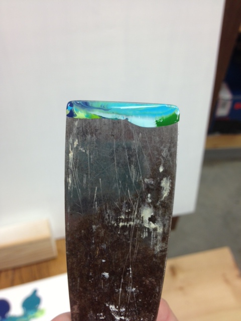
Like Katie, I didn't own a real painter's pallet knife, but I did have a putty knife that I use out in the shop all the time for wood putty-ing projects.  I spent a minute scraping off dried wood putty and then it was ready to go!  I dipped it into several different colors, making sure there was paint all the way across the top of the knife.

There was no rhyme or reason to which colors I chose, I just stuck it in whichever ones felt good.  My paints started blending together like this.

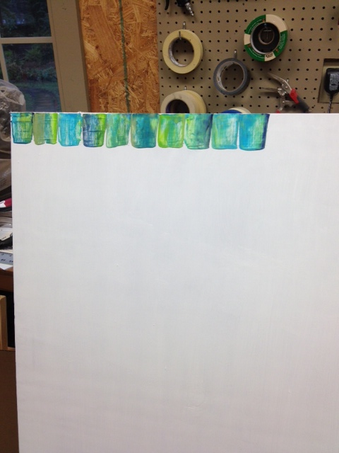
I started in the top left corner of my "canvas" and moved to the right.  It took me a minute to get my groove.  This is probably where a real canvas would probably be a little bit easier to work with, as it would give a little against the putty knife.  On my wood surface, I was scraping a hard flat object against another hard flat object, so if there was a bump on the board or anything like that, I'd end up getting only a partial scrape, if that makes sense at all.  I had to go over it a few times on occasion.  Anyway, all I did was load the paint up on my putty knife, place it on the top of the board, and scrape it down my desired length.  I did not draw a line to keep them straight; I just eyeballed it.

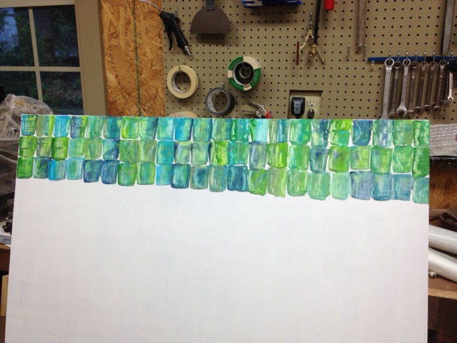
I really liked how the blues and greens were blending together.   After finishing the top row all the way across, I just moved down and repeated the process right below it.

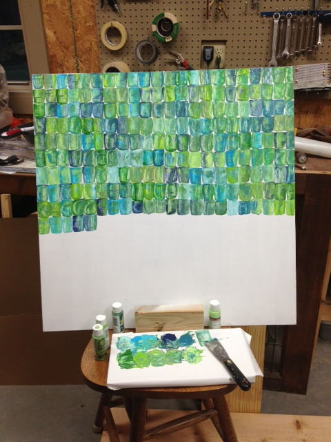
Once I had my groove, this moved really quickly!  I filled up the majority of the board in no time, making sure to dip my knife into different paint color combinations each time.  If I felt like things were getting too green, I dipped in blue for a while, and vice versa.  Sometimes I would have enough paint on my knife to do two scrapes side by side that matched.

Now, here's where I deviated from Katie's tutorial a little and stopped taking step-by-step pictures.  I knew where I was going to be hanging this piece of art and wanted it to tie in more colors than just blues and greens.  I would be using a little bit of red in the area too, so I needed to work that in.

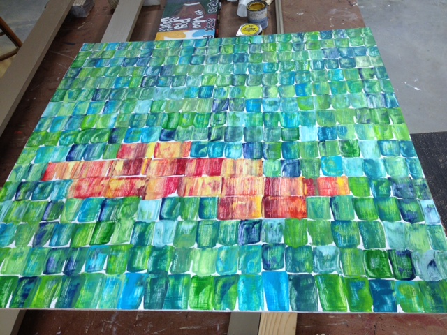
I squirted out several shades of red paint and also added in some yellows and oranges to have something to blend it with.  Rather than cleaning off the putty knife I was using, I grabbed another one we had in the shop.  This one was double the width of the first one (usually used for spackling) and one scrape with it would match the size of two scrapes of the smaller one.  I used the exact same method of dipping it into multiple colors and then just scraping down my desired length.  I worked these colors in in a random shape.  I thought about doing a solid line or two of the red/yellow scrapes, but decided to keep it random.

When it was all done, my canvas looked like this.

Obviously, when I had the red and yellow area filled in the way I wanted it, I just picked back up with the smaller putty knife and the blues and greens and finished the rest of the canvas.  Easy peasy!  It took me about 30 minutes to get the whole thing done.

It looks great in the frame and hanging on the wall.  I have two more projects to show you and then I'll reveal how they all came together in our little entry nook.  Be back soon!

Beaded Board Letters

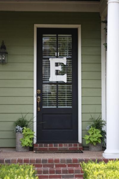
For my last baby shower, I had a really hard time coming up with a good idea for a hostess gift.  Obviously I wanted to give something that my lovely hostesses would like, and hopefully it'd be something they didn't already have.  I figured the easiest way to guarantee that I was giving them something they didn't already have was to give them something I made myself. With about a week to go before the shower, Operation: Homemade Hostess Gifts was launched.  The craft project I decided on was to make personalized door hangers, just like the one I made a while ago for my own door.

The first step of this process was by far the hardest: draw the templates for the letters.  I drew them out on newspaper and had a pretty hard time getting them to look right.  For some reason, the larger a drawing is, the harder it is for me to get it all proportionate and to scale.  Anyone else have that problem?

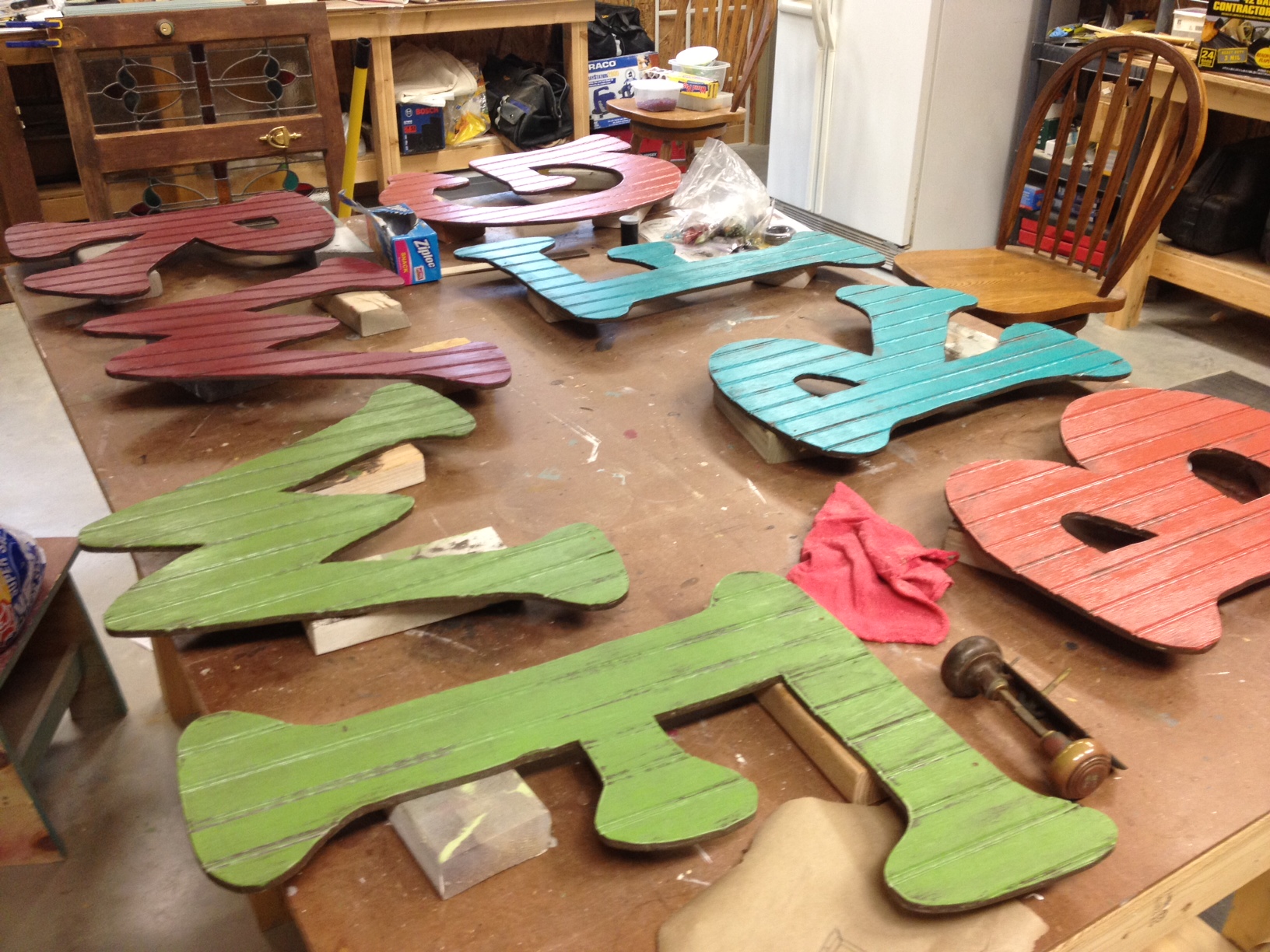
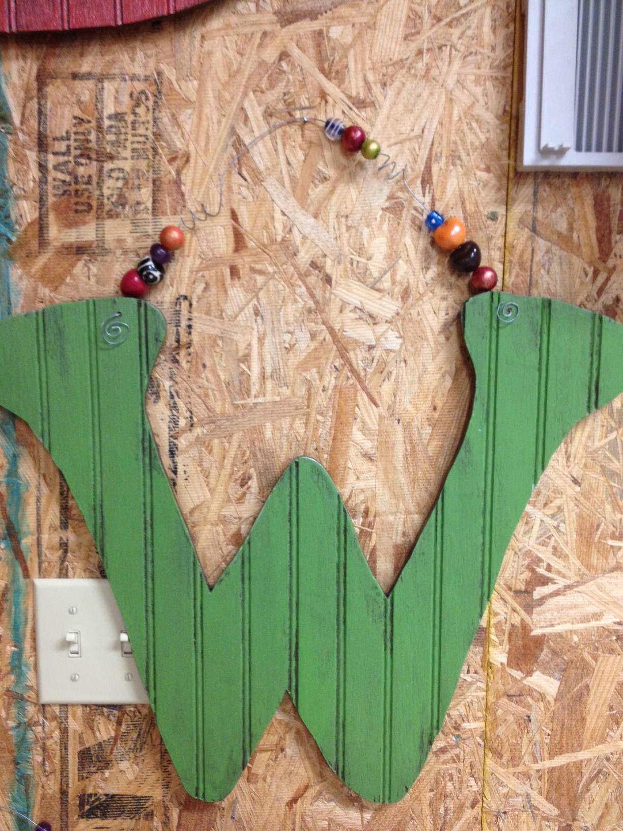
I finally got them all drawn and cut out of newspaper and was able to trace them on scrap pieces of beaded board we already had in the shop.   We used our scroll saw to cut them out, but you could also use a jigsaw if that's all you had.  Here's the G about halfway through getting cut out.

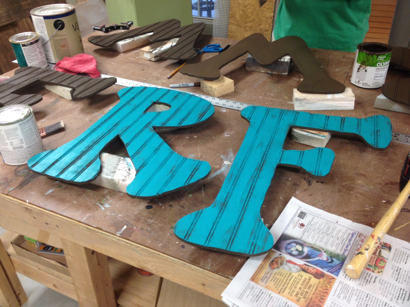
After cutting out all eight letters and sanding the edges down smooth, the next step was to paint them.  I started with a coat of dark chocolate brown on both the fronts and backs of each one.  (I didn't take a picture of this step but you can see them in the background of the picture below.)

For the colors on the front, my mom and I tried to pick the best color for each hostess's house.  We ended up doing 2 each of four different colors.  I did the two turquoise ones first (the backs stayed plain brown).  I brushed the the front color on lightly, being careful not to paint in all the beaded grooves so that they'd still show up.

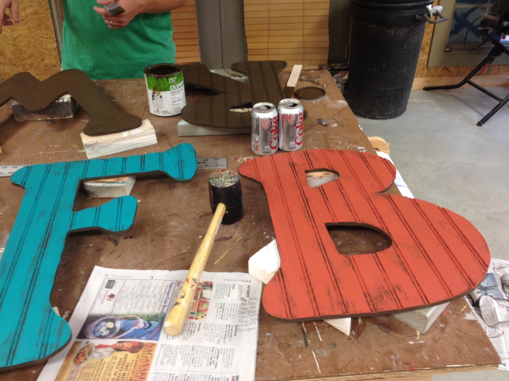
After the turquoise, I moved on to a fall-ish orange.

The last two colors I used were bright green and red.

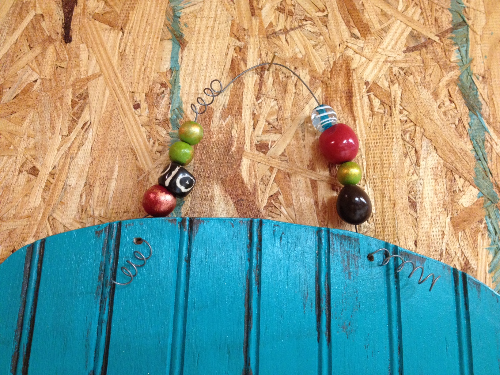
I applied a quick coat of polyurethane before the last step - adding a wire hanger.  The letter I made for my door just has a simple wire hanger, but for these I decided to dress it up a little with some colorful beads.  I also gave the wires a few twists and curly-ques.

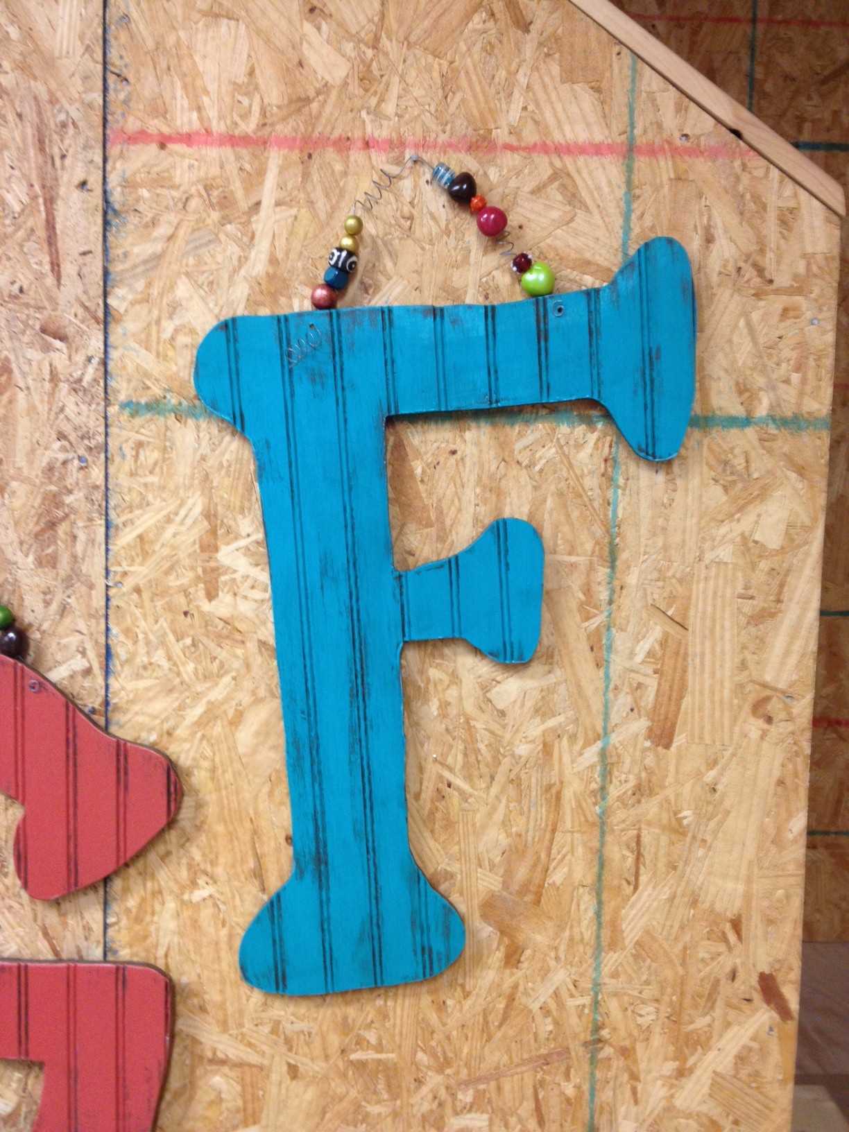
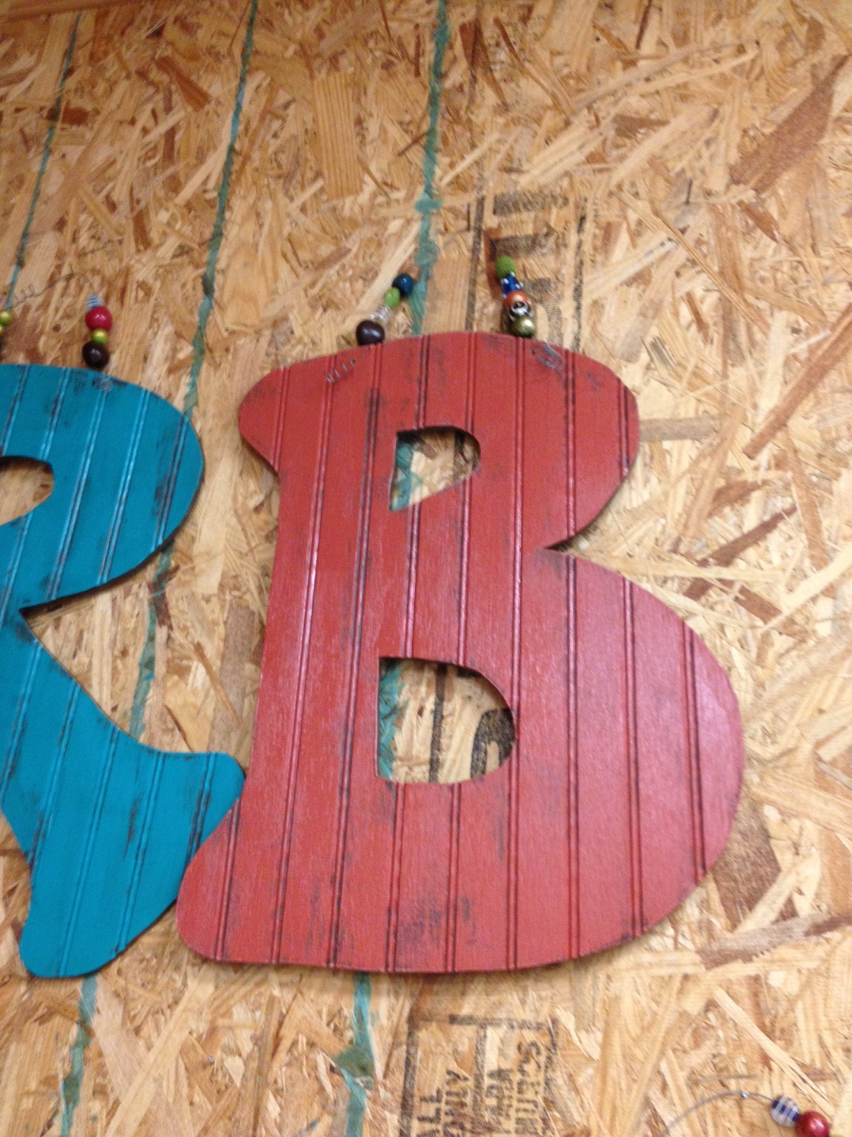
Here are some of the finished projects.  Super easy, but I think they turned out pretty cute!

Of course, I'm sure they'd look even cuter actually hanging on a front door (or a wall!) instead of a plywood wall in a woodshop, but I don't have those pictures.

So there ya go, an easy project that makes a good personalized gift.  Perfect for those friends that already have everything!