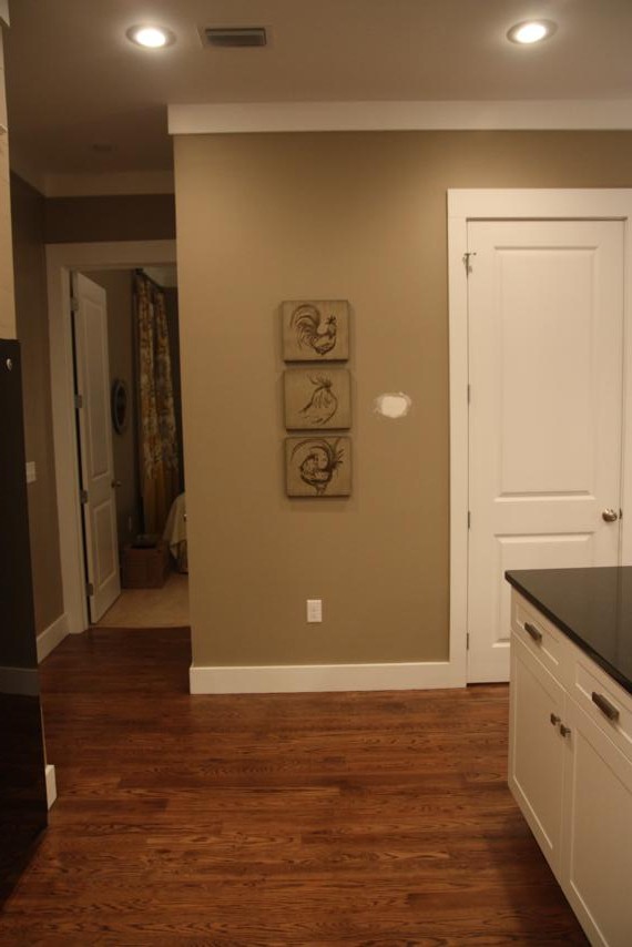
Let's wrap this thing up, shall we? The last stops on the tour are the master suite and the "mini master." I think we'll start with the mini; it's downstairs and we got a small peek into it on Part 2 of the tour when we were in the kitchen.
The mini master is the only bedroom downstairs and even though it's probably the smallest in size, the tall ceilings keep it from feeling tiny. It's located at the back of the house, just off the kitchen, and the builder called it a mini master because it has it's own full bath. This is where Doc and I stayed while we were there and we give it a 2 thumbs up. It's quite cozy.
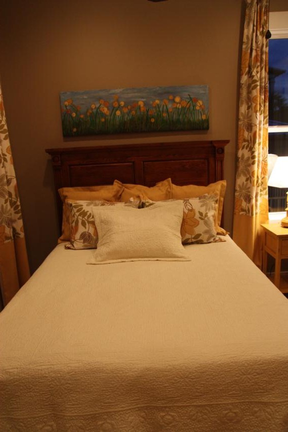
So let's get closer. Here's the view from right at the door.
Early on in our shopping, my mom and I were visiting my aunt and she took us to a great furniture outlet store. We bought three of the beds there - all brand new and ridiculously cheap. One was the footboard and headboard that we had to paint white. We had to buy side rails for it since it wasn't a complete bed and now it looks great in the "Jackie" room. The king bed in the master bedroom was the same situation; we had to buy side rails for it too but at least we didn't have to paint that one. For this room, we got the solid wood headboard for 100 smackaroos. We attached a metal bedframe to it and called it done.
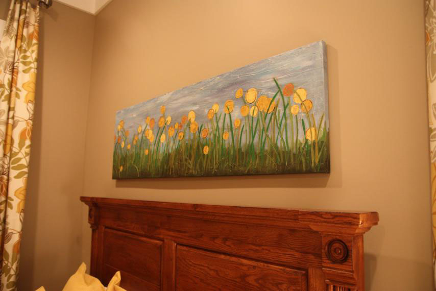
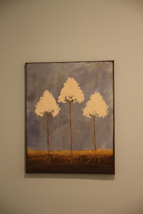
Hopefully you recognize the flower painting above the bed. That's the $8 Target canvas I made over a few weeks ago.
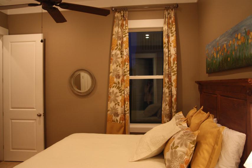
Here's a shot of the side wall. The curtains (made by my mom) look a little wonky since we kept drawing them closed at night. And in this picture, that mirror looks really low but I promise if you were standing in front of it checking to see if you had something in your teeth, the height is just right.
The floral fabric used for the curtains, shams, and bed skirt is a Premier Print. The cream matlasee was another TJ Maxx find and it only had one sham to go with it, which explains the random single pillow in front.
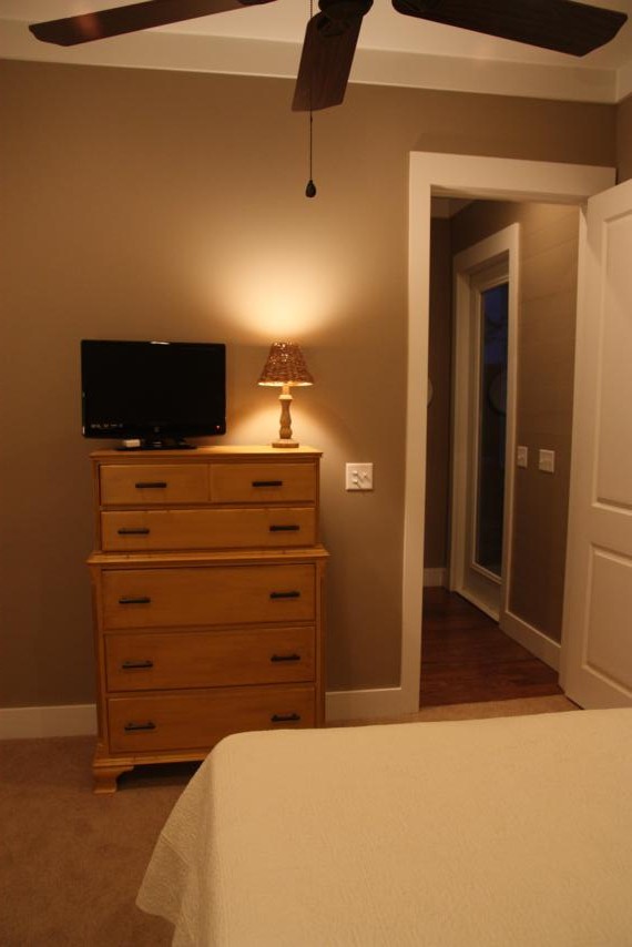
Across from the bed is the mustard yellow dresser that I'm still in love with.
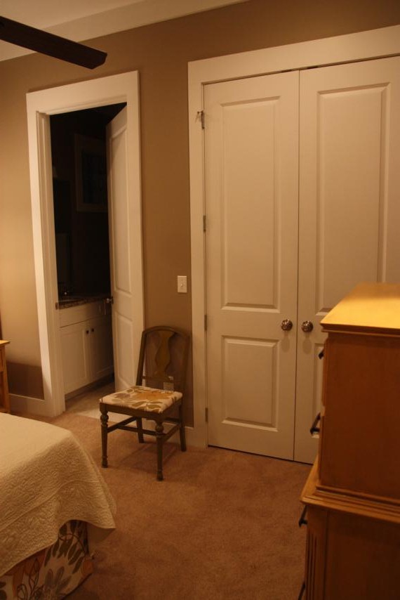
The last wall of the room has the closet and bathroom doors on it. The green chair sits in between the two and, from this picture, kinda looks like it sticks out and would be in the way, but I loved having it there to throw my clothes everyday.
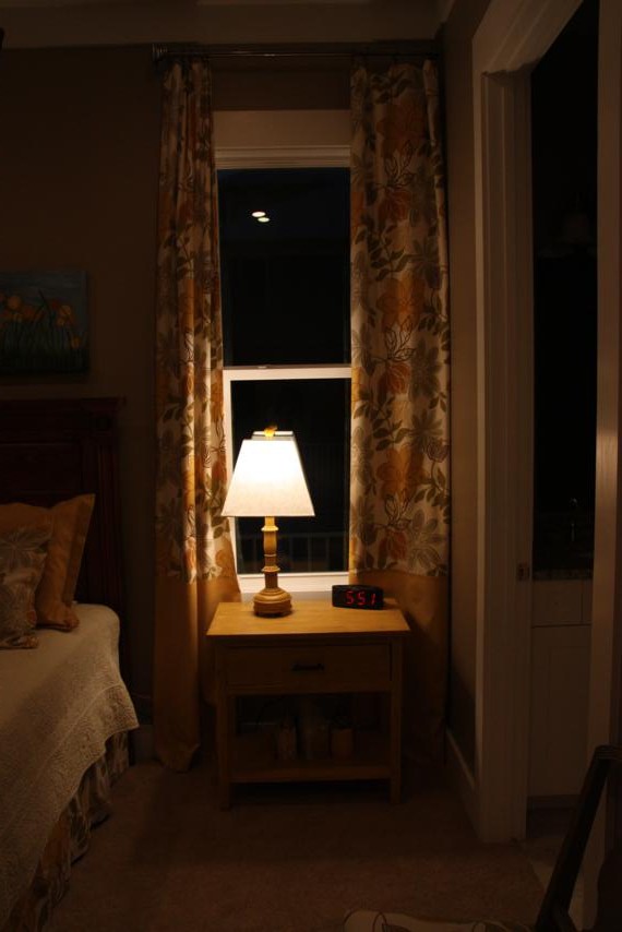
Beside the bed sits the little yellow side table we made. Sorry this picture (and the others, too) is so dark. My daylight was all gone and I didn't turn on my flash.
I completely forgot that the bottom half of the curtains in this room were solid yellow when I decided to paint the table that color. So there's a slight yellow overload but I really don't know what other color I would've painted it. I had also forgotten about this yellow lamp that we bought for this room. The crazy thing is that it's the exact same shade of yellow, even the glazes match! I probably couldn't have matched them better if I tried.
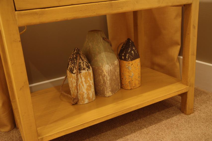
We added a few more buoys to the bottom of the table.
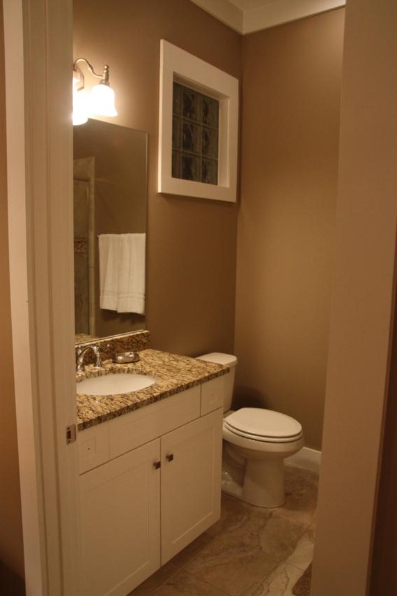
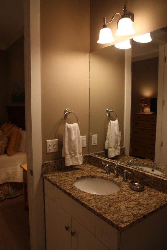
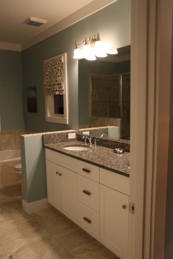
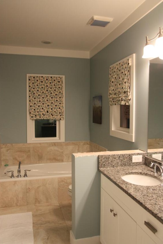
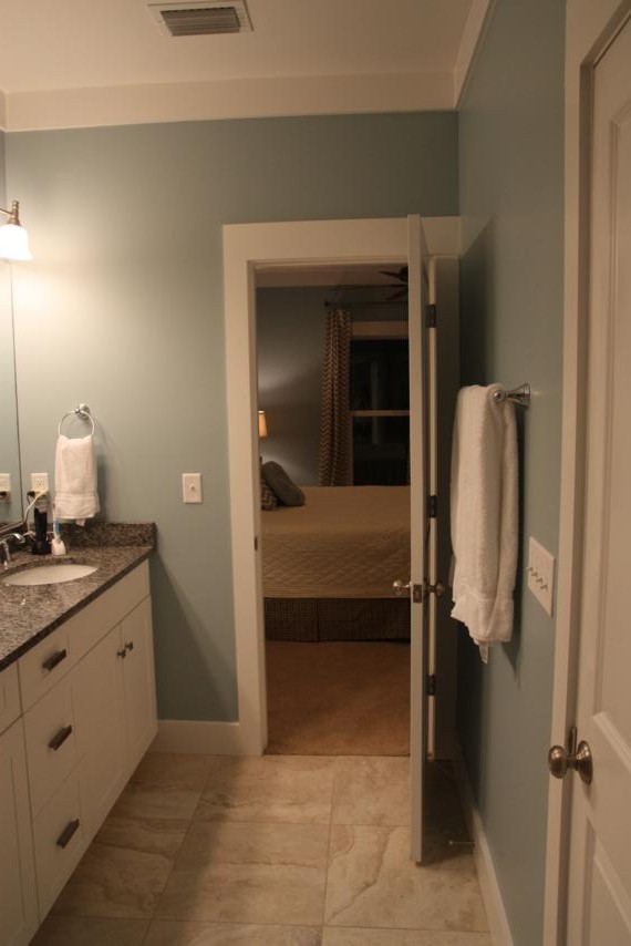
The bathroom is not tiny, but it was still had for me to get good pictures of. I couldn't stand back very far to get a good shot. And just in case anyone reading this really notices details, yes, the knobs on the drawers were still missing. They're there now, though. :)
The countertop is another granite remnant that our builder picked out. I'm so glad he had good taste!
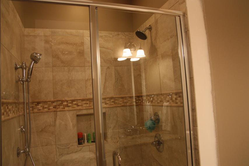
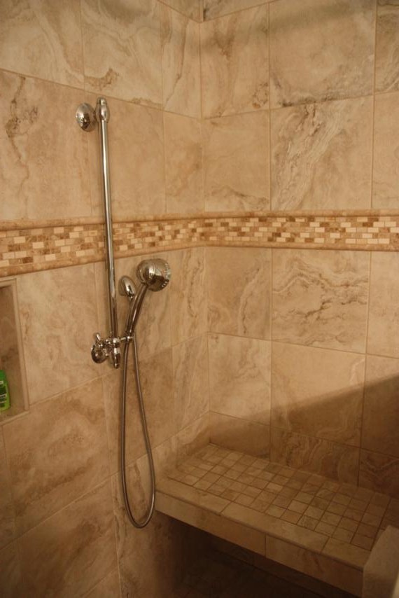
This is about as good as I could get of the tiled shower. The white strip of sheetrock on the right has since been painted.
Who's ready to go upstairs to the real master suite? I am, cause I think it's my favorite room. (Although I do change my mind about that a lot.)
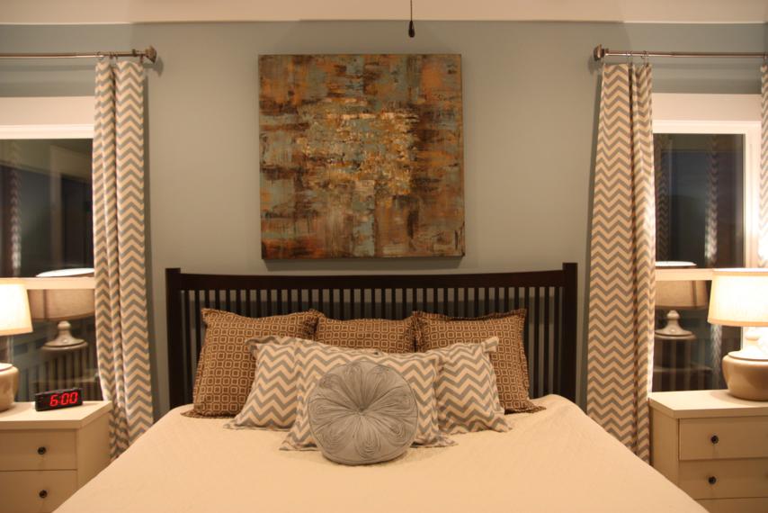
The master suite is upstairs over the dining room and mini master side of the house. Here it is from the door.
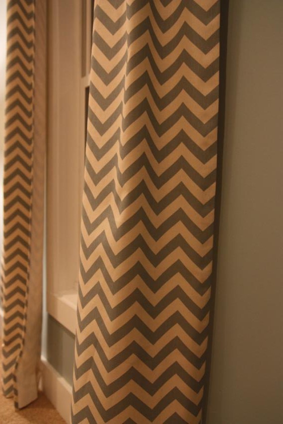
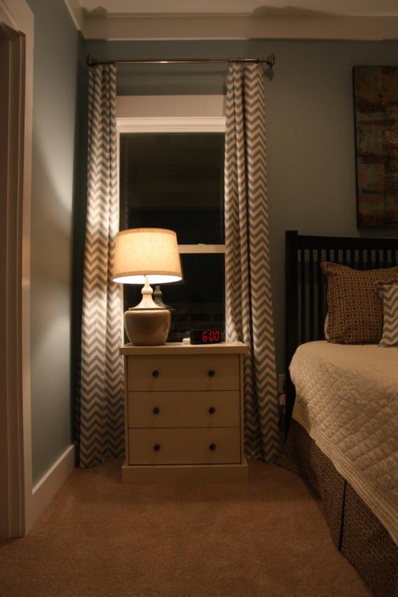
Let's start with the color scheme. My mom bought this blue and cream chevron fabric (another Premier Print) completely by mistake. I had asked her to pick up a different blue fabric and she grabbed this one because I had gotten a swatch of it too while at the fabric store.
It is not unlike us to have a few yards of fabric (or even a whole bolt!) that we don't even have a purpose for, so we just held on to this and figured we'd find a place for it. Then my mom found this brown print somewhere and had the idea to use them together for the master.
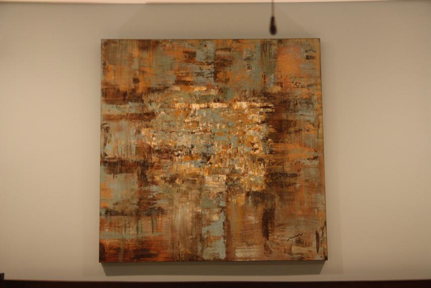
Shortly after pairing the two together, we had our big score at the furnitre store that was going out of business and found the painting that's over the bed. It was perfect. (And if you're a Dooce reader, she has the same painting hanging in her house!)
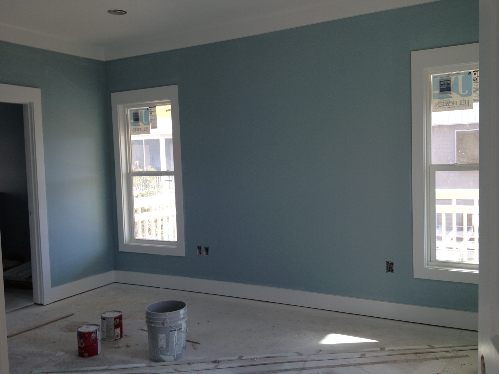
So that's how the color scheme came about; we just then had to put it all together. We went out on a limb with the blue walls (Rain by Sherwin Williams) but we wanted at least one room that wasn't a neutral color. I'll admit, I was very nervous about this room once I saw it painted. Before it had any carpet or furniture, the blue walls and white trim looked really, really bright. I wasn't sure that our cream furniture was going to work.
I was nearing panic mode and ready to start over on the decorations when my mom told me to relax. She reminded me the curtains would hide a lot of the bright white trim and the carpet would tone it all down. I'm glad I choked down that chill pill because I really like this room now!
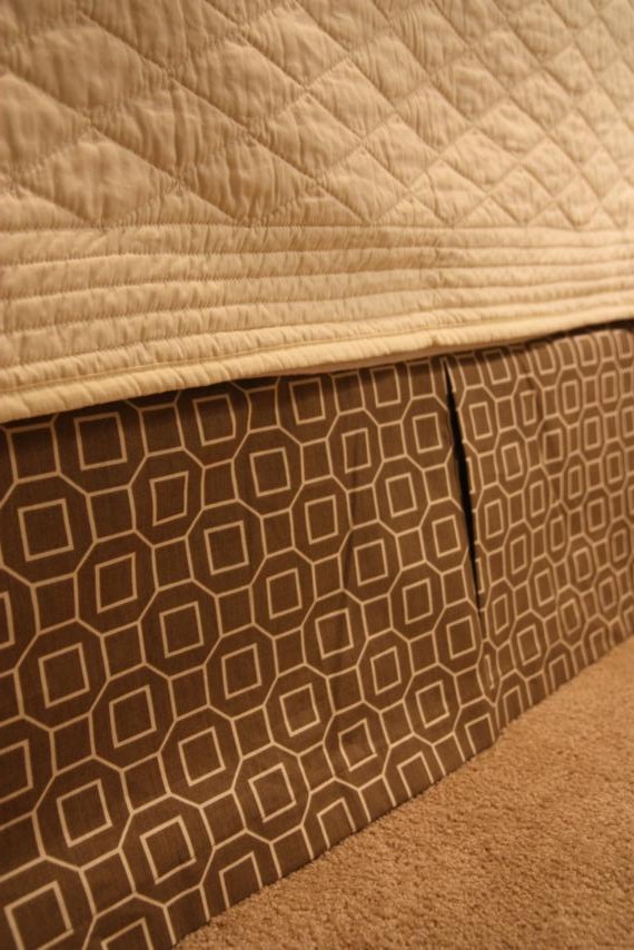
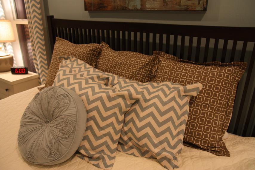
The cream quilt is Martha Stewart and is reversible. The other side is a sandy brown, just a shade lighter than the fabric on the bed skirt. Mom made all the throw pillows except for the round one in front. That one came from TJ Maxx.
Remember the neutral Rast dressers with the neutral lamps and neutral lamp shades? I'm glad that I stuck with all the neutral since they're flanked by the chevron curtains. I love the way they look.
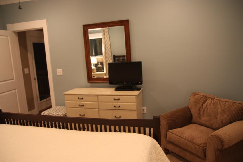
Across from the bed is the cream dresser I painted.
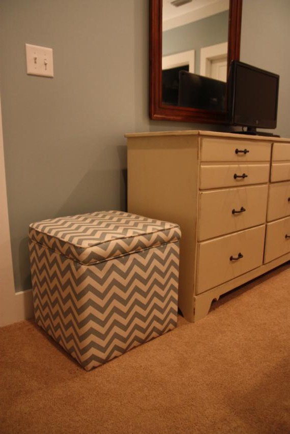
On one side of the dresser sits this cute little footstool. It was not needed at all, but the fabric store was itching to get it out of their inventory so we did them a favor and bought it. The top is a hinged lid for some hidden storage.
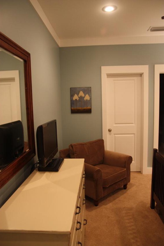
On the other side of the dresser is this chair we picked up for $100 at an estate sale. We had to have it recovered but it was still a really good deal.
The painting hanging over the chair is the one my mom did at our painting class.
The master bathroom is obviously the biggest one in the house.
The half wall ledge at the end of the sinks was still missing a piece of granite when I took these pictures.
Mom made more faux roman shades to hang over the windows in here. The fabric is a coordinating one to the chevron in the bedroom.
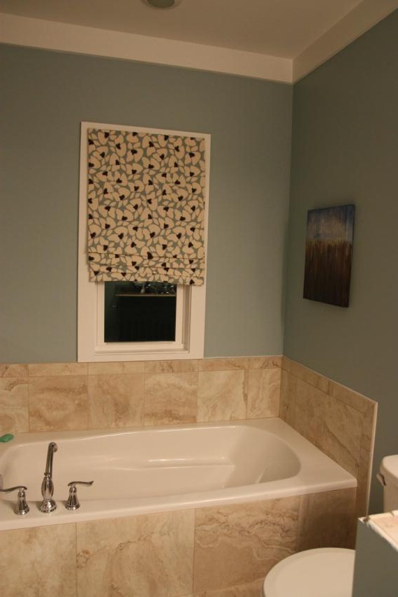
My freestyle painting from our paint night is hanging over the soaker tub.
The tile shower in this bathroom is a lot like the one downstairs, except bigger and with a bench.
Here's a final picture looking back into the master bedroom.
I guess this brings our Beach House Tour to an end. Sadness.
I'm also at a loss for what I'm supposed to do on the weekends now, with no more furniture to paint or wall art to create. I gotta say, decorating and furnishing an entire house from 450 miles away is not the easiest thing in the world to do, but I'm more than pleased with how it all turned out. Doc and I are going back in just a couple weeks and will be taking the kids (who still don't even know it exists). I can't wait to see their faces when we tell them its ours, but mostly, I can wait to just relax and enjoy it!
So what do you think about it? Too much hype for what it is? Glad its over so we don't have to talk about it anymore? Or are you ready to come for a visit? Which room would you choose if you got first dibs? Give it to me straight.


