Matching Buddies

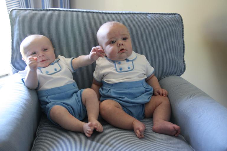
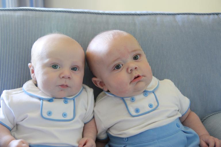
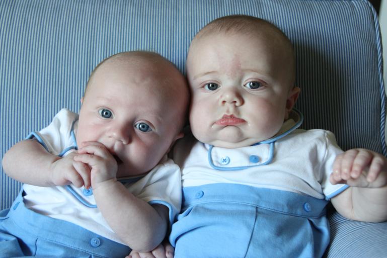
A week or so ago, Thomas and I had a visit from my friend Jenny and her little boy, Henry.  When Thomas was born, Jenny had gifted us with a cute little outfit from Janie and Jack and said that she'd gotten one for Henry too so that when the time was right, they could have their pictures made together in them.  Well, when they came for their visit, the time was right.  

Who doesn't love two matching little boys?!

matching

I realize my photography skills are majorly lacking.  I didn't have time to edit any of these either.  :(

matching

Henry is exactly two months older than Thomas so he's a few milestones ahead of him right now.  It's funny how big a difference two months is during the first couple of years but then after that we'll just say they're the same age.  

matching

Henry is pretty much sitting up on his own these days but during this particular photoshoot, he was feeling a little lean-y.  Also, see Thomas's hands?  I am pretty sure he's going to be a thumb sucker.  His hands are always in his mouth.  He doesn't always find his thumb right now but I think once he starts getting it consistently, it'll become his favorite thing ever.  

matching
matching

"Get off me, bruh."

matching

Henry's turn to let Thomas lean on him.  :)

matching

Thomas was the one who eventually put an end to my picture-taking.  Poor little fella just won't sit happily for long!

matching

New Coffee Table

Guys, I have bad news.  This is my last week of maternity leave.  I realize this is probably only bad news to me, but I'm really sad about it.  Mostly because, since we likely will not be having more children, I'm going back to work indefinitely.  No more long breaks anytime in my future.  So sad!

I have several goals this week but one is to get caught up on the blog.  Lots has happened since the last time I posted - we went on vacation! - and I really want to get it all on here before I get busy with work and the real world again.  

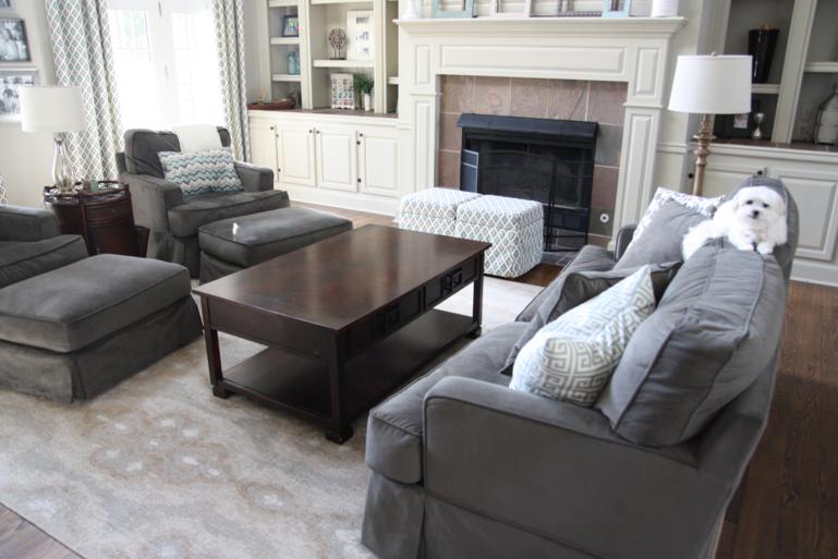
First, here's a quick little living room update we did.  I have been wanting a smaller, less bulky coffee table for our living room and, after shopping around and not finding anything that I liked, Matt built me one!

Before I show off his handy work, here are pictures of the coffee table we've had for years.  We purchased this one before we were even engaged so we definitely got our money's worth out of it.  It has served us well!

before

Our cleaning ladies like to use a LOT of furniture polish so it was always super shiny.  Also, I haven't been able to keep anything on it since there's a certain toddler that likes to push off anything sitting on it so she can climb up and have a front row seat for Frozen viewings.

before

The big coffee table combined with the ottomans from the chairs didn't leave much room on the floor for the kids to play.

before

Here's a view from the top.  Nevermind that box full of balls over in the corner.

before

Matt used Ana White's Rustic X Coffee Table plans for the new table and did a great job putting it together!  We modified the plan a little bit to make it more narrow.  Her plans call for 5 boards across the top but we only used 4.  (I wanted to use only 3 but got majorly vetoed on that.)  After he built it, I used this stuff to make it look like driftwood and also spray-painted some hardware to put on it.  

after
after

We added L-brackets to the corners and hex bolts on each of the legs to give it a little extra character.  

after
after

When I first started staining it, I was a little upset that one of the top boards was red wood while the other three were white, but now I kinda like how unique it makes it.  Can you tell that the third board from the left is more red than the others?

after

Here is a view from the top of both tables for comparison.  It's hard to tell in the pictures but we gained at least 8 inches of space since the new table is not as wide as the other one.  And, it's even a couple inches longer too, although it doesn't look like it in the picture.  

before
after

We've been using it for over a week now and so far really like it!  Hopefully, since it has a driftwood weathered look to it, it won't be noticeable as it gets bumps and dings from the kids.  Now I'm debating if we should build a matching console table to go with it or not.  Time will tell...

Phone Phavorites

Time for some more photos from my phone's camera roll!

This girl has decided she LOVES peaches!  After completely ruining a nice shirt, there is a new rule that they have to be eaten nekkid.  :)

peach
peach

I can NOT put Thomas in his crib for any amount of time without Katie Wynn begging to get in with him.  Now that she has learned how to jump, it's getting a little dangerous. 

bed
bed
bed

Wearing his swimsuit for the first time!  It is ridiculously hard to find teeny tiny swimsuits.  Most of them start at size six months.  We received this 3 months one as a gift and Thomas already kind of fits in it.

swimsuit
swimsuit

My little mama bear had to help me get him completely dressed while he was in his bed.  "Hat on! Hat on!"  Good thing we protected him from all that sun in his room.

swimsuit
swimsuit

It took way longer than it should have but I eventually got all three of us suited up, lathered up in sunscreen, and to the pool where it turns out the two of them just wanted to hang out in the buff.

swimming
nekkid

I hate that I occasionally let her watch Let It Go on my phone.  I know everything is fine in moderation but I really don't want her to be glued to tvs and i-devices.  She mostly gets to watch something when my Mom Energy is running really low for the day.  I snapped these pics because she looked so grown up to me!

frozen
frozen

Guess who's finally decided it's cool to be smiley occasionally?!?  These gummy grins totally make my day!  One big smile can almost make me forget about an hour's long screaming fit.

smiles
smiles
smiles
smiles
smiles
smiles
smiles
smiles
smiles

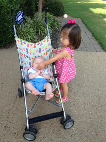
The day that I finally let Katie Wynn push Thomas in her little stroller was probably the best day of her life.  She was beside herself excited when I sat him in it.  And, like the good mama bear that she is, she made sure he got his paci back when he dropped it.  

stroller
stroller

Just chillin'...

nap nanny

I swear, this girl keeps us laughing.  After taking the picture below on the left, I asked her if her belly was big and she looked down at it and then told me "noooo-oh" as if that was the most ridiculous question ever.  On the right, she had carried my rain boots to and said "Hep me, Mama!" so that I could help her get in them.  Then she couldn't even move!

big belly
boots

First ride on the lawn mower!  I used to beg my parents to let me ride with them; I remember loving it.  She seemed to enjoy it too.  I was shocked she didn't cry when Mom started it since she's scared of loud noises.

lawn mower

I've been working on perfecting my selfie with the kids...

selfie
selfie

Since Thomas enjoys being upright so much, we got out the bumbo for him to try.  He liked being able to sit up like the rest of us!

bumbo
bumbo
bumbo

She doesn't stay still for anything!

IMG_9553.JPG
rocker
rocker
bumbo
bumbo

Sometimes when we're playing in the floor, Matt thinks he can sneak in some exercises.  He had some help with his crunches!

crunches

This past weekend we drove to visit our friends, the Kinsers.  It was our first night away from Thomas as he stayed back with my parents.  Katie bug loved getting to see Gus and spend the night with him!  They took us to a really cool neighborhood park where we could have stayed and played for hours if it hadn't been so dang hot!!  That evening, the kids played with Gus's grandparents while we got to go on a kid-free double date.  It was a great night!
old mill
old mill
old mill
old mill
old mill
old mill

Ok, the baby in my arm is crying now (I've been typing one handed...) so I better wrap up.  More soon!

Frame Upgrade

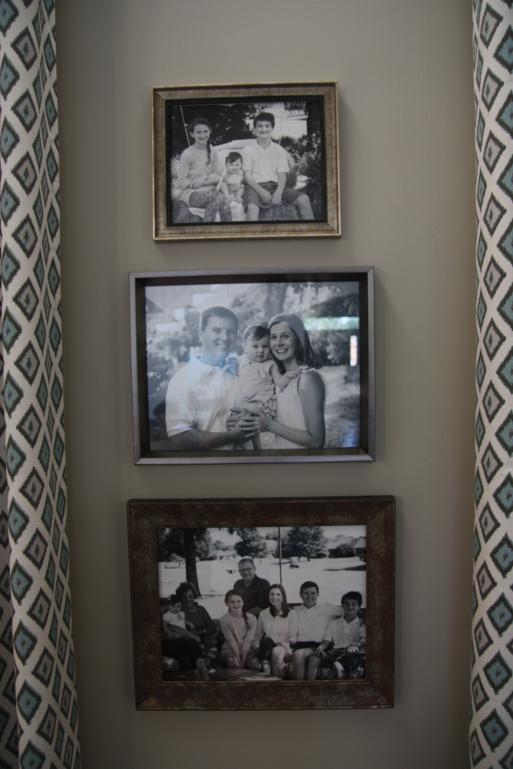
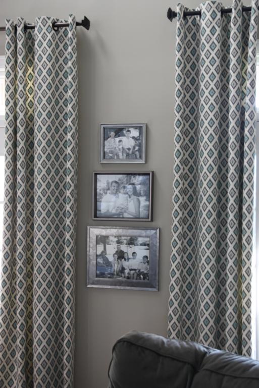
So, we've had this set of three frames hanging in our living room for some time now.  It started out with just the middle one, but I thought it looked a little small and lonely by itself so I added one above it and one below it and filled them all with black and white photos.  

frames

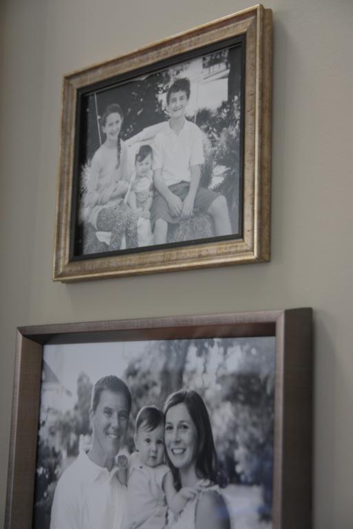
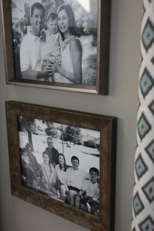
While I loved the addition of the two new frames and they way they helped fill up the space, there was something about them that drove me nuts any time I was sitting in the room and had a view of them.  I thought the top and bottom frames were silver when I added them, but compared to the middle frame that was already there, they looked very gold and horrible with the black and white photos.

frames

Here's a closer view of the top and bottom frames compared to the middle one.

frames
frames

Since the color of the frames drove me crazy, I figured I could solve that problem by just taking them down and making them more silver.  And it was a really good excuse to try two products that I've been wanting to test out.

For the top smaller frame, I bought a tube of silver Rub N Buff that I've seen a lot of other bloggers use.  The goal was to make the frame more silver so I bought the color Silver Leaf.

rub n buff

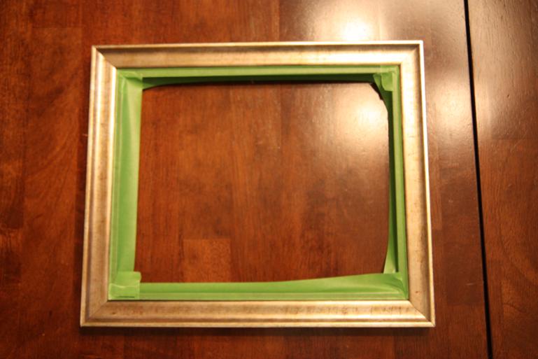
The application was really simple.  I took the photo and glass out of the frame and taped off the inner black edge.  

frame before

To apply the silver leaf Rub N Buff, I just squirted a small amount onto a paper towel and rubbed it on.  It covered it a lot like painting it would have, but it dried very quickly and had the smoothest finish ever!  Below, the original frame is pictured on the left, and the Rubbed and Buffed frame is on the right.

original
rub n buffed
rub n buff

After removing the tape, I was left with a shiny silver frame!

silver frame

Turns out, though, that it was a little too shiny.  I probably should've bought more of a pewter color in the Rub N Buff.  But, I knew I could tone it down a little with some dark glaze.  

IMG_9351.JPG
glazed

When I applied the glaze, some of the Rub N Buff smeared over onto my black edge.  Guess I should've taped it off again!  No big deal, I'm ok with the way the frame looks without it.

frame

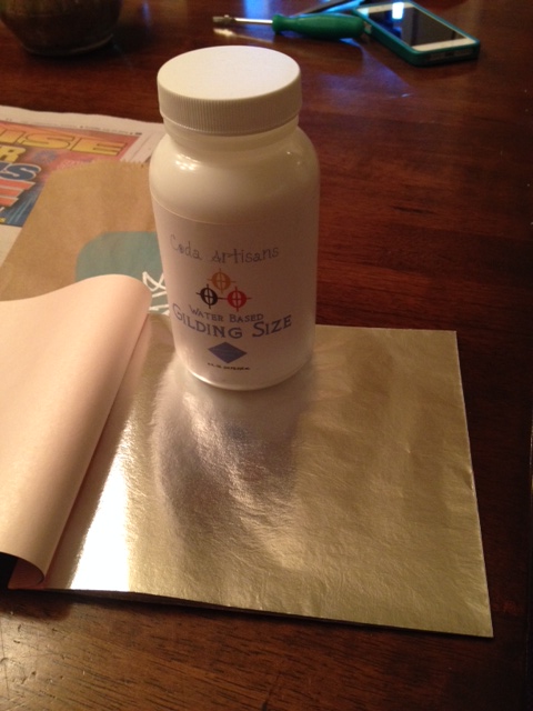
So with that frame more silver, but not too shiny, I could call it done and move on to the bigger one.  For it, I wanted to try out using actual silver leafing.  My supplies included a jar of gilding size and sheets of silver leafing.

frame
supplies

This process was a lot more involved than using the Rub N Buff.  First I had to brush on some of the gilding size (the sticky stuff to make the sheet of leafing adhere to the frame) and then I placed a piece of the super thin leafing on top of it.  

sizing
leaf

Then I used a dry brush to tap all over the leaf until it was good and stuck down.  As I did this, small pieces would flake off.  

leafing
leafing

The end result looked like this - kind of a distressed silver.  

leafing
leafed frame

Just like with the smaller frame, I was afraid this would be too shiny silver so I rubbed on some dark glaze while I still had it out.  Then I could call that one done and get these bad boys back up on the wall!

new frames
new frames

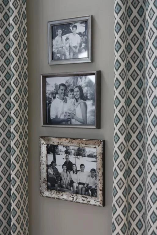
While I was pleased with how the upgrades on the two frames turned out, I still didn't like the grouping on the wall.  The top frame that got the Rub N Buff application looked much better with the original middle frame, but the bottom one that got the silver leafing looked out of place to me.  The other two were solid colors, making the distressed look of the bottom one look off.  

Luckily, I happened to see this frame on sale for 40% off at Michael's and thought it would work well with the other two.  So down came the bottom one and up went a new purchased one.  Don't worry, I'll find a new home for the leafed frame!

new frames
new frames

It didn't turn out to be the super quick and easy upgrade that I thought it would be since the silver leafing took more effort and then I still ended up buying a new frame, but I'm really glad that I can now sit on the couch without being annoyed at how the look together!  It's the little things, right?

Splish Splash

I'm here to tell you about some wall art that I recently did.  And by "recently did," what I really mean is recently finished.  I started the project when Thomas was two weeks old.  He is now 12 weeks old and I just finished.  So you might say it drug on for a while.

When Thomas was two weeks old, this wall art was gonna look a LOT different than the way it actually ended up looking.  Remember the watercolor quote art I did for Bren's room?  

To date, it's still one of my very favorite pieces that I've done so, naturally, when I was brainstorming something to make for the little kids' bathroom, this came to mind.  I decided to copy the technique and do something for our own house.

watercolor art

While Matt's parents were in town visiting and helping with Thomas, I decided to get started on the project.  I gathered my supplies - two wooden canvases that I'd already had my Dad make for me and a handful of colorful craft paints.  I chose brighter colors than the ones I used for Bren's quote art because I didn't want it to be too girly in the bathroom that Thomas would be using too.

blank canvas
paints

Using the same technique as with Bren's, I started dabbing on the different colors with LOTS of water so that they would run and bleed together.  And...it looked terrible.

watercolor
watercolor

The brighter colors just didn't blend as well or look as pretty as Bren's softer colors did.  In a lot of places, the colors turned a gross orange-brown shade as they blended together.  Not really the look I was going for.  So I dumped them in the garage until I could come up with Plan B.

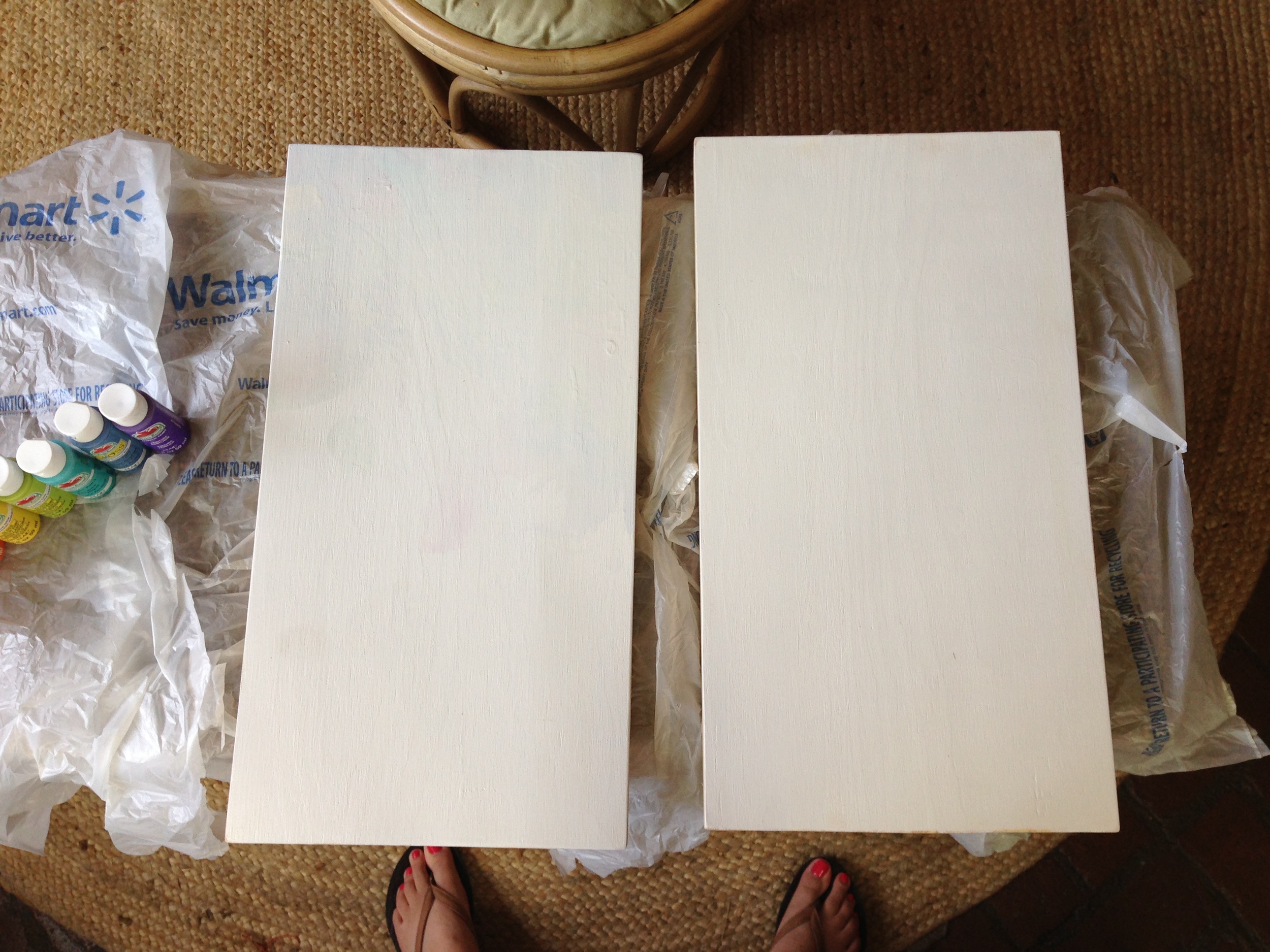
About, oh, a month or so later, I was ready to try again.  I had painted over the watercolor mess, giving me two blank canvases again.  This time, I added red to my paint lineup.  The pink is still pictured but I didn't end up using it.  It seemed like it would make it too girly instead of keeping it gender neutral.

blank canvases
paint

For Plan B, I decided to pick up some new paint brushes.

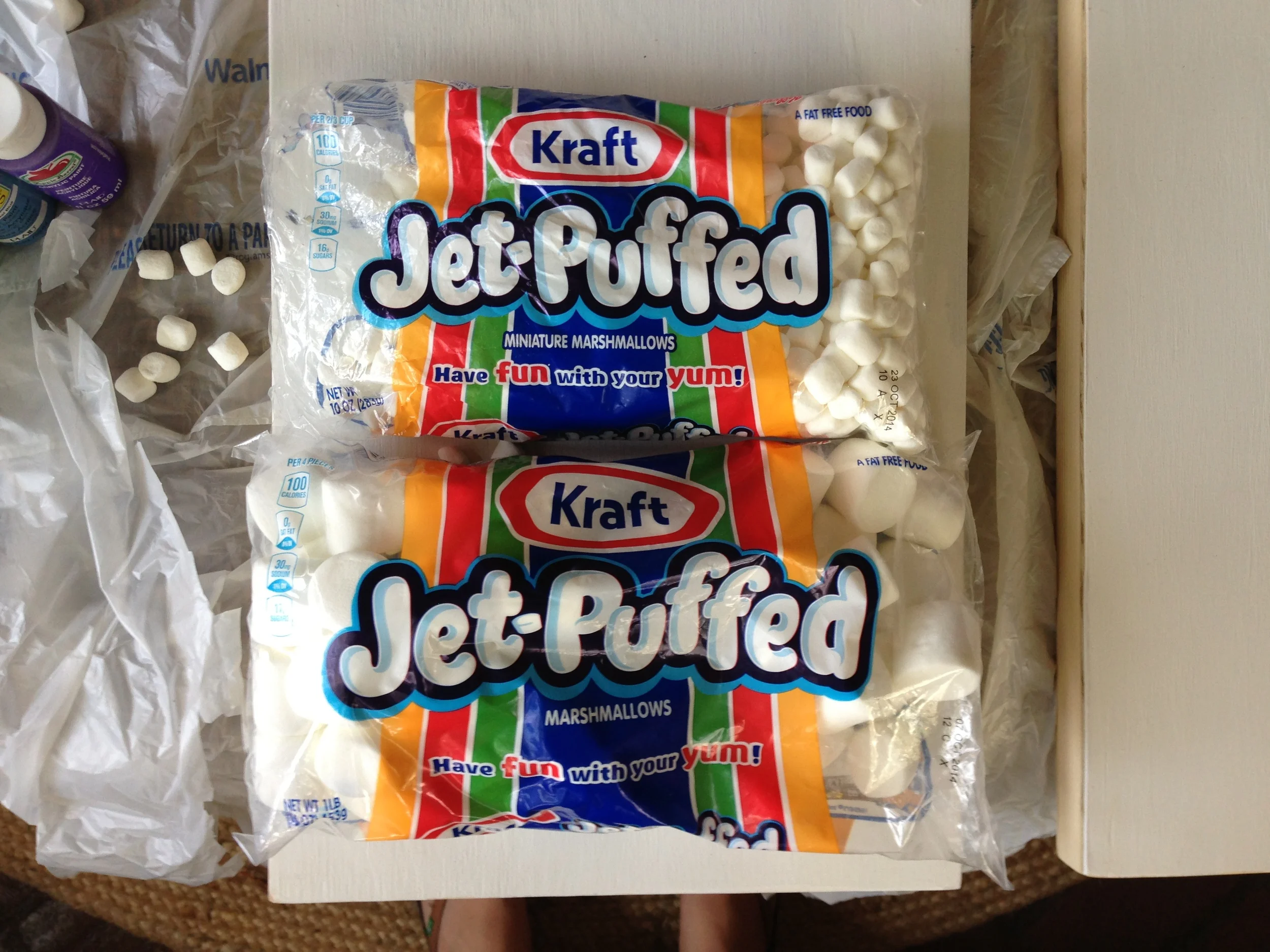
mallows

Sweet, right?  

I'll go ahead and admit that painting with marshmallows did not turn out the way I had pictured it in my head, but that doesn't mean it didn't work.  In fact, I really like the way it ended up working out!

I roped Mom into helping me so that it wouldn't take forever.  We were all set up on her back porch while Mr. T was snoozing.  To begin, we squirted out a little of each paint color, and grabbed a big marshmallow for each color.

paint pallets

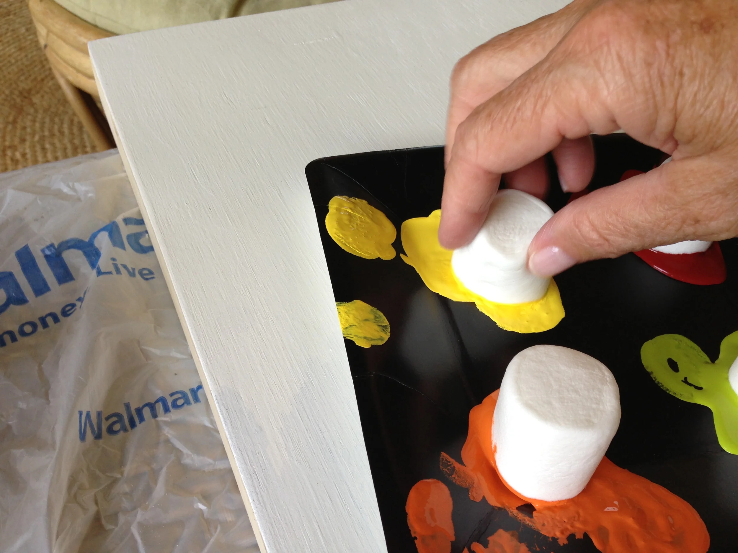
We dipped the 'mallow in the paint...

dipping

And then dabbed it onto the canvas.

painting

For the most part, the marshmallows left a more solid and filled in circle than using a sponge would have.

two rows
full of big dots

We kept our marshmallow dots in rows and tried to be as random as possible about our color orders - something much easier said than done for the two of us!  If the dots started getting too spongey looking, we just ditched the marshmallows and grabbed new ones.  We may have eaten a few along the way too.  :)

When we painted the second canvas, we followed the exact same order of colors so we didn't have to think about it as much.  The second one was completed much faster than the first one!

I actually contemplated stopping the project right there.  Who doesn't love a bunch of colorful dots?  My niece and nephews all thought they were cool.  But, I couldn't just waste that bag of smaller marshmallows, you know?

With the bigger circles dry, we used the smaller 'mallows to fill in the white spots between the dots.  At first I thought we had made a big mistake by doing this, but by the time we were finished, I was ok with how it looked.  And I knew if I was going to move onto the next step, I needed as little white background showing as possible.

Pictured at right, the white space has been filled with smaller dots on the top canvas.  The bottom canvas was next!

smaller dots

With my canvases full of color, I could repeat the same steps I used to complete Bren's watercolor quote art.  Just like with hers, I used my silhouette machine to cut some letters out of adhesive vinyl.  Getting the letters evenly spaced and stuck down straight is always the hardest part for me!  I used a piece of painters tape to give me a straight line to work with.

vinyl

After what felt like an eternity of sticking and resticking, I finally had all the letters of "Splish Splash" good and stuck.  :)

splish splash

This project could've easily been finished here.  Colorful background with white letters would totally work.  But I was going for the opposite of that.

With a drop cloth down in the yard, I went to town with some glossy white spray paint.  It was so sunny outside that these nearly blinded me as I worked on them.  I couldn't see at all when I went back into the dark (by comparison) house!

spray paint

After about a bajillion coats of white paint (had to cover up all those brightly covered dots!), I could peel the Splish Splash letters off and call 'em done!  You know, only two months after I'd started them...

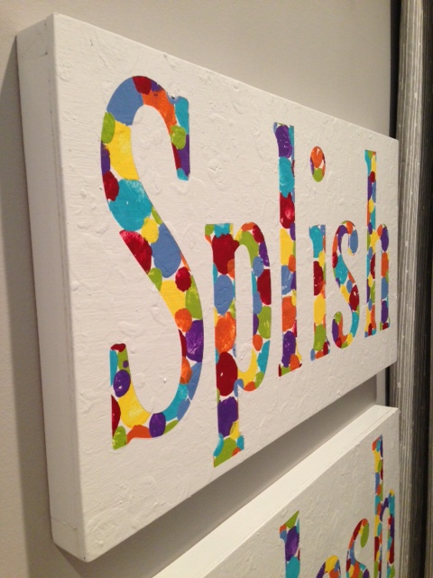
Here they are hanging up in the kids' bathroom (which I've totally redone, by the way.  Pics soon).  You can see that the marshmallow dots added some texture to the white background, but I'm totally cool with that.  Don't mind how it looks at all!  And, I like that I finally have something gender neutral and bathroom appropriate to hang on the wall!

splish splash
splish splash

I'll have more pictures when I reveal the whole bathroom.  Need to find a new mirror first and then it'll all be done!  In the mean time, go paint something with some marshmallows!