Lamps

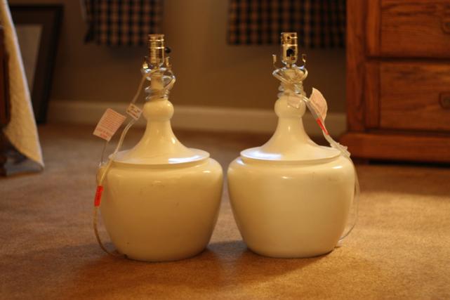
We're still hard at work trying to finish up some projects before we move into the beach house this month.  There are so many in different stages so I'm going to have to break them into different posts.  Today is all about the lamps.  Well, only 3 of them. If you've been reading for a while, you may remember this post when we scored some really good deals on a lot of lamps.  In that group of lamps were these two that needed a mini makeover.

We loved their shape but they were pretty scuffed up and didn't have lampshades.  No problem to us, those are easy fixes.

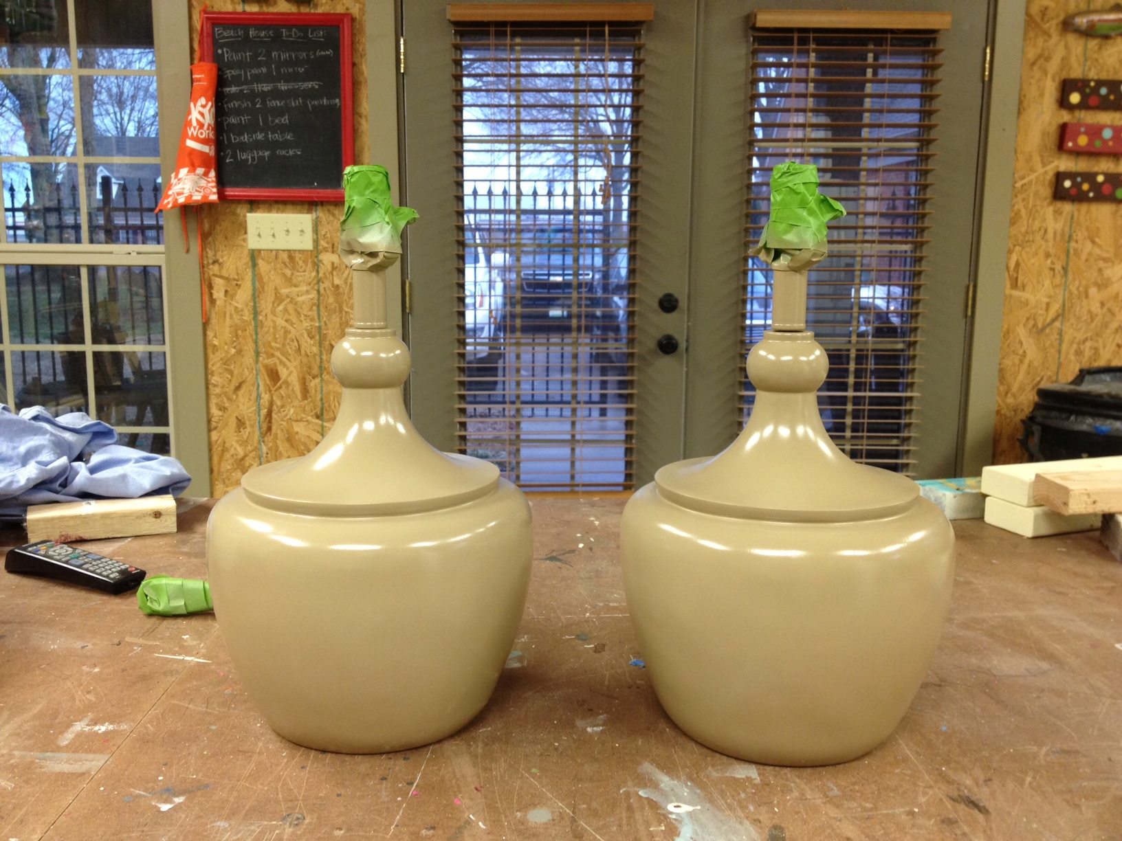
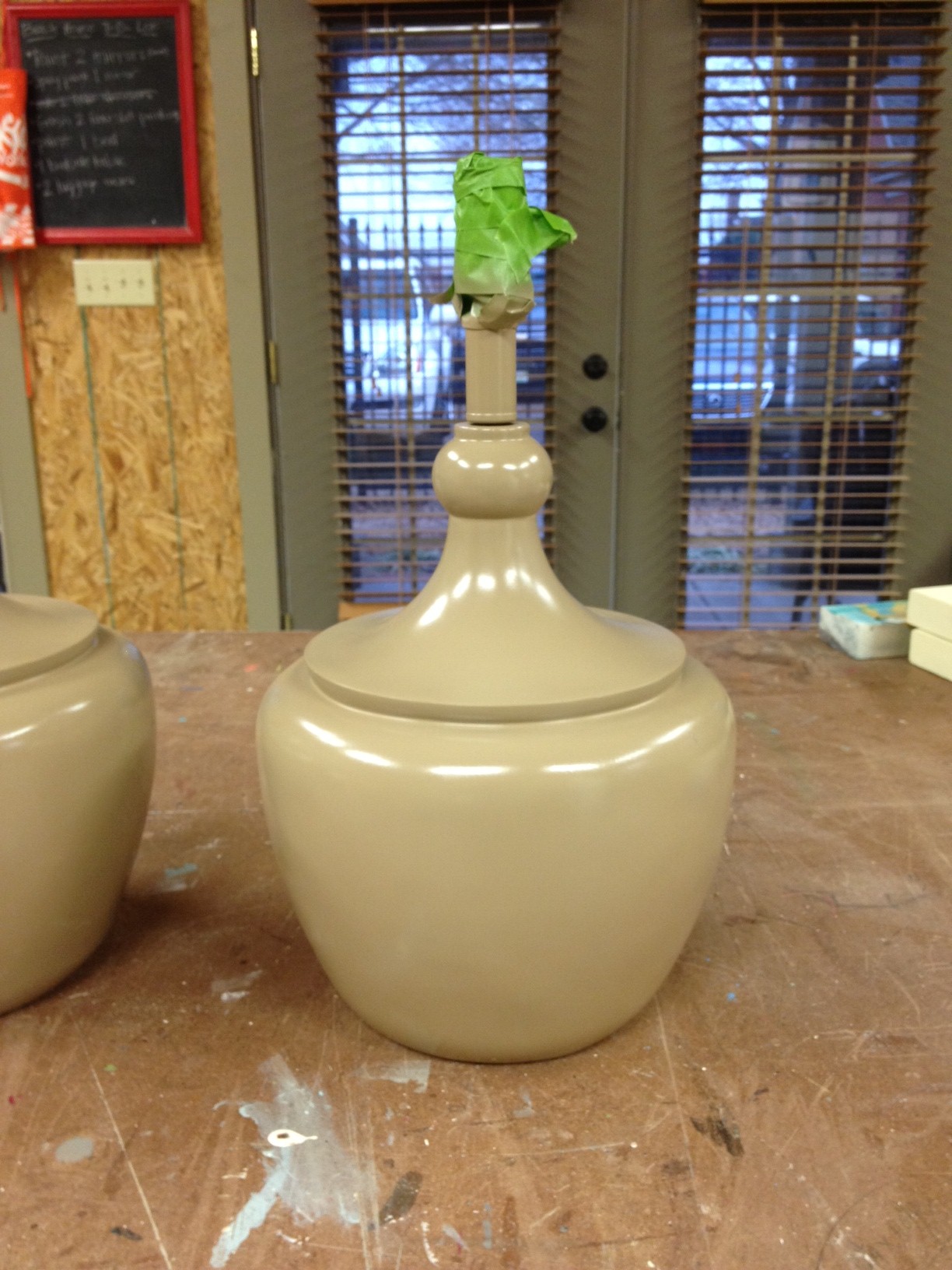
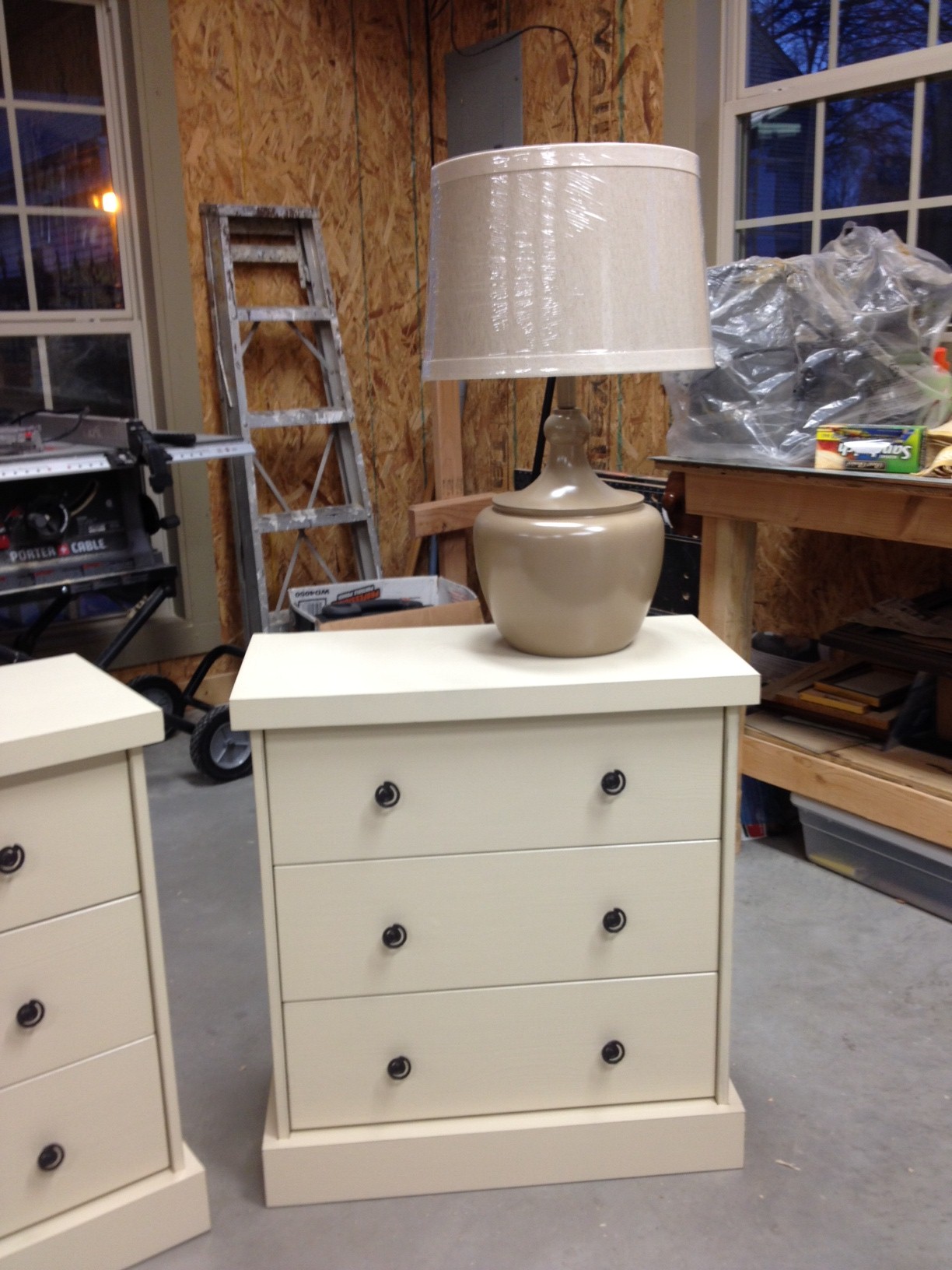
A couple coats of khaki spray paint later, and they were looking like this.

The paint adhered really well and had a smooth, even coverage.

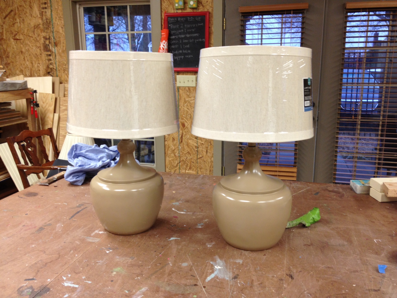
At Target, I picked up a pair of linen drum shades.  We popped them on top of the freshly painted lamps.

These two lamps are for the master bedroom and will sit on top of the Ikea Rast bedside tables we made over.

That's a whole lotta neutral going on, but we've got some pattern planned for the bed and curtains, so hopefully it'll look ok in the room.

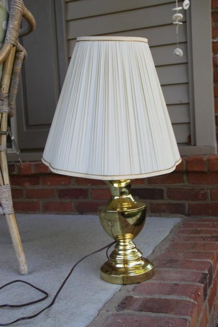
Moving on to the third lamp, this is one I found in my mom's attic.

Now that is GOLD, and not in a good way at all.

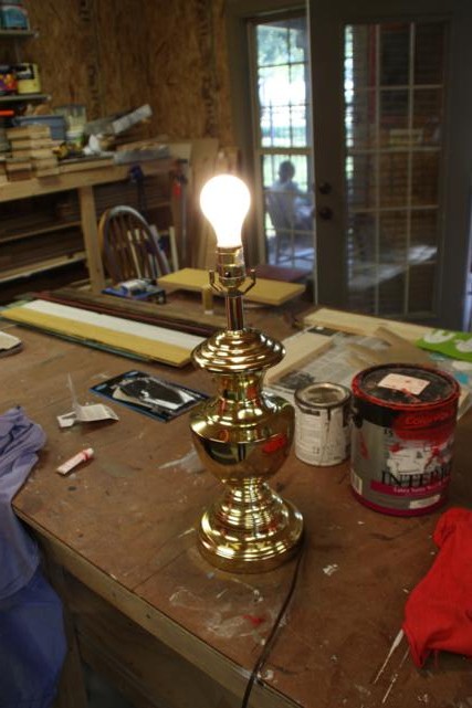
Before spending any time on this, we had to find a bulb and make sure it still worked.  It did!  Game on.

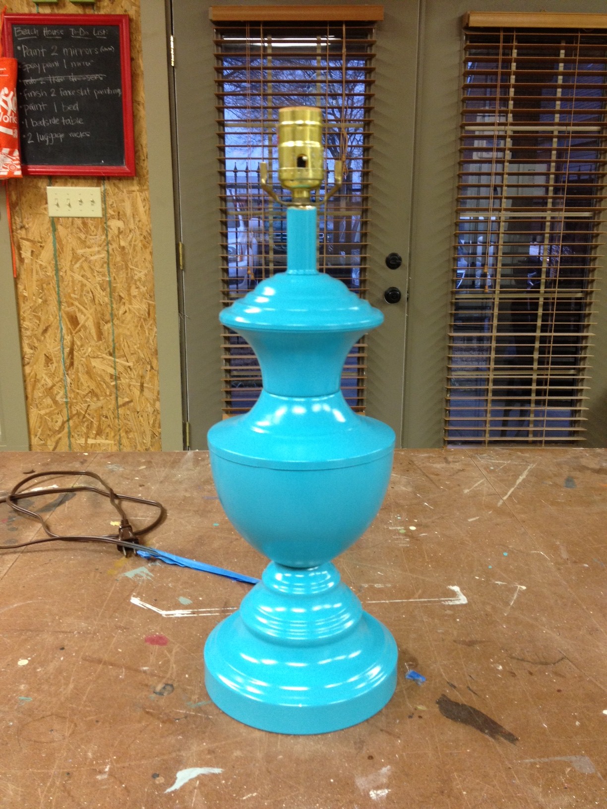
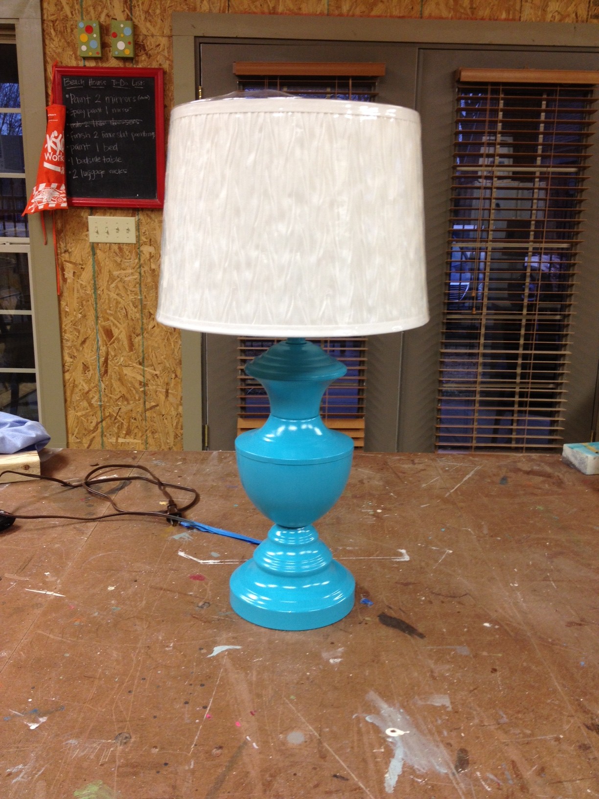
Once again, we grabbed a can of spray paint.  This time it was turquoise.  A couple coats of paint and bam, Goldilocks was gone.

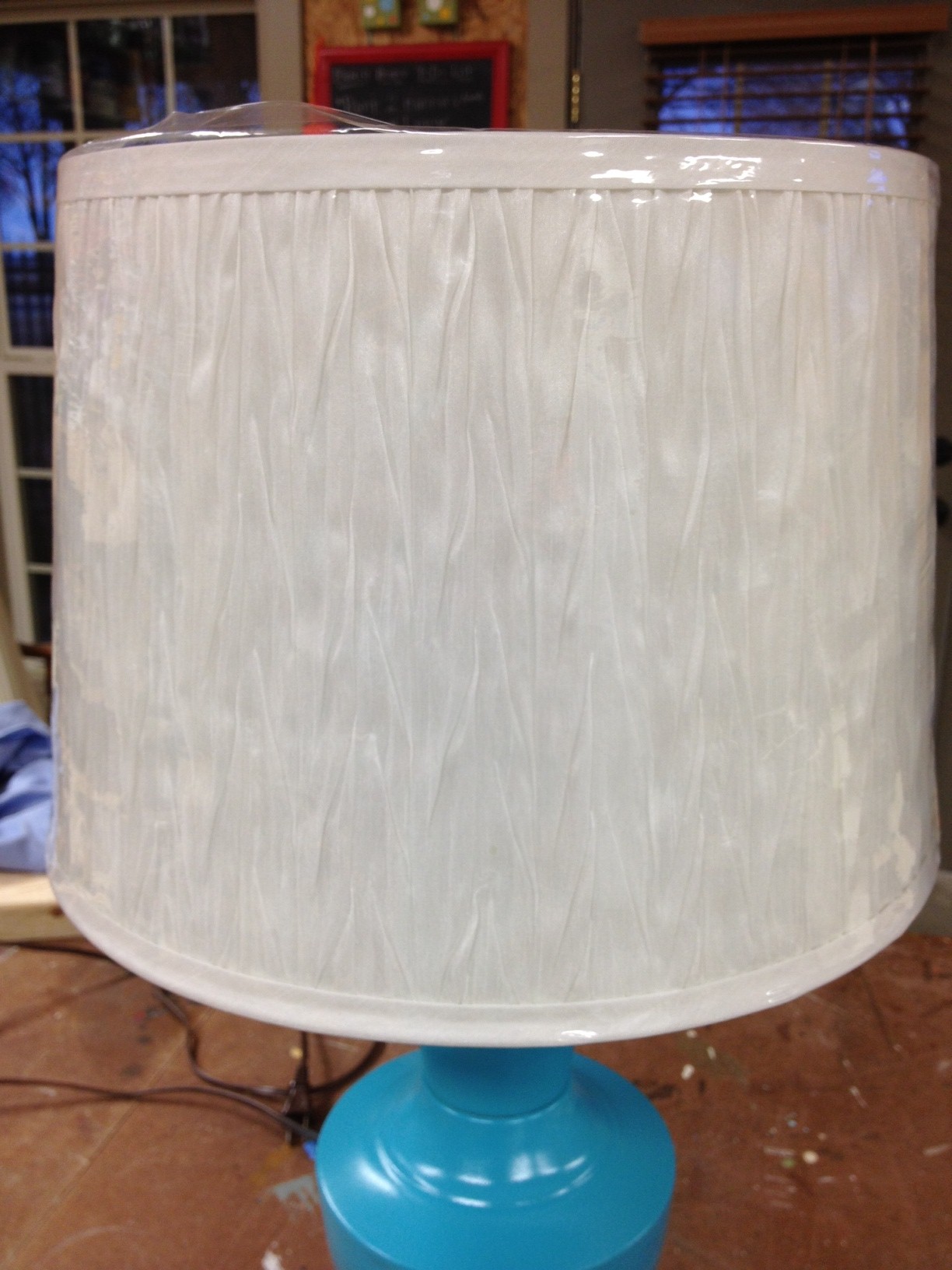
Clearly, there was no way that shade from the 80s was going back on.  This new shade also came from Target and has a little bit of texture on it.

Here's the full after shot.  Much better, right?

Now we'll be able to see the light at the beach house.  Ba-dum-chh.  More projects to come!

Help, Help Me Rhonda

Rhonda - I need your help!  Wait...is there even a Rhonda that reads this blog?  Probably not.  Maybe I should start over. Readers - I need your help!  I have a small sitch I can't decide on and I desperately need your opinions.  It's very important.  Crucial.  A make or break it decision.

I don't know what color the mirror in the beach house dining room should be.

See?  I told you this was important.

Lemme break it down for you.  Back in June when my alma mater was closing its doors, I spent a weekend with a few friends cleaning out our sorority house.  A lot of stuff got thrown away, others got categorized for a yard sale.  And since we were doing the hard work, that meant that we got first dibs on everything.  That's fair, right?  So I swiped a nice big mirror from the living room.  I knew it'd come in handy eventually.

The mirrror was originally bright, gaudy gold but at some point, someone (probably a sorority sister of mine) spray painted it black.  The black was definitely an improvement to the house's decor, but it was kinda a shoddy paint job.  Whoever painted it didn't do a good job giving it an even coat of spray paint, and their tape job must not have been very good because there is still lots of gold peaking out around the edges.  I took the mirror anyway because I  knew I could give it my own paint job and it would look just fine.

My dad taped off the mirror this weekend (I've gotten pretty bad at handing out orders in the shop lately - I can't do it all myself!) and so it's all set and ready to be painted.  Going into it, I assumed I'd just give it another coat of black.  But then I thought, since I'm re-painting the whole thing anyway (as opposed to just doing touch-ups), I'm not limited to stick with black.  That just opens this project up to a whole new world of possibilities.

Before you start throwing out color options, let's look at everything else that will be near the mirror.  We decided on the dining room in the beach house.  Here's how it looked the last time I saw it.

The walls are Tony Taupe by Sherwin Williams.  When we picked the color, we were looking for something in the greige family (grey + beige = greige).  Admittedly, this looks more straight up khaki than I thought it would.  There's not much grey in it at all.  In the picture above, it's the wall on the far left (just past the stairs) where the mirror will hang.  That wall also has the horizontal paneling. 

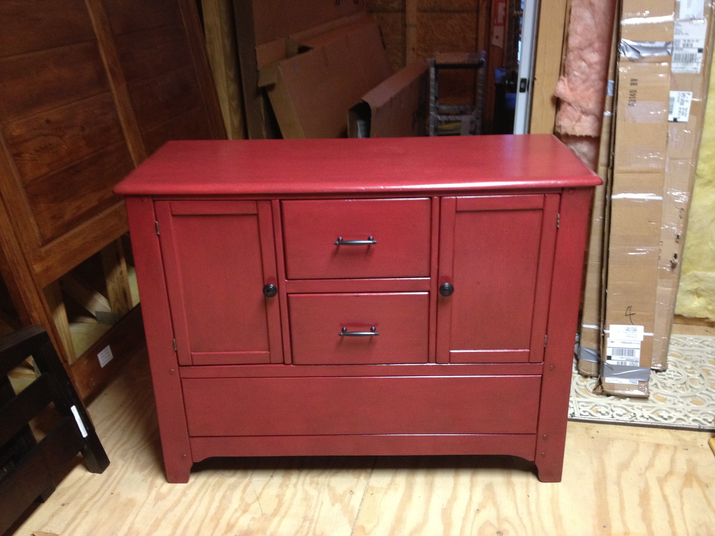
The mirror will hang over this red buffet that I refinished.

The mirror is rectangle in shape, and the long side is slightly longer than the buffet is wide.  That means we'll probably hang it vertically, so it will be taller than it is wide (portrait orientation, if you will).  Oh, and the mirror is not super fancy and overly ornate, but its not just plain straight lines either.  It has just a bit of detail on it, but not enough to make it look out of place in our casual beach house.  (I forgot to take a pic of the mirror.)

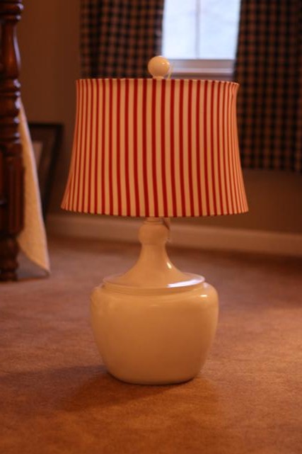
There's a good chance we'll put this lamp (from this old post) on the buffet.

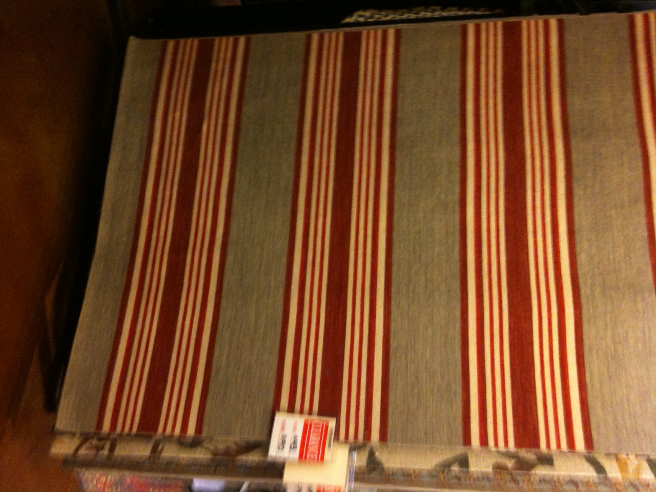
On the hardwood floors will be this rug.  It's red with both grey and cream stripes.  It's no longer online so this is just a picture I took with my phone when we bought it.  (Side note - see that clearance tag?  Yea, that's how we roll.)


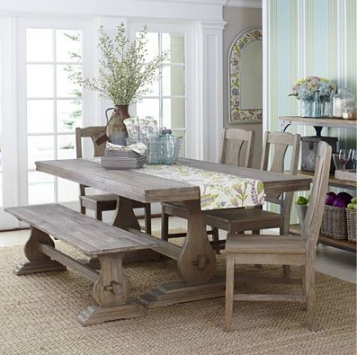
And on that rug will be this table from World Market, except ours will have benches on both sides and the chairs at just the two ends of the table.  It's a pretty neutral color in person, kind of a natural wood color.

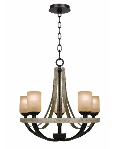
I really wanted a long light fixture (something like this, or this) that would mimic the length of the table, but alas, those light fixtures do not come in our budget.  So instead, we'll have this light fixture from Home Depot hanging above the table. 

I really hope it ends up looking ok.  I didn't get to see it in person because they didn't have it in the store, just online.  Fingers crossed it works with the room!

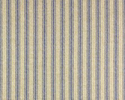
The window treatments will be made out of a linen-y pillow ticking fabric.  The background is almost the exact same shade as the walls and the stripes are a light black.  It looks similar to this, except black instead of blue.  The curtains will be plain drapes and will  hopefully blend in with the wall more than standing out.

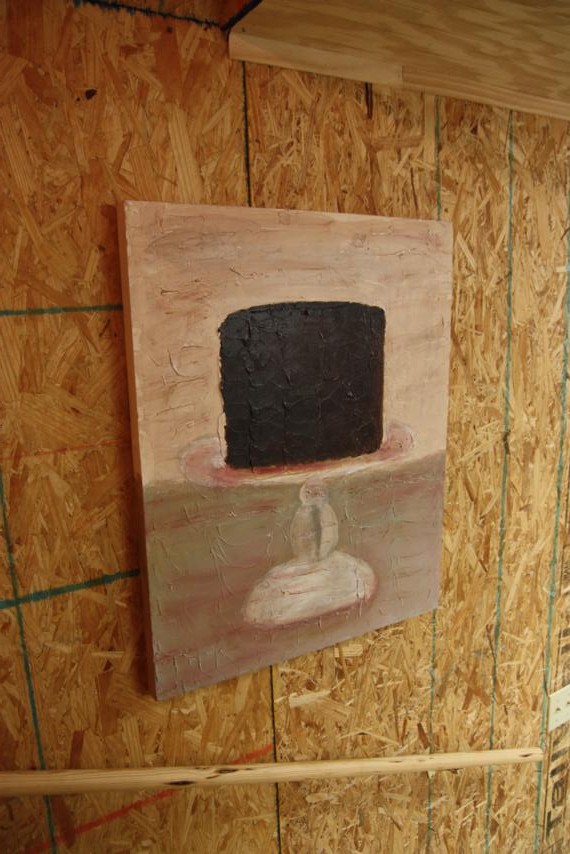
The only other thing that I know for sure will be in this room is the chocolate cake painting that Beth did.


So that's the room.  Not much black in it (really there's none since the stripe in the fabric is kinda muted) which is why I'm second guessing painting the mirror that color.  But what color do I go with?  I could do red like the buffet, but I think that will be too much.  White will stand out and possibly clash with the cream in the rug, chandelier, and painting.  Right now I'm kinda leaning towards trying out a grey color, but will that look weird on the wall color?  I could rub on some black glaze to accent the details in the mirror frame.  Any other suggestions?  I'll probably try to get this done over the upcoming weekend, so speak up now!

Rast Redo

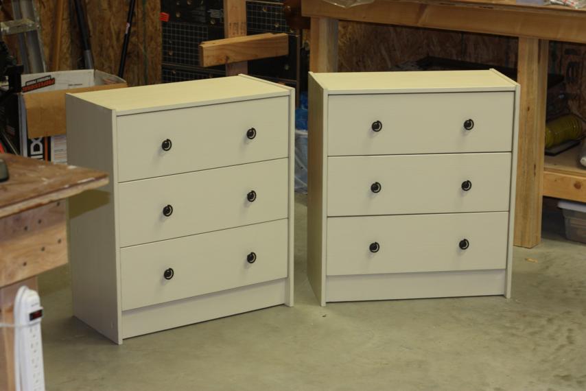
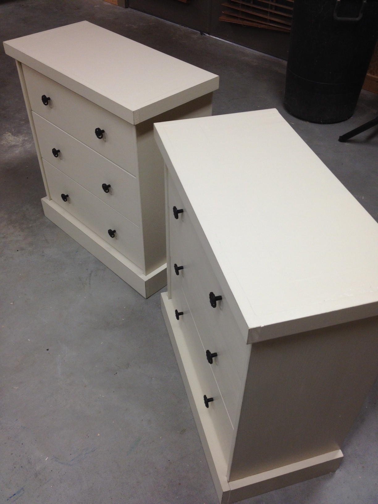
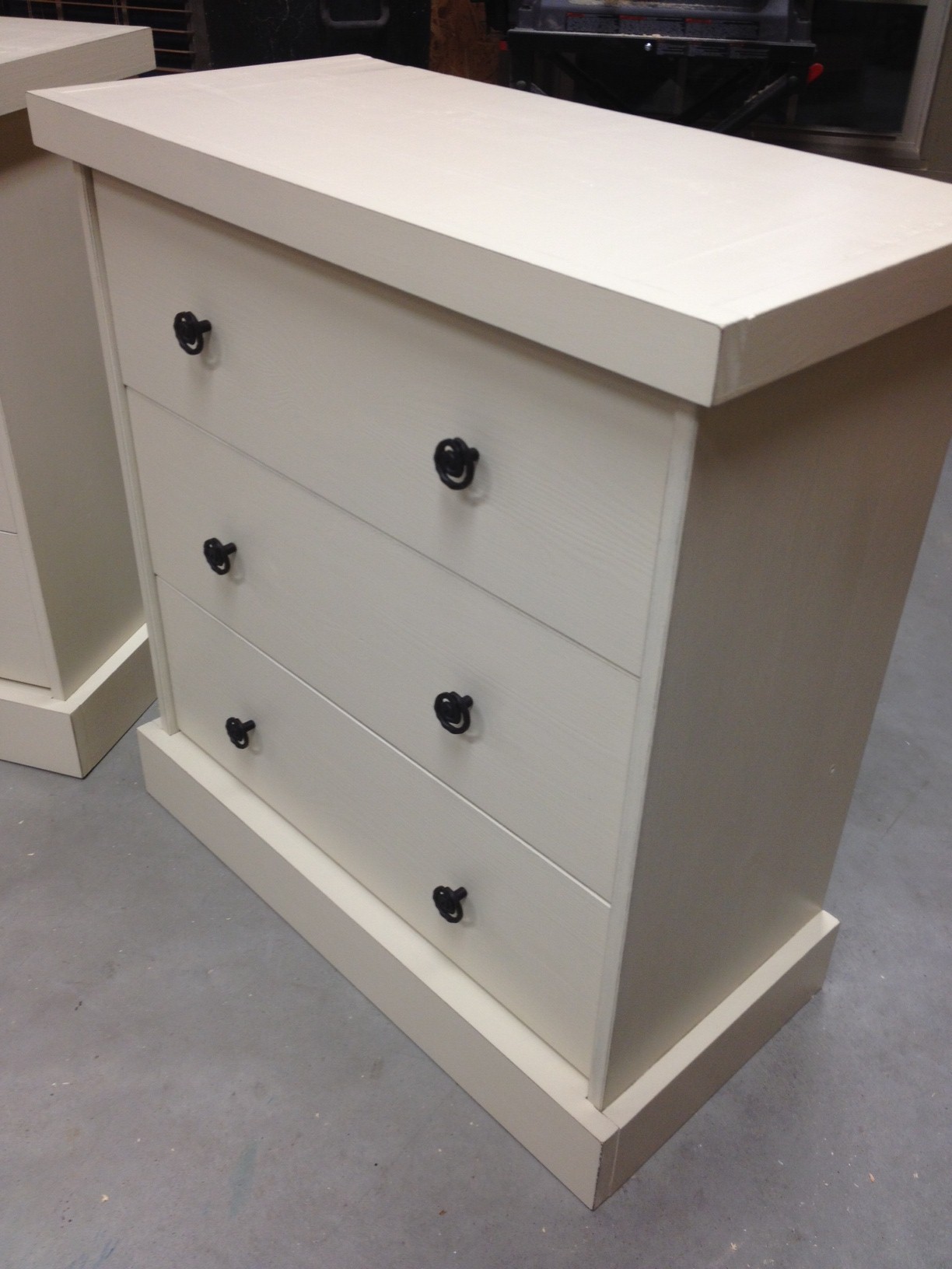
I promise I'll stop talking about Ikea Rast hacks soon.  Or at least I'll take a little break.  But first, I've got to update you on this redo. Remember the first two Rast dressers that I tackled?  The two that were yawn-in-my-face boring?  They looked like this.

I was pleased with them at the time.  Plain was what I was going for and it's definitely what I got, so I thought they were ok.

The next Rast dresser I stenciled and I liked it a lot more than the plain, neutral ones.  It's way more fun to look at, that's for sure.  But plain was still the name of the game for the first two, so they stayed as is.

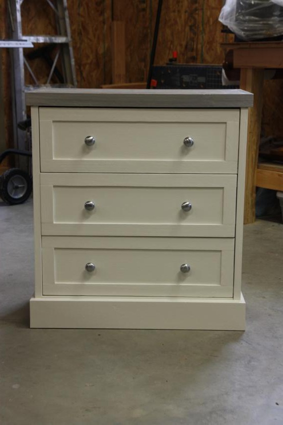
And then I made this one and ooooh wee, it became my newest favorite.  I love how the added trim pieces beefed it up a little and made it look  more like a susbtantial piece of furniture.

Oh how I suddenly wished that I had done this to the first two!  Some ideas started rolling around in my head...could I go back and beef up the first two?  Oh yes, yes I could.

One thing I knew for sure before I started tacking on trim: I did NOT want to repaint.  And I didn't want to mess up the paint job I'd already done, especially since it was already sealed with polyurethane.  So I had to get creative.  I wouldn't be able add the smaller trim to each drawer, but I could at least beef up the top and bottom.

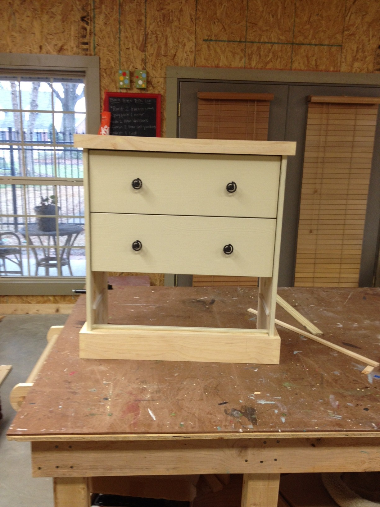
With my dad's help, we got to work building the top and bottom pieces.  I figured it would be easier if we could build these to fit, but then take them off so I could paint them before actually attaching them.  That seemed like the easiest way to get them painted without ruining the original paint job on the base piece.

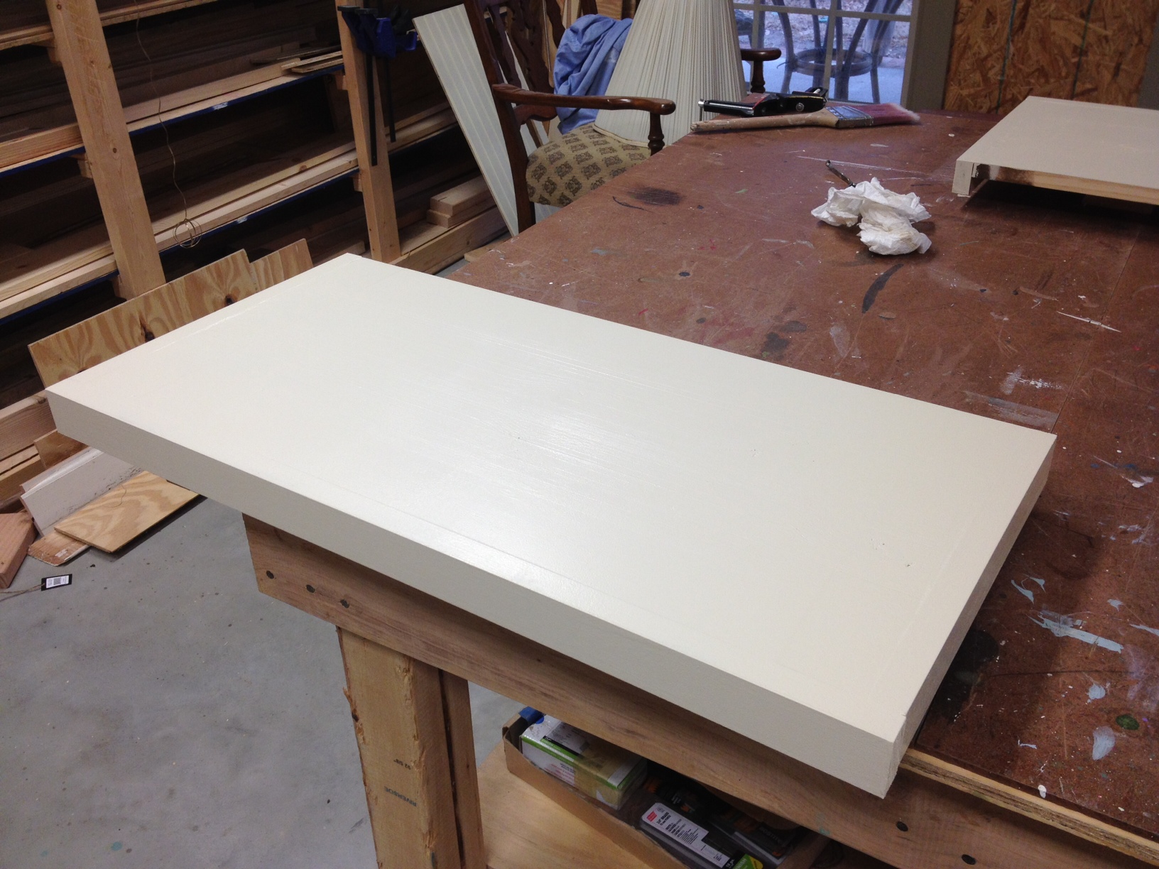
 The top was pretty much just a lid that slid right off. 

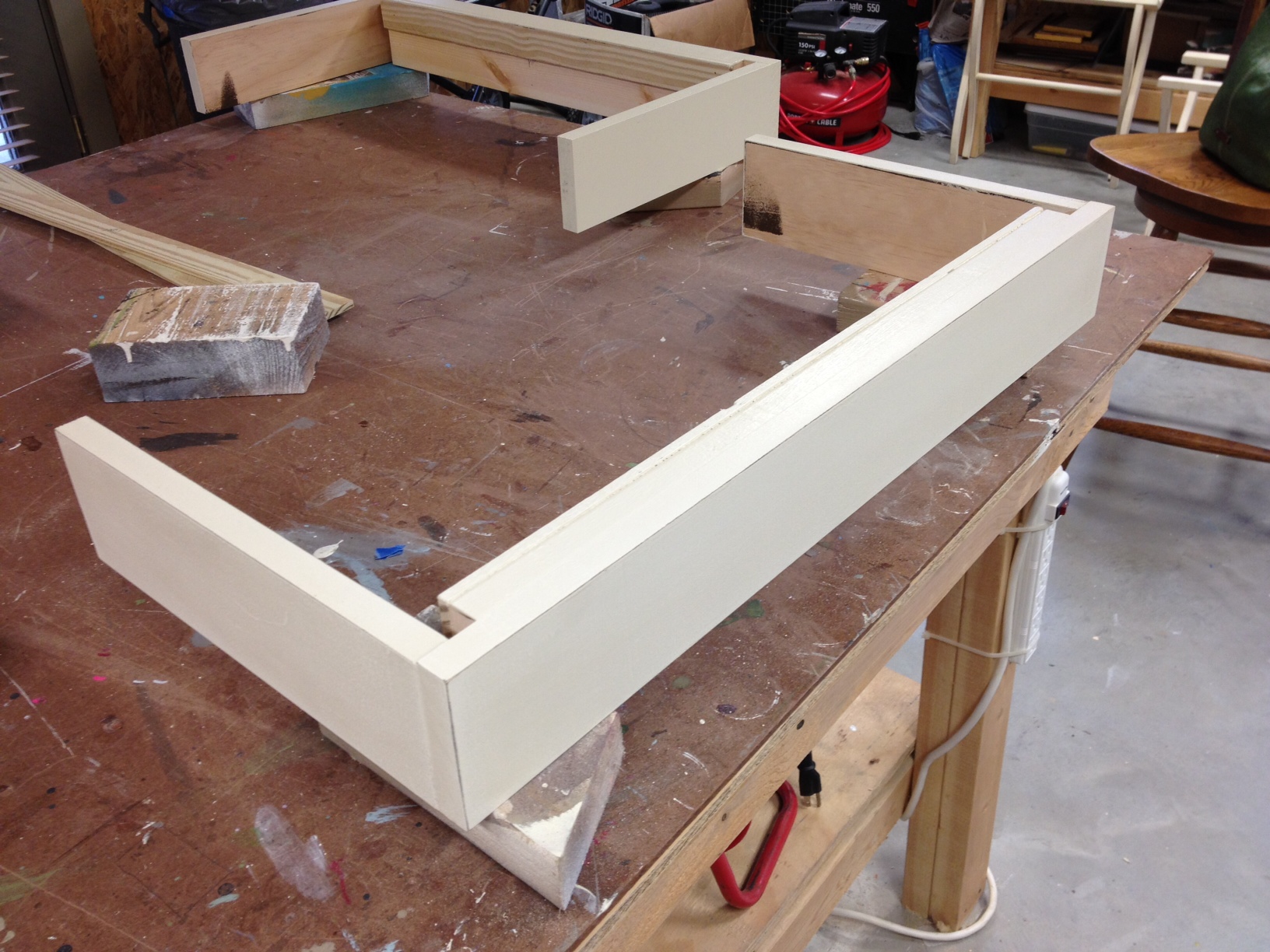
And the bottom piece was kinda like a....retainer?  Mouthpiece?  That's the only thing that's coming to me.  Basically, it slid right on the front and fit over the front of the two sides.

I gave them the same paint treatment: chocolate brown as a base followed by two coats of the cream.  I gently sanded the edges to distress them just a little.

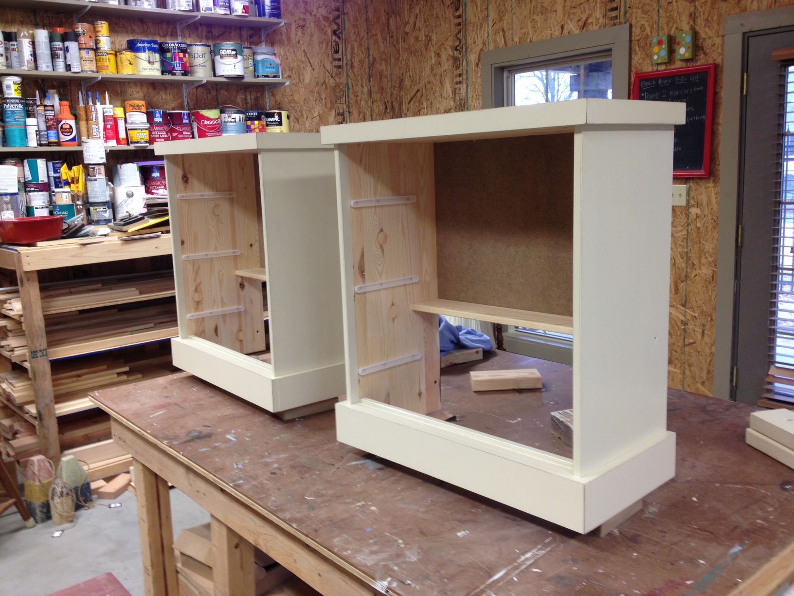
My dad figured out a way we could screw them to the base piece of furniture from the inside so we wouldn't have any visible nail holes on the outside.  I love it when he comes through with a good idea like that. :)  In the picture below, he's got the base flipped upside down and is attaching the top from the inside.

I did wait to add the poly until the new pieces were affixed to the base.  In my mind, this helped "seal" them to the base.  Probably not really in reality, but it sounded good in my head.

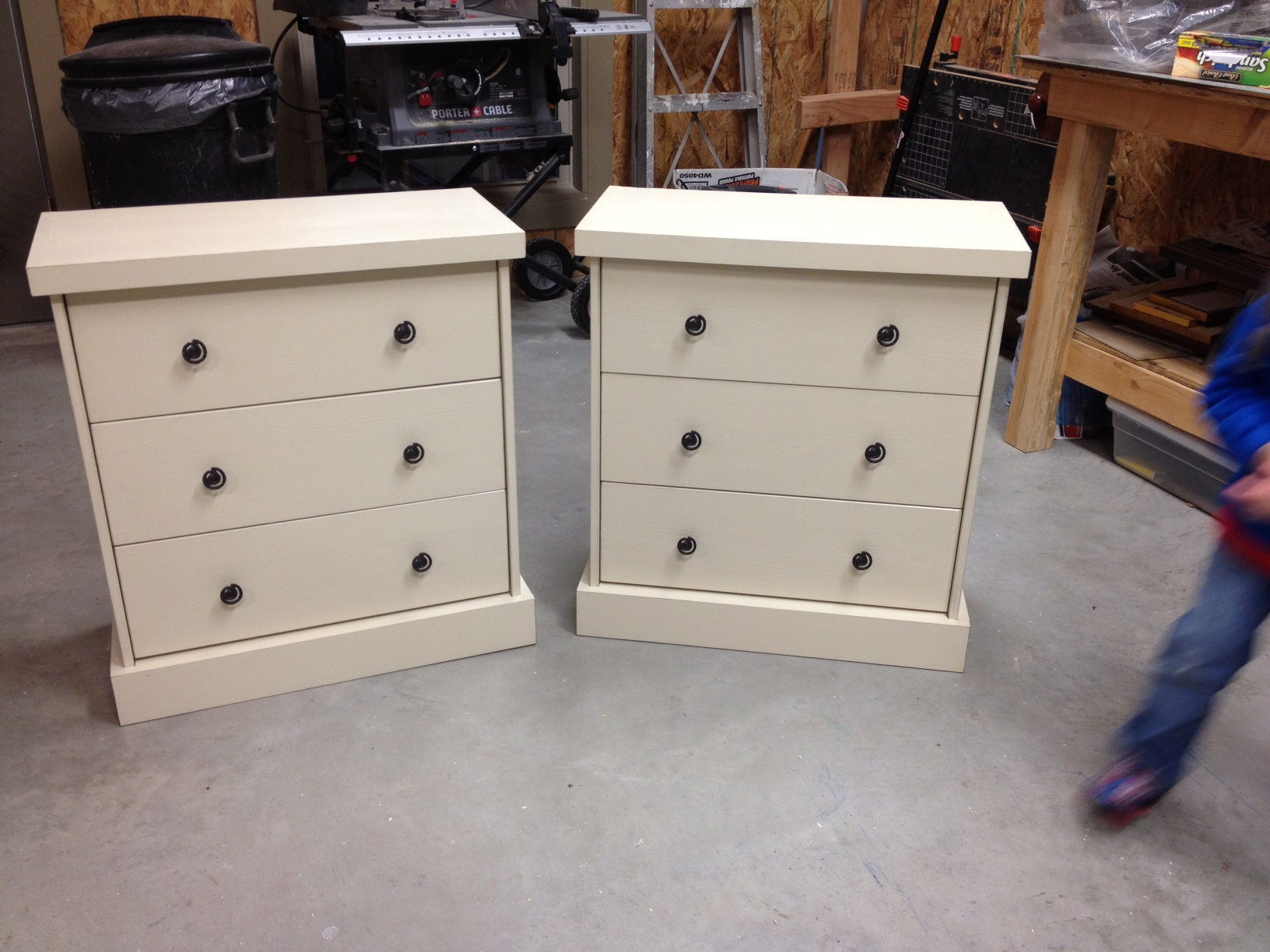
Then it was just a matter of sliding the drawers back in!  They still aren't quite as cute as the original one with the trim, but it's definitely an improvement from before.

Did I mention that we're still short one bedside table?  Yea, we have one room that still doesn't have anything and the clock is ticking.  We've been hunting for something reasonably priced that we could refinish, but haven't had much luck.  It might be time to think about building something from scratch...I probably should stop wasting time redoing things that are already done!

Beach House Update

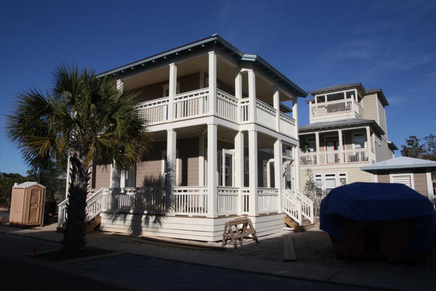
It was so nice to get to see the house in person!  The last time Doc and I were there, it was mostly just a big box of wood, so it definitely looked a lot different.

It's to the point, now, where the construction crew is locking up the house before they leave.  Since we arrived a few minutes before our builder, we couldn't get in right away.  Wasn't a big deal, though, because there was plenty outside to check out!  For one, this was the first time we'd seen our bike shed.

So what if it is just a big outside closet and we don't even have bikes to go in it yet?  I like it anyway.  Next to the bike shed is this little fenced-in area.  I'm not sure if its for garbage cans or pool equipment.  I suppose we can also use it as a "jail" for little kids that don't behave themselves.

We were pretty pumped to see the pool.  It was kinda weird looking at it from up on the ground...without water, it looked like a really deep hole!  We had to "take a dip" to see how deep it really was.

As teeny tiny as the pool is, it still has a shallow end and a deep end.  It goes from about mid-chest deep down to about eye level.  And these little steps are over in the corner of the shallow end.

These steps are on the side of the house near the pool area.  They lead into the screened in section of our porch.

Our builder arrived and we were finally able to go inside.  Just inside the front doors is the stairwell.  It will be hardwood.

To the right of the stairs is the dining room.  Not much to see in there.  That door leads out to the screened in porch that I mentioned earlier.  The paint color for the downstairs, should anyone be interested, is Tony Taupe by Sherwin Williams.

To the left of the stairs are the living room and kitchen.  I think I've already shown this shot before...the afternoon sunshine wasn't helping my pictures.  The back of the bar has been framed out in preparation for the corrugated metal that will go on.

Here's a shot from a never before seen angle in the living room.  This wall is the side of the stairwell and has both a game niche and a half bath.  The game niche will have shelves and will obviously be where we store board games, puzzles, and such.

I'm not sure that I've shown a shot of the kitchen from this viewpoint.  Straight ahead in the photo is where the stove and oven will go.  The microwave will hang over it and an ice maker will be next to it on the right.  On the side set of cabinets will be the sink, dishwasher, and fridge.

The countertops will be black granite, like this sample piece below.

Here's the downtairs bedroom.  This is where the yellow dresser, green chair, and this painting will go.

Though not the master, this bedroom does have its own private bath.  No bathtub, but it does have a two-person shower.  The picture below shows the tile we chose.

At the top of the stairs is the laundry room.

The laundry room will have full-sized stackable washer and dryer on one side, and on the other is this shelving.

Through the laundry room is also the owner's closet.  This is where we'll be able to lock up anything we don't want renters to have access to.  Our rental agent suggested we have an outlet in there so we can plug in a mini fridge.  That way we can keep condiments cool and don't have to re-buy them every time we go.  Genius.  We've already sent the request to the builder.

On one side of the upstairs are the jack-and-jill bedrooms.  They have both been painted a shade of grey (Essential Grey by Sherwin Williams).  One room will have the stenciled Rast dresser, the white chair and either the polka dot or beach scene painting from this post.

The other jack-and-jill room will have this dresser, a bench we already had, and the other painting.

The bathroom between the two rooms is also painted grey and has white cabinets.

The shower is white subway tile and will have a curtain made out of the same fabric from the white chair.

The master doesn't look much different from my last update.  It's painted Rain by Sherwin Williams.

The tile in the master bath is the same as the downstairs bath, but this bathroom has a separate tub and shower.

The door to the balcony is in the upstairs hallway.  Here's the balcony on the front part of the house.

The balcony wraps around the side of the house.  The side section of it is over the screened in porch below and is a little bit wider.

From there, you can look down and see the pool.

As I was walking around the house snapping pictures, I looked out one of the bedroom windows and spotted this on one of the neighbors' porches.

That's a hanging bed that swings like a porch swing (I'm assuming it usually has a cushion and/or pillows on it).  I may have added this to our list of things left to do...would there be anything better than a late afternoon nap on an outdoor swinging bed?

I apologize if my posts get a little beach-house heavy over the next couple of weeks.  It won't be much longer before we move in and I still have projects to finish up and share.  The exciting part is that the move-in date has been set!  Movers have been hired!  Vacation days are on the calendar!  Ready or not, we're moving in to this house soon!

Before and After: 2 Chairs

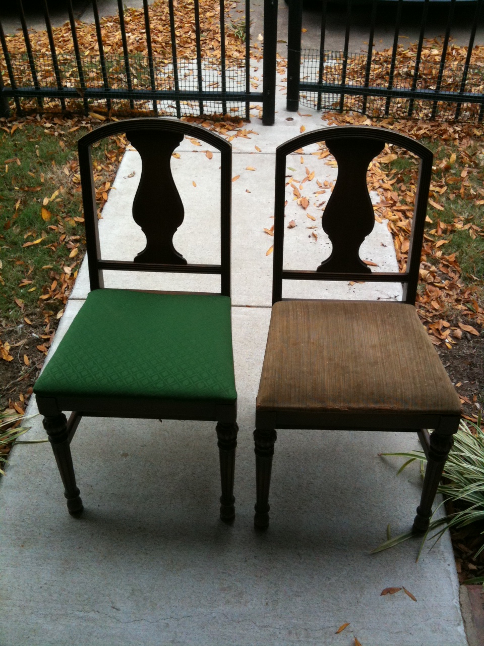
A good while back - I can't even remember when, maybe last summer? - my mom and I stopped by a second-hand furniture sale on the side of the road and scooped up these two chairs.

Pretty grody in that condition, but they had decent lines so we knew we could spruce them up.  I don't remember how much we paid for them - maybe $20-ish?  I do remember we talked the seller down from the original price, but not quite as low as we wanted.  As our typical fashion, we didn't even have a plan for them, but we bought 'em anyway!

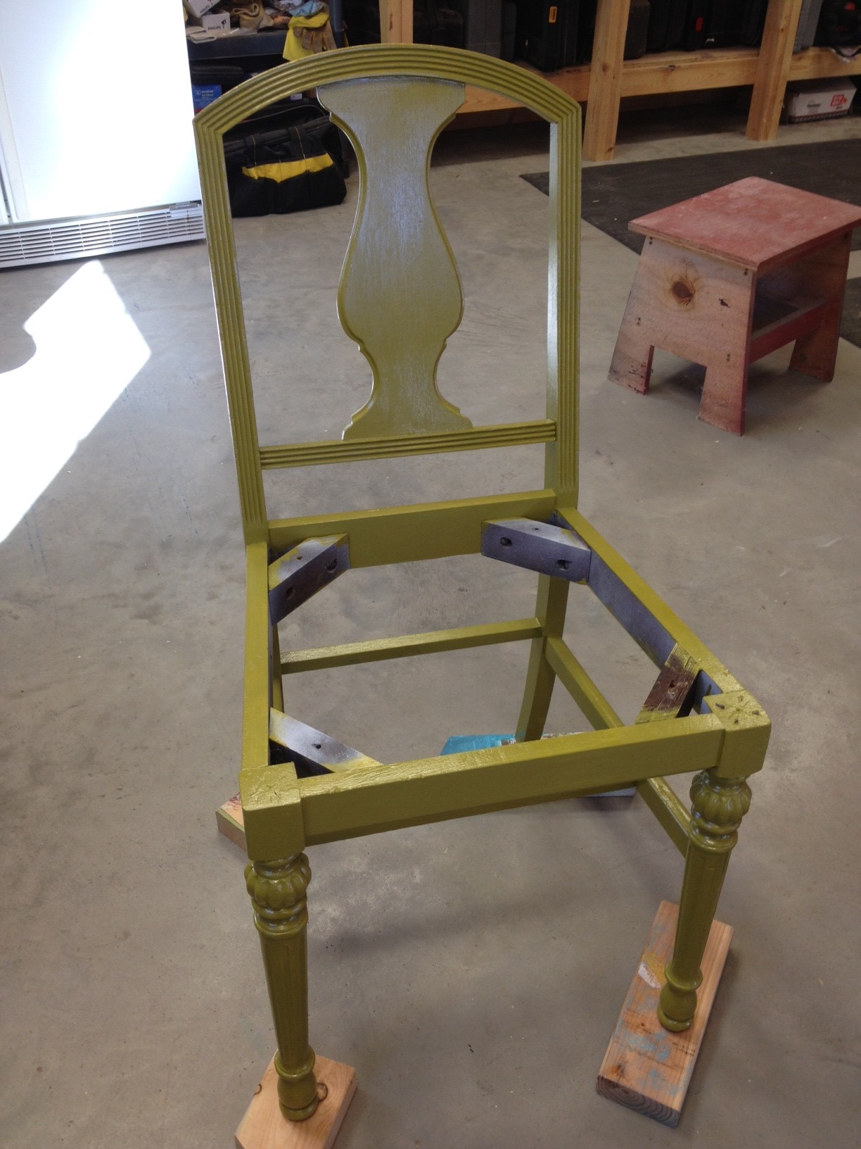
Fast forward lottsa months and I finally got around to refinishing them.  It wasn't hard at all.  I found some spray primer in the shop, so I skipped the sanding step completely (such a rebel!) and misted them with the primer.  Then it was just a matter of slapping on paint and recovering the seats.

Oh, and obviously since I was working on them, we'd figured out their purpose.  As with every other project these days, they'd head to the beach house.  Every bedroom needs a chair for you to throw your clothes in, right?

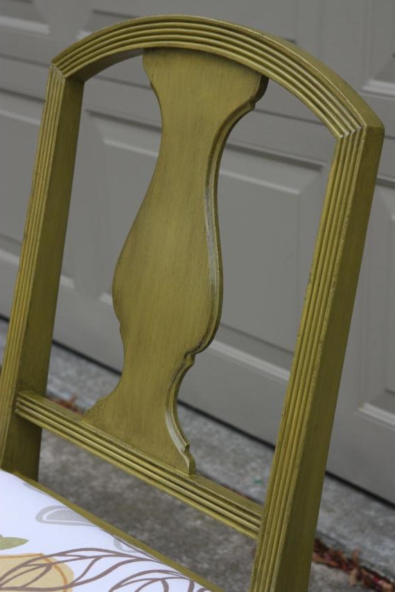
The first one got painted green and ooooh-wee! was it a rough shade of green.  Kinda like green pea baby food or something.  This picture really doesn't show off it's nastiness.

Can I just interrupt real fast and say that I hate, hate, hate painting chairs by hand?  All those legs and spindles and slats are torture.  This would've been an ideal candidate for some spray paint, if only I'd had some in green and the weather had been nicer.  The green pea color didn't make me enjoy painting it any more, either.

I almost completely ditched the project and said to heck with it, but I decided to give it one last effort and rub some glaze on it, hoping it would tone down the green peas.  Luckily, it did.  The picture below shows off the glaze the best.

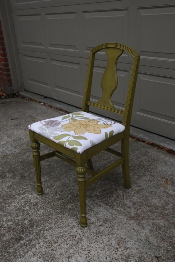
This chair, we decided, will go in the downstairs bedroom with the yellow dresser and this painting.  I used the fabric we picked for the curtains to recover the seat.  No fancy reupholstery tricks here - we just popped the seat off, added a layer of batting, wrapped it up like a present in the fabric, and staple-gunned it down.  Here's the finished product.


(Yes, I used the garage door as the backdrop to my photoshoot.  I was looking for a background that wouldn't be too distracting.  Our neighbors, I'm sure, think I'm totally weird.)

Here's a close-up of the fabric.

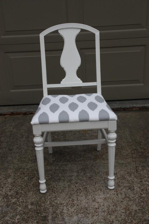
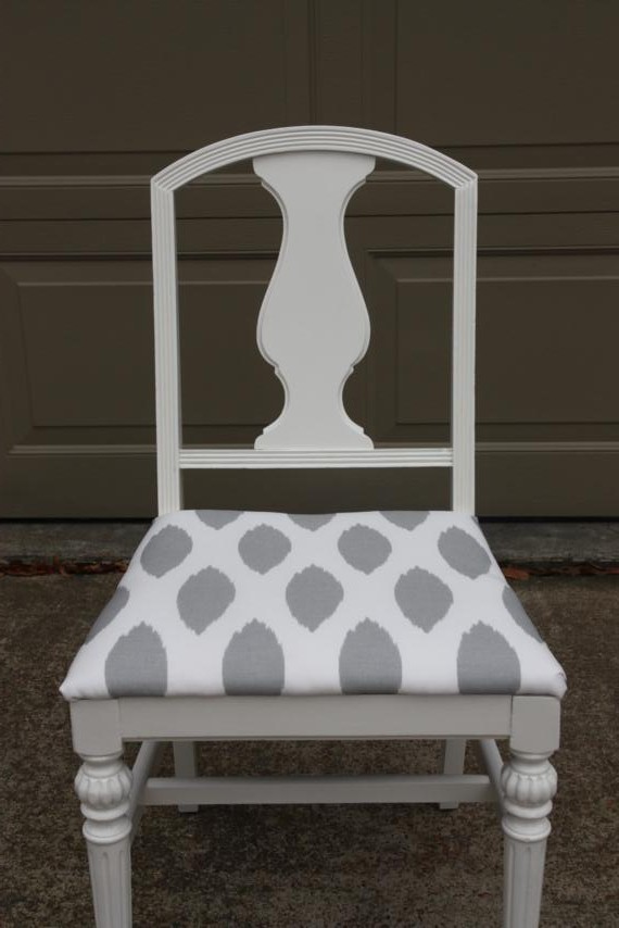
The other chair was done pretty much the same way, except minus the coat of glaze.  It got coated in glossy white paint and will go in one of the jack-and-jill bedrooms.  The fabric on the seat is the same fabric from the shower curtain my mom made for that bathroom.


A close-up of the fabric on this one.

Just for fun, let's go back to the before shot...

Yea, pretty sure I like them better now.


Which do you like better, the white or the green?