Ikea Rast Hack #3

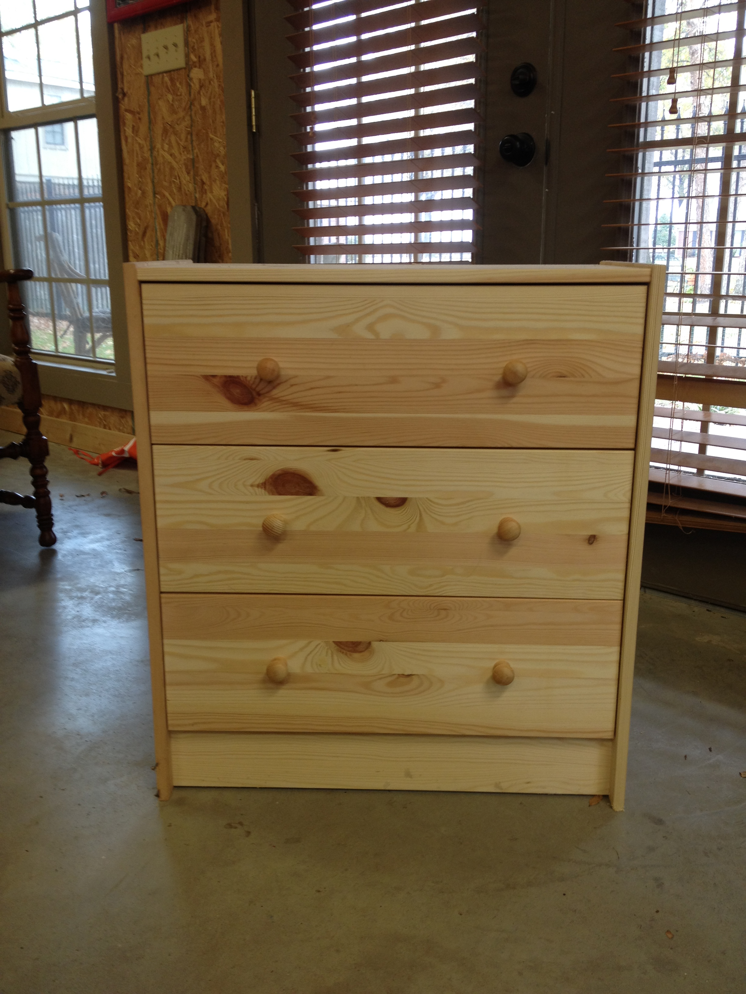
Don't know what an Ikea Rast dresser is?  Check out my first hack here for more info.  And if you're curious, hack #2 can be found here. We cranked out the third and final hack the day after Christmas.  I didn't take pics of our step-by-step process, so this before and after should be quick.  If you need a refresher, here's what the Ikea Rast dresser looked like right out of the box.

Plain, simple, raw wood.  We used A Charming Nest's hack as our inspiration.  Hop on over to her blog if you want more details of the steps.

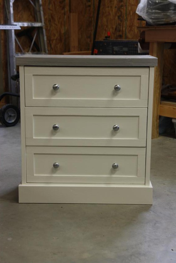
No point in wasting time, let's get right to the after shots!

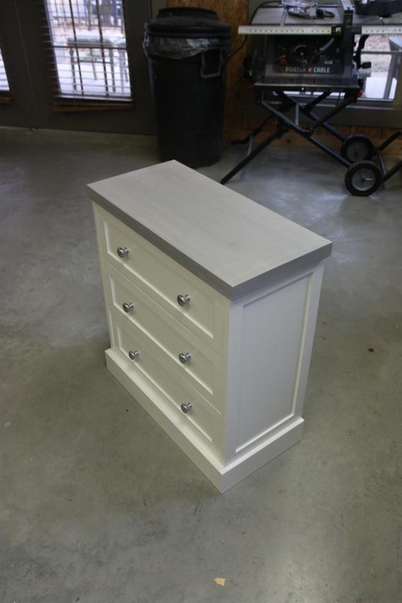
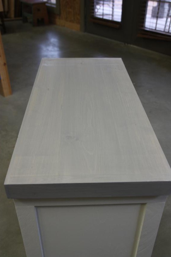
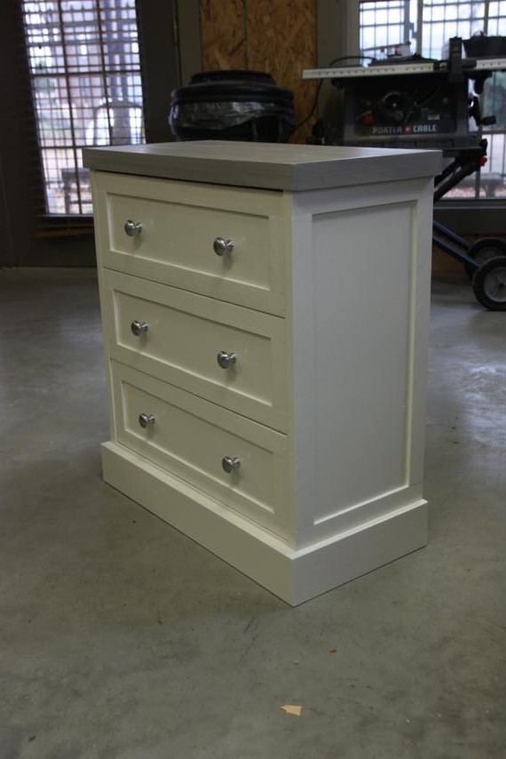
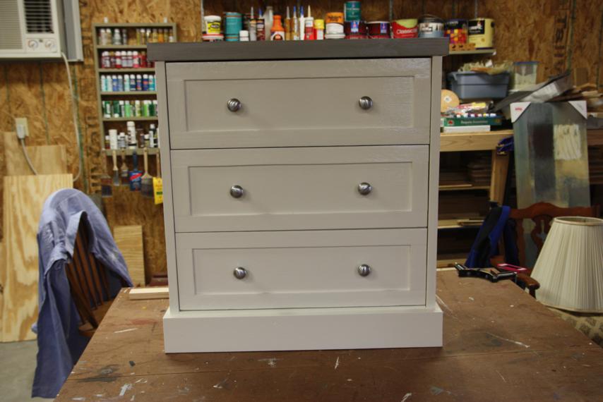
I love it!  I used the same colors that I used for the stenciled hack since they'll both go in the jack-and-jill bedrooms at the beach house.  Instead of staining the top, I watered down my grey paint and white-washed it on.

I really like that it has a nice contrast from the white base, but that you can still see some of the wood grain too.

And I thought brushed silver knobs would go well with the light grey top.

Kinda makes me wish I could go back and add trim to the other ones now, but I'm not sure if I have time!

Which one do you like best?  I was in love with the stenciled one, but I think this one may be winning me over now.

A Canvas Makeover

In my last post, I said that I had a few paintings for the beach house in the works, and now I've got one to share. Here it is!  What do you think?  Isn't it great?

Juuuuuust kidding.  That painting will not be hanging on a wall in the beach house.  At least, not looking like that.

This masterpiece came from Target.  Let's zoom in so you can see why I bought it.

Less than 8 bucks...holla!  You can't buy a plain canvas that size for anywhere near that low of a price, so you know me, I decided I could just paint over it.  I loaded that clearance rack gem into the MINI and brought it home with me.

I've been hanging on to this for a couple months now.  Of course I bought it without knowing exactly what I'd do with it, but I knew the perfect idea would come.  And it finally did.  After Beth finished all her paintings, it hit me that we still didn't have anything at all for the walls in the downstairs bedroom.  That's where the yellow dresser will go.

So with a general idea in my head, I got to work.  Keep in mind that I am by no means an artist.  I was totally wingin' it.  First, I knew I wanted to add some texture to it.  I'm sure modeling paste or something would've been ideal to use, but you can't find modeling paste in our woodshop so I was outta luck.  I improvised with something you can buy from a hardware store...if it ends up holding up, maybe I'll share my secret!  I figure if it doesn't hold up, I'm only out $7.56.

I started slapping my medium on using a putty knife.  Again, probably not what real artists use, but it worked.  Then, I used the wrong end of a paintbrush to draw in my general design.  Then I had to waaaaaaaaaait.  I am so not patient when it comes to things having to dry!  But I absolutely had to give this stuff 24 hours, so I left it alone for the night.

Doc saw it while it was drying and said, "Oh cool, bubbles in the grass."  That's when I thought oh crap, this may be harder than I thought.  They weren't supposed to be bubbles...I was going for whimsical flowers!

The next day I was able to start painting.  I didn't have good paint, so it was craft paint for me.  I was planning to start with the sky, so I filled my plate with several shades of blue, some white and cream, and even some grey.  I tried really hard to tap into my inner artist and not be too much of a perfectionist with how things looked.  I told myself it was ok for things to look a little messy and not perfectly blended.

For the grass, I used several different shades of green with a little brown and black mixed in.  It started out looking very camo-ish, but I think I eventually got it looking a little better.

The main color in this bedroom is yellow, so I chose a couple shades of it for the flowers and started filling in my circles.

I'm pretty sure this is when my dad came in and commented on the "weeds in front of the ocean."  Awesome.  Clearly, I still had more work to do.

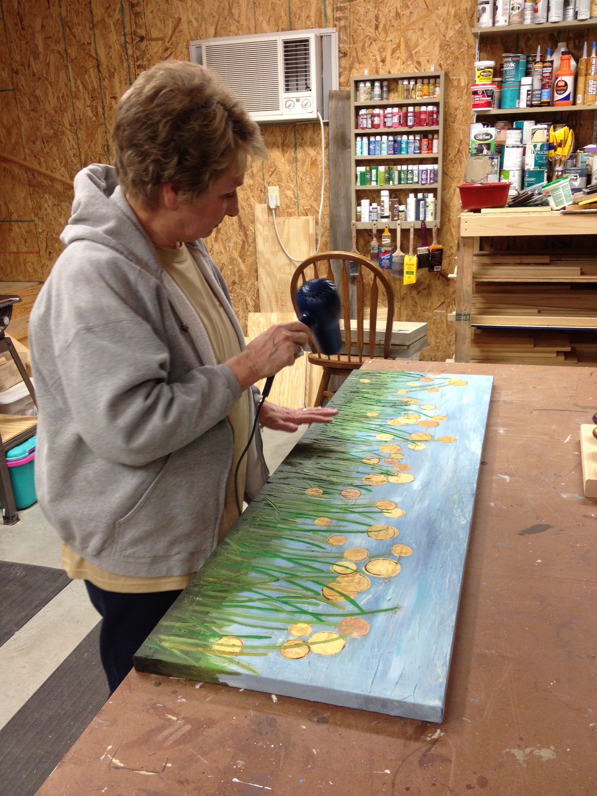
I knew when I was painting the yellow that I'd have to come back and add in some more green over the flowers so they didn't all look like they were on top of the grass.  My mom became an expert painting dryer.  We broke out the hair dryer since I was too impatient to wait for things to dry!

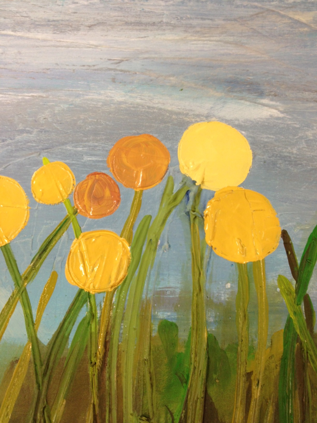
I also didn't like how flat the flowers looked, so I went back and added some outlines to some of them.  I think it made a big difference.  (Before is on the left, after is on the right.)


Here are some more shots of the finished flowers.

And finally, the whole painting, hanging a little caddy-whampus on a plywood wall.

So, do you think it's an upgrade or downgrade from its original $8 look?  I can't wait to see it with the fabric we're using in that room.  Not too much longer!

Beach House Paintings

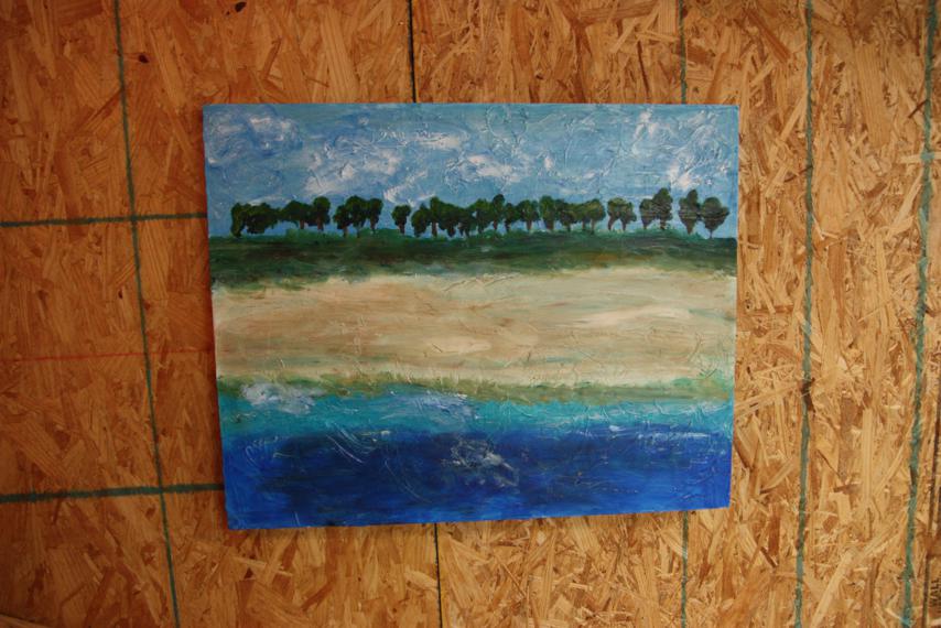
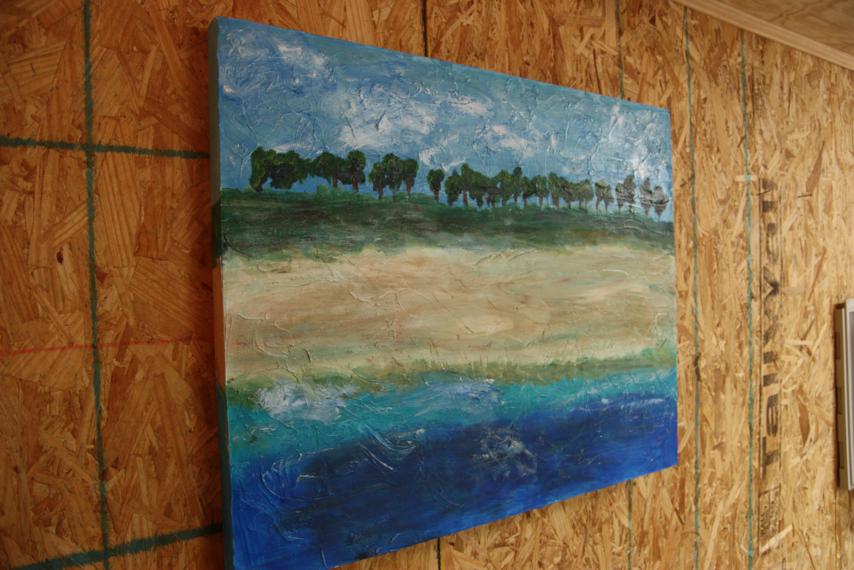
This post is all about bragging on my sister-in-law Beth and the fantastic works of art she made for the beach house.  About a month or so ago, she and I sat down to talk about color schemes in rooms and flip through paintings we liked, before coming up with some ideas for her to paint.  Now she's done and they all look fantastic! This beach scene is something you might expect to find in a house near the beach, but Beth made it more abstract than your average sand-waves-sunset painting.  I like the tree line in the background and how it's chock-full of texture.  This will be for one of the jack-and-jill bedrooms.

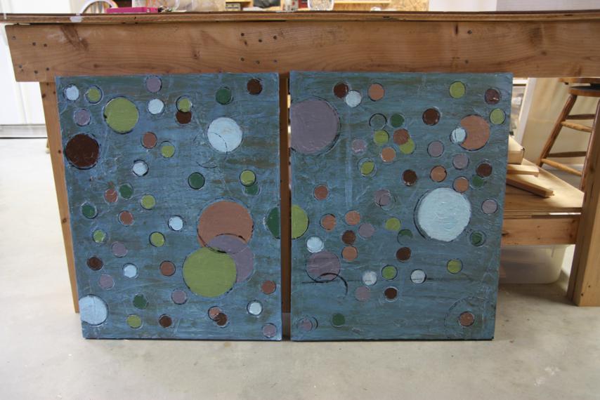
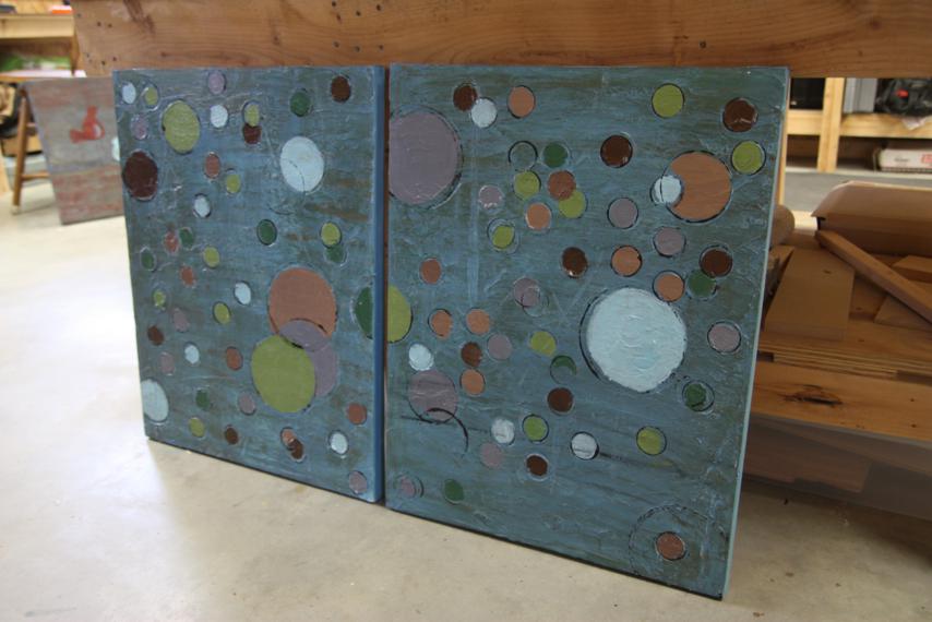
At the time that we talked about the paintings, we still hadn't purchased a bed for the last bedroom - the other jack-and-jill one.  We were in a bit of debate about another queen bed versus bunk beds.  So, Beth painted not one but two paintings for this room.  The idea was that they could be hung together as a pair, but would also look fine hanging separately on two sides of a window if we need to split them up.  Gotta love polka dots!

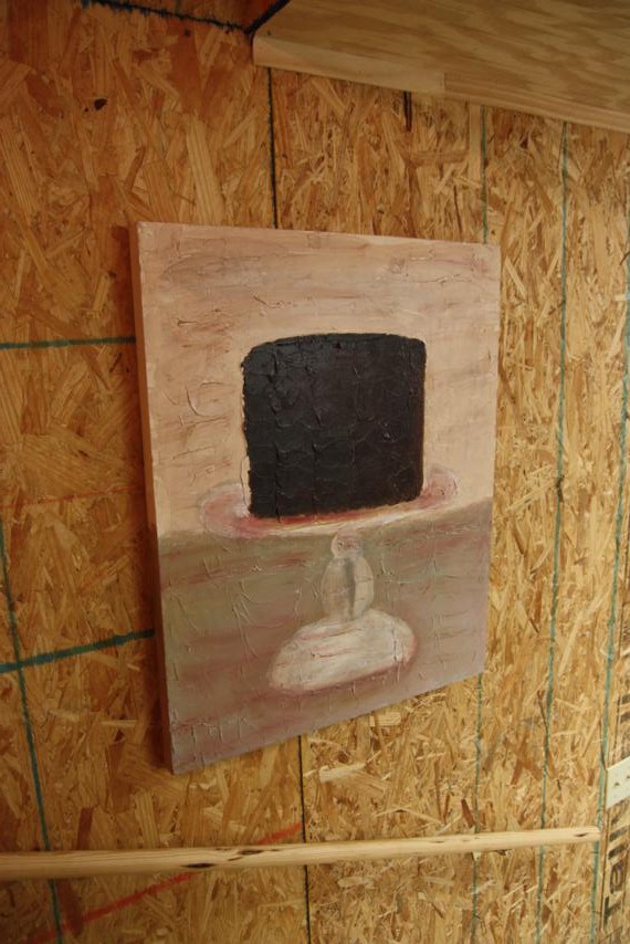
This next one - for the dining room - is my personal favorite.  I will most definitely be placing an order for one of these for my house sometime!  Chocolate cake on a cake stand.  Does it get better than that?  And it will look even yummier when it's not hanging on a plywood wall.

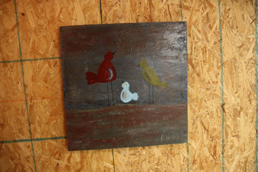
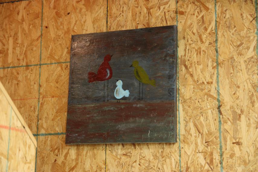
The last one is for the living room and is a trio of whimsical birds.  I love them too!  Beth and I have gone back and forth about whether or not the birds need a black dot for eyes?  What do you think?  Doc says they're looking away so they don't need them.  Sometimes I think it would take away from the whimsical-ness of the birds, other times I think they need eyes.  Help?

Didn't Beth do a great job?  I've got a few things in the wall-hanging category that I'm working on too, but they won't even compare to these.  You know I'll share them with you anyway!

Beach House Update

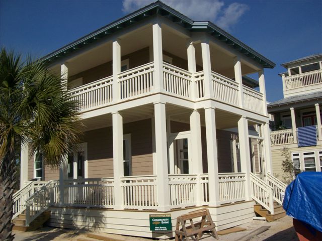
Back when we first broke ground on the beach house, I just knew that we'd be spending the week between Christmas and New Year's there.  That seemed like a reasonable amount of time to build a house to me, especially since at that time, December was so. far. away.  As it turns out, we need not spend the last week of 2011 chillin' in our beach house.  I guess we could've, but it wouldn't have been that much fun without any heat, air, electriciy, flooring, furniture, and so on.  Thanks to a fair amount of rain, the holidays, and the cabinets being late, our house still isn't done.  (Side note: What is up with the cabinets always being late?  We ordered them back in August, sheesh!)  But we're getting close! We may not have been at the beach a couple of weeks ago, but our friends Chris and Allison where and they graciously checked on the house for us.  As usual, let's start our update with the exterior.

Still no landscaping (that won't come til the end), but it looks like since the last update, the railing has been finished around the front porch and the steps have been added.

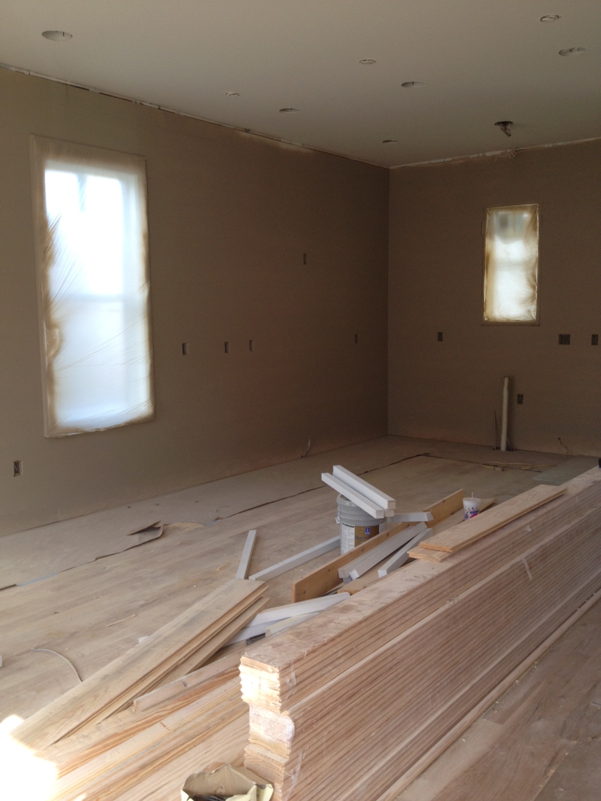
Here's a picture that Allison sent of the main living space.  If you'll remember, this is the room that has horizontal paneling on the walls.  You really can't see it at all in this pic, but I think it will [hopefully] be more noticeable in person.  I'm pretty sure the stack of wood on the floor is what they'll use to do the banding around the ceiling and floor.

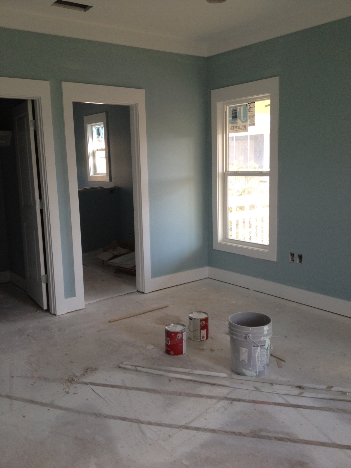
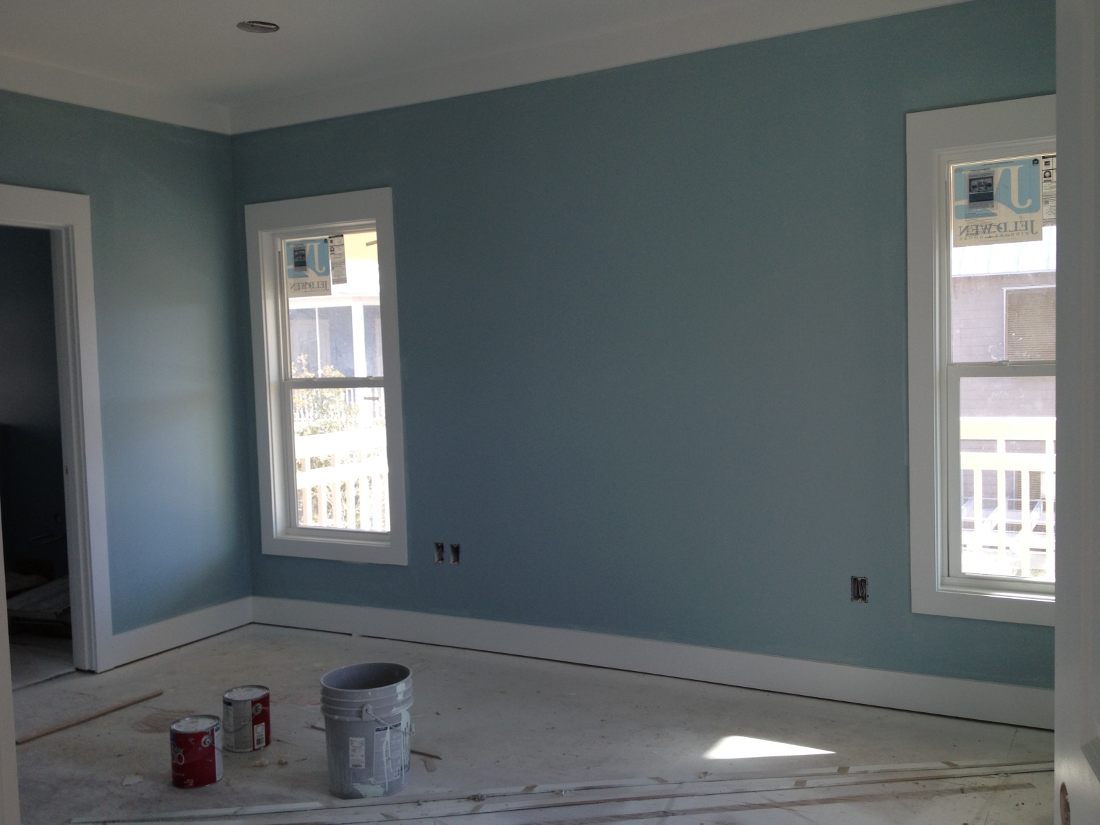
Since they've started the interior painting, I asked Allison for pics of the master bedroom.  The fabric we've chosen for that room has some blue in it, so we picked out a blue for the walls.  I was eager to see how it looked.

I like the blue!  I hope the stuff we've picked out will look ok.  We chose more of a cream for the bedspread instead of bright white like the trim, but surely that will look fine.  This room, as well as the other three bedrooms, will get a neutral shade of shag carpet.

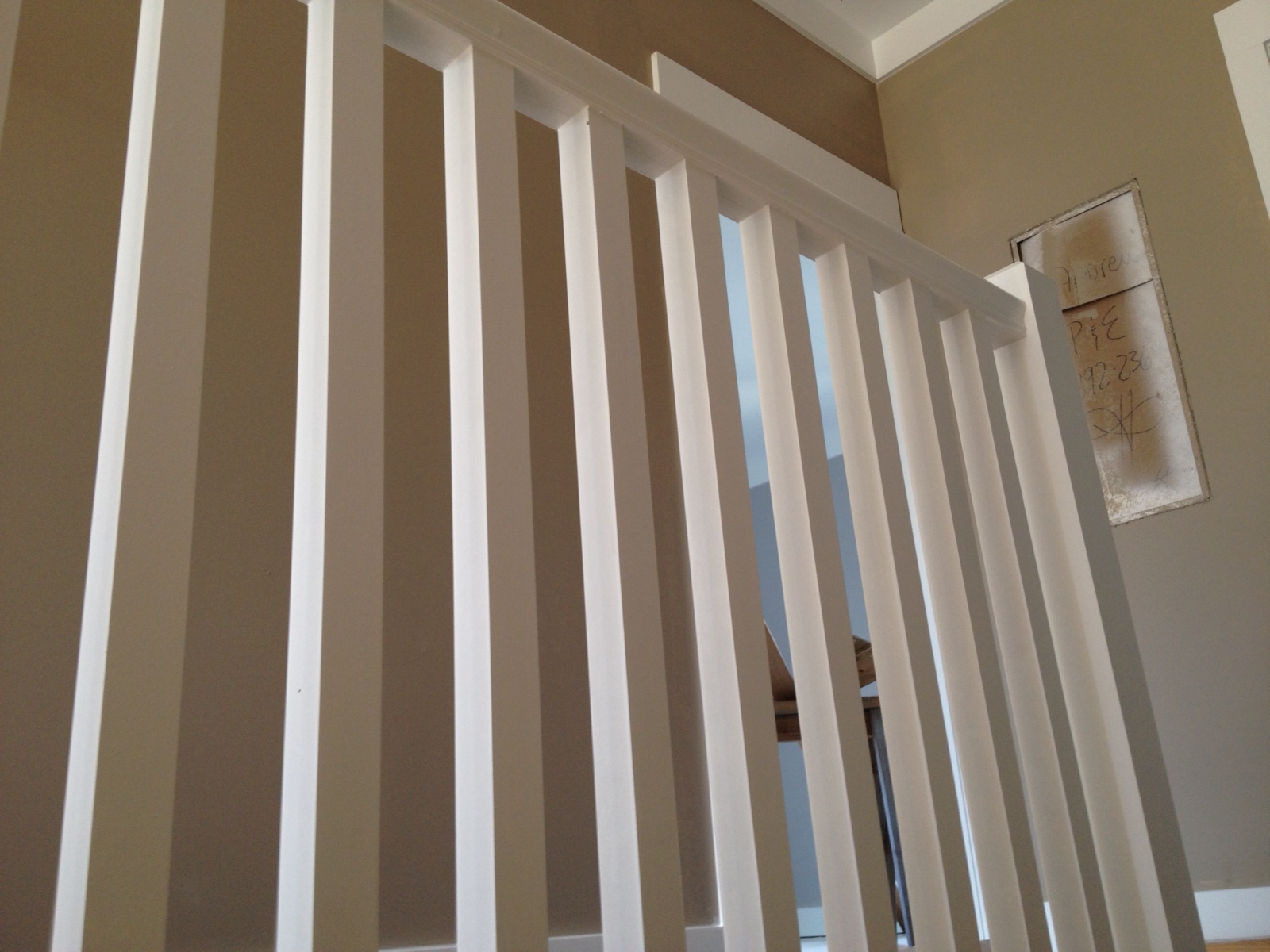
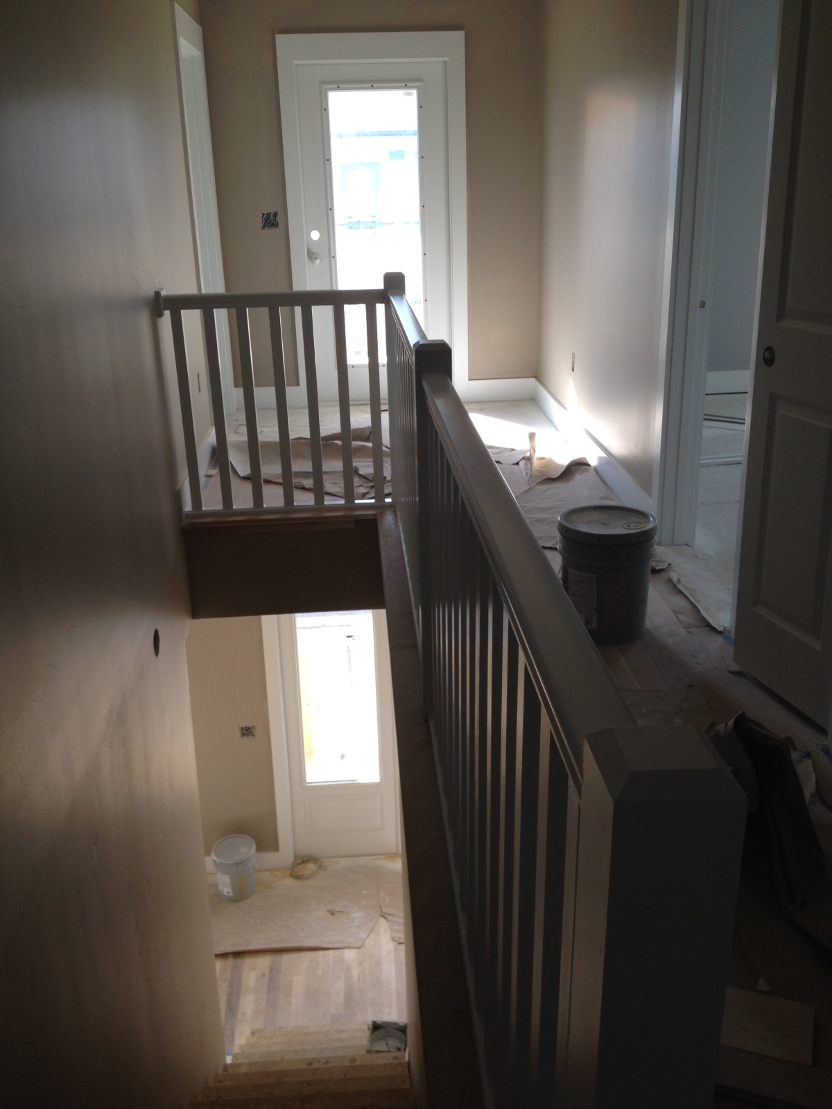
We had not yet seen what kind of banister would go around the stairwell in the upstairs hallway, but Allison said it was up so she sent pics of it too.  I like it - plain and casual is what we're going for in this house so I think it's perfect.

If you peek through the rails in the picture above, you can kinda see the grey walls in one of the jack-and-jill bedrooms.

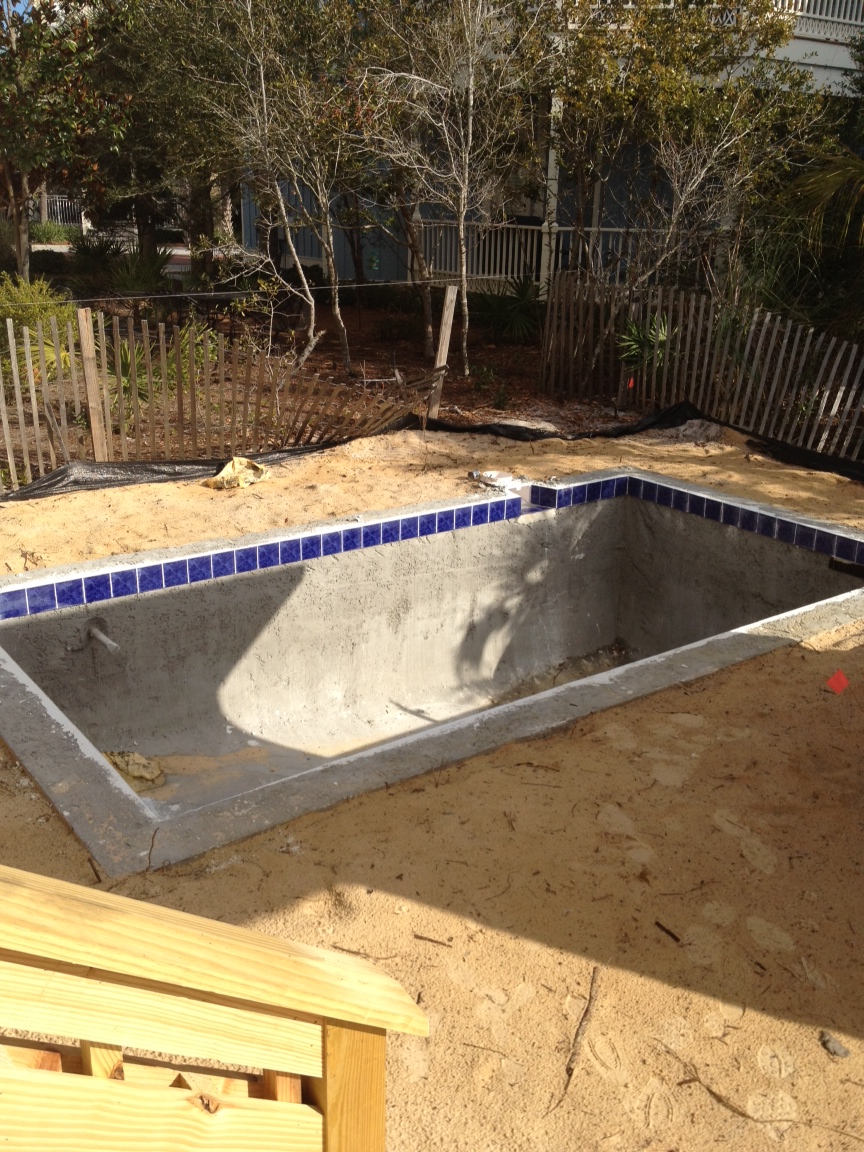
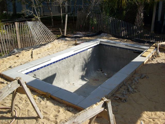
On their way out, Allison also grabbed a quick shot of our teeny, tiny pool.

This past week we got an email from our builder.  More money equals more pictures.  Here's the picture of the pool that we got this week; I'm not sure that there's much difference from when Allison was there.

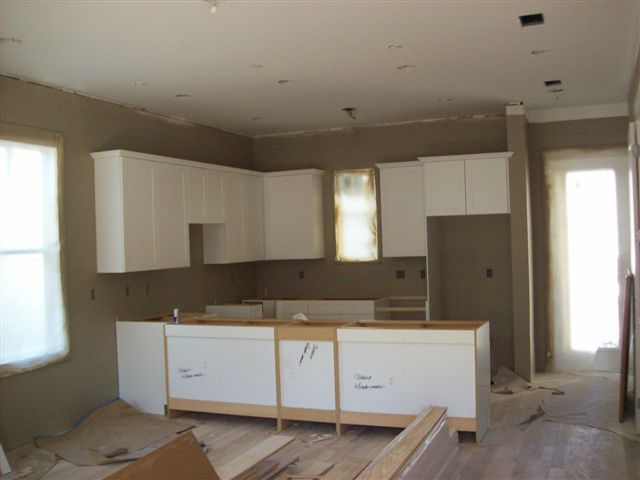
But there's a BIG difference in the kitchen.  Finally, cabinets!

That picture makes me very excited, especially since our builder says everything should be pretty fast-moving from here.  Apparently, cabinets hold up progress on everything.

Might as well end this post the same way it started, with a shot of the exterior.  This time it's more of a side view and if you look closely on the downstairs porch, you can see they've framed out the doors for the screened-in portion.

That's all the pictures I have for now.  Doc and I will be the next ones to check it out, and it's possible the next time any of us go, it will be to move in.  Hooray!  Many, many more pics to come after our quick trip...I'm sure I'll be trigger happy with my camera!

Ikea Rast Hack (Again)

If you missed my last ho-hum Ikea Rast Hack (or have no idea what I'm talking about...), you can see it here. Like I said in the last Rast Hack post, after we saw the sturdiness of the first two we ordered, we immediately placed the order for two more (but unfortunately, not before the price went up five bucks to $34.99 each).  I knew right away which beach house room one of these would go in, so I could start on it immediately.  And this one was not going to be as Plain Jane as the other two.

My first step, like always, was to tape off the areas I didn't want to paint, like the inside of the dresser base and the sides of the drawers.  Then I gave this Rast Dresser two good coats of white paint.  I didn't take pictures of this process but I'm sure you can imagine what it looked like.  Picture one small dresser and three drawers all white.  Got it?  Good.

To jazz it up, I pulled out this pack of stencils that my mom gave me for Christmas last year.  It's the Ed Roth Stencil 101 Decor set.

After thumbing through the reusable stencils and holding up to see how'd they look, I finally settled on this pattern of hexagons for my Rast Dresser.  Ignore the blue-green paint...apparently I didn't clean it off the last time I used it.  Oops?

I planned on only stenciling the drawer fronts, not the whole piece of furniture.  And I also knew that I wanted to stencil the three drawers together so that the stencil matched up (as opposed to stenciling each one individually and then the pattern not lining up when they were placed in the dresser).  To do that, I lined my drawers up and taped them together.

This gave me one big blank slate to go crazy with, er stencil.

My stencil was bigger than the height of one drawer front, which meant my pattern would bleed from drawer to drawer.  I was ok with that, but it also meant that instead of lining it up and starting in a corner, I needed to find my center and start there.  I measured to find my midpoint (and then measured again) and lined up one of the hexagons with the middle.  I tried to place my marked midpoint on the drawers in the dead-smack center of the hexagon.

I was more than a little nervous to start stenciling.  I have never been very successful at painting over the stencil - in the past I've ended up just tracing the design and then filling it in with a paint brush.  I was determined to do this right, though, I read as many tips and tutorials as I could find online.  The secret seemed to be in the stencil adhesive, so I grabbed some from Michael's before starting.  I don't remember exactly what it was called, but it was Martha Stewart brand.  I sprayed it on the back of my stencil AND taped down the edges, penciled in my registration marks (so that I could easily line up the next repeat of the stencil), took a deep breath, and went for it.  I used a foam roller with very, very little paint on it and rolled over the stencil multiple times until the pattern was filled in.

The color is Essential Grey from Sherwin Williams and is the color of the walls in the bedroom where this dresser will live.  It seemed like it took forever for this first stencil to dry, but then, since I could work out from it in four different directions, the rest of it flew by.

Aww yeah!  I was supah excited with how this was turning out!

Up close it was not perfect by any means, but none of the edges were bad enough that a few swipes with a small paintbrush couldn't fix.  I'll be honest here - I did fix a few smudged edges, but not all of them.  I can live with a few imperfections, especially since you have to get really close to even see them.

I slapped on a couple of coats of water-based polyurethane before moving onto the hardware.  As far as hardware goes, I wanted plain and simple so that the stenciled pattern could be the star of this show.  Lowe's had a clear knob that ended up being the winner.

And check this out - the shape of the knob is the same hexagon shape as my pattern.  Score!  I love coincedences like that...especially since I didn't even realize they were shaped the same when I picked them out.

Ready for the full view?  Here'tis!

I know the after shots are always a lot more exciting when they're staged in a room, but since we haven't moved into the beach house yet, we'll have to settle with after shots being in the woodshop.  We'll be able to stage it in a bedroom soon, though!

So with that, we have 3 Ikea Rast Hacks done and 1 more to go.  I haven't even started on it yet and don't have a plan.  Anyone have any good suggestions?