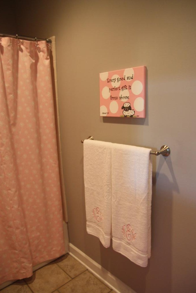
The last post in this "catch up on really old things" series is about the bathroom in Katie Wynn's room. When we moved into the house just before she arrived, we decorated the room just for her. It was very pink.
When Thomas came along (yes, over two years ago - I'm nothing if not fashionably late on things), we converted an office to his nursery but it didn't come with a bathroom. He would be sharing this one with her. And even though it is right off her very pink and girly bedroom, I at least wanted the bathroom to feel a tad bit more appropriate and welcoming for a little boy. So we did a big ol' switcheroo with all the accessories to make this space a little more coed feeling.
Here's how it looks now!
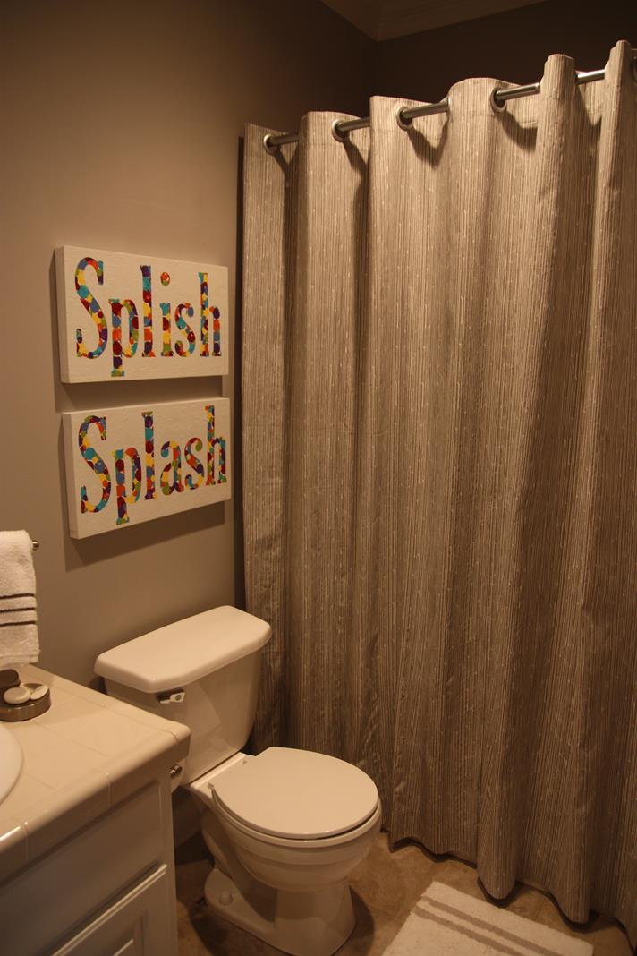
The pink shower curtain got switched out for a grey and white one. I like this it sorta looks like water streaming down. Kinda. Ish.
Do you remember the Splish Splash sign that I painted with marshmallows? (Probably not since I posted it back in 2014 back when I was a little more "on time" with things...) It now lives above the toilet - a space that was previously blank - and I love that it fills up the wall and adds some color.
My design plan for this room was to just use grey and white - neutrals - for the shower curtain, rugs, and towels and then bring in bright colors with the wall hangings. The splish splash sign does just that!
I apologize for the blurriness of this photo. It's the wall opposite of the sink and toilet and previously just held monogrammed towels. Now, while I love a pretty monogrammed towel, it just wasn't very functional to have "do not touch" towels hanging there and nowhere for the damp used towels to go. (Funny side note - at first, I did switch out one of KW's monogrammed towels for one that had Thomas's monogram so there'd be one of each. But his monogram spells out the word WET so it kinda looked like the other towel should DRY. Haha.)
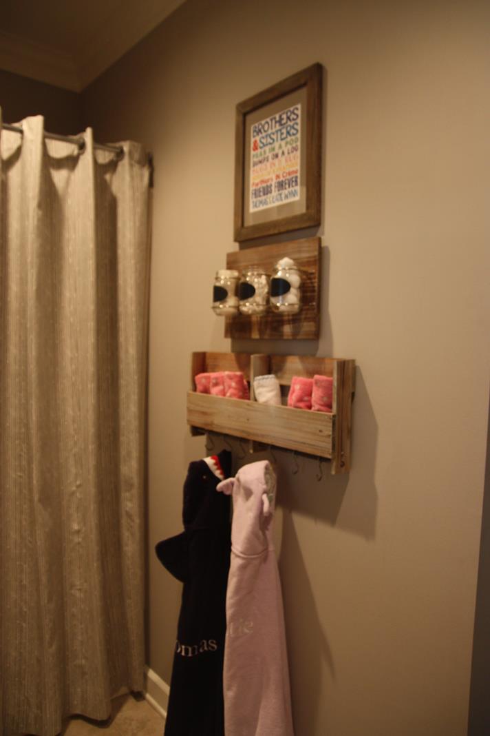
I bought the pallet rack with hooks from Target and it made the perfect spot to hang used towels and hold wash rags. The kids can drape their towels easily on the hooks too which is a plus.
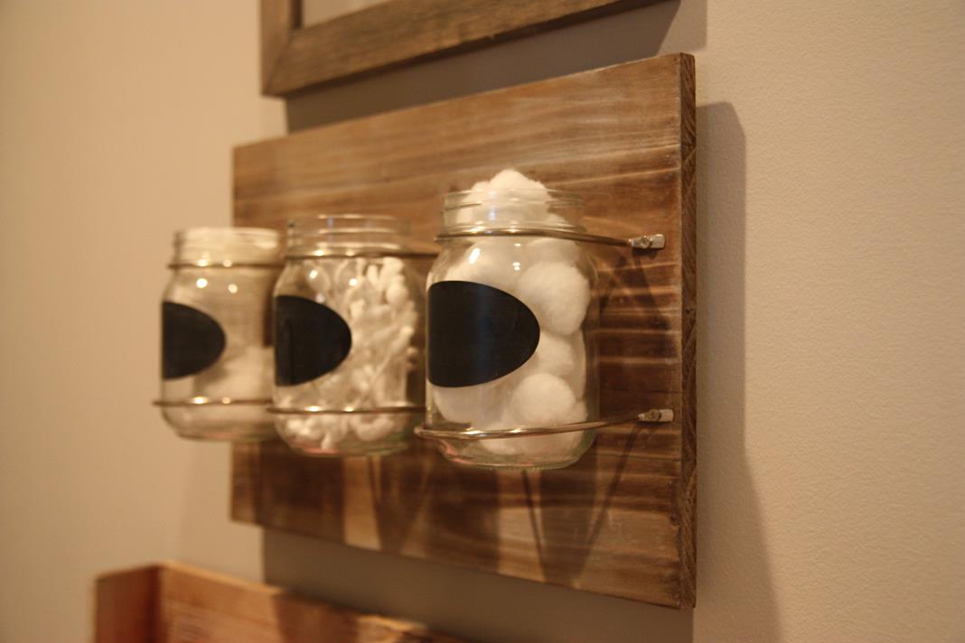
I bought the matching mason jar holder because I thought it was cute, but it really serves no purpose. I filled it up with cotton goods but still haven't gotten around to writing on the chalk labels! Pretend like they have a really cute handwriting that says "Cotton Pads, Cotton Sticks, Cotton Balls" or something like that.
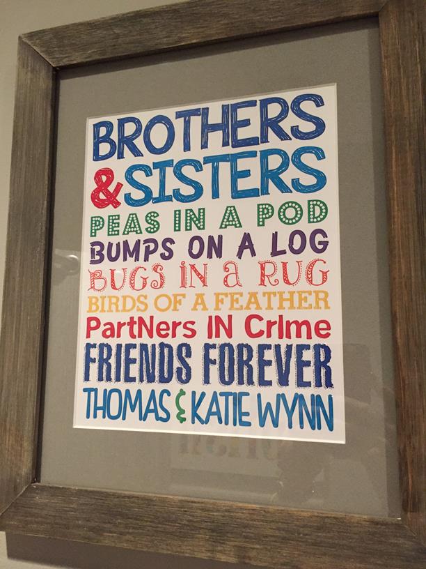
I purchased the the print at the very top from Little Life Designs on Etsy. I thought the sayings were cute and love that the colors tie in with the Splish Splash artwork. Katie Wynn often asks for me to read it to her and always questions why Thomas comes before her. "Because I'm bigger?" "Yes, I'm sure that's why."
The mirror was one of the very last things to change in the bathroom. In fact, I started the redo before Thomas even made his debut, but just found a mirror the right size a couple of months ago. I was not a fan of the fancy silver one (see it in the before photos above) and thought that plain white was more fitting for a little boy and little girl. In a perfect world, this makeover would have also included busting up that tile counter and adding a slab of granite, but that just didn't make the to-do list on this go-round.
I've saved my favorite part of the bathroom for last. The art on this wall:
I found these cute little portraits on Etsy by Phyllis Harris Designs. They are just stock drawings she had - not custom portraits - but I like that they resemble both of my cuties. They are slightly customizable in that you can pick hair, eye, and shirt colors. Since I ordered these when Thomas was less than a month old, I actually have the boy drawing as a brunette with brown eyes too. Who knew he would be a blond?! Since the color has stuck this long, I finally ordered a new one this past summer to more accurately represent my blue-eyed blondie.
And that's a wrap on our really difficult to photograph, tiny coed bathroom that was updated a couple years ago! Now we can return to more current events. :)
