Before and After: Nursery

As I said in a recent post, my mom and I got the fun job of picking out fabrics for my soon-to-be-here nephew's room.  With as many cute baby fabrics as there are out there, this could have been a really daunting task.  Luckily for us, we knew that Erin had already spotted one print that she liked earlier in the summer, and we decided that print would be our starting point. The fabric that Erin had said she liked was turquoise and white stripes with stripes of bright green dots lining the turquoise.  My mom and I quickly found it at the fabric store where she found it.  Only problem?  There wasn't very much of it left.  We knew going into the store that we'd be looking for coordinating fabrics to go with it, we just didn't realize that our "main print" was going to become just an accent print.  After making a couple laps around the store, we were able to conclude that the only fabric that perfectly matched the shade of turquoise in the stripes was minky dot, so we needed to focus on the green.  We planned on using the minky dot too, but it wouldn't work for curtains or a bed skirt.

We pulled bolts of fabric from multiple aisles, until we finally had it narrowed down to the ones we wanted to buy.  Before we had any cut, though, I sent this picture to Erin to get her approval.  The turquoise stripe on the left was our starting point, and we planned to use it mostly with the green and white striped and polka dot, with the elephants just being an accent.

She approved!  We purchased!  My mom sewed!

That's the quick way of saying that I really got the best end of this deal.  I voiced my opinions (which I usually do anyway) and helped select fabrics (which I love to do) and then got to sit back while my mom did all the hard work.  Then I got to show up on "installation day" and get partial credit.  Winning!

We had a lot going on last week and weren't really sure when we'd be ready to take everything over to my brother's house.  We ended up giving Ben and Erin very little notice to clear out the room before we showed up knocking at their door.  They moved into their current house just earlier this year, and while all of Parker's old nursery furniture did land in this room on move-in day, so did all of his toys.  So for the last few months, it's been his space to spread out and play with all his toys.  Let's hope he still likes his little brother after he realizes the little squirt took away his playroom.

That said, here's how the room looked when we arrived.  This is the view from the door.

This is the front corner of the room, with all of Parker's toys lined neatly in a row.

On the opposite side of the room is the changing table - already stocked with diapers - and Parker's pirate tent and toy box.

Obviously our first move after taking Before pictures was to clear out all the toys.  Parker was napping in his bedroom across the hall, so we carried them down the hall to the guest room.  My mom and I decided to leave the furniture where it already was, and that Ben and Erin could rearrange later if they wanted.  So, with toys gone and furniture in place, we just had to dress the room with all our new fabrics.  We put Dad to work hanging curtain rods while we tackled the bed.

An hour or so later, our work was done.  The room is still not 100% complete, but it is 100% baby room now, as opposed to half nursery, half playroom.

Here's the crib with its new bedding.  We used the original inspiration fabric for the bedskirt (looks short now, but will kiss the floor when the mattress is lowered), and put a solid white sheet on the matress.  (Still need something to hang over the bed, so ignore the blank wall...)

"Cording" is somewhat of a 4-letter-word to my mom, so she generally avoids projects that require it.  I think she was probably dreading making the bumper because of that, but I think she did a really good job!  (Her sewing job is better than my picture taking...) The bumper is green and white polka dots on the outside, the turquoise minky dot on the inside, and tied together with green and white striped cording.

Here's a shot of the simple curtain panels my mom made.  Ignore the toy box to the left, it got moved out of the room right after I took this picture.

Up close, you can see that there's a herd of marching elephants guarding the window.

Erin and Ben have a rocking chair that I think they plan on bringing into the nursery.  My mom used leftover fabric to make a couple pillows to sit in the chair, but since the chair wasn't there and we didn't have accessories yet for the corner shelf, we put the pillows there.  I love this elephant one on top.  If you look closely you can see that she used turquoise thread to trim the squares.

My mom found this "It's A Boy!" rattle at a gift shop.  She saw it was the perfect color combination and snagged it.  There was already a nail in the wall between the two windows we just stuck it there for the time being.

My mom also sewed some curtains for the changing table, so all those diapers and other baby things could be concealed.  They have marching elephants on them, too.  My easy art is hanging above the changing table for now, even though it's a little small for the space.

The small white set of drawers that was already in the room happened to match perfectly, so it got to stay in the room.

We topped it with a new white lamp.

So that's the nursery.  While it could definitely use some more things on the wall and maybe some personalized things when he gets a name, the thing it's really missing is a little baby!  Even without art on the walls, Baby Boy will complete the room.  I can't wait for him to get here!

Before and After: Kersten's Bedroom

Boy, have I got a cute room redo to show you!  I love, love, love the way this one turned out. Kersten, an outgoing second-grader, has been itching to get rid of her pale pink and "baby-ish" room decor.  Around this same time last year I helped decorate her parents' master bedroom (her mom is a coworker and friend of mine) and then a few months later I painted a triptych for her little sister's room.  Kersten patiently waited her turn as we promised her a bedroom makeover.  Her turn finally arrived this weekend and I think she could barely contain herself, she was so excited!

I visited her room a few weeks ago to take some measurements and while I was there, I took some Before shots.  I gave her and her mom little notice before I arrived and I caught them on sheet-cleaning day, so overlook the unmade bed.  Here's how Kersten's room looked - from the doorway - on my first visit.

Kersten made it clear that she did not want her new room to look like a baby or little girl room.  Her mom and I used some down time at work to surf the net and plan out her room.  We found the perfect bedding at Pottery Barn Teen (on sale!) and used this bedroom view online as our inspiration.

We loved the bright colors against the white bed, which is why we decided to paint the headboard I made solid white.  The white sheets, turquoise pillows, and tailored window treatments were all things we thought we could copy too.  We obviously didn't have the built-in bookcase around the bed or tons of colorful medals but I felt confident that we could create this same bedroom style in Kersten's room.

Some pre-work had to be done before the big day.  While I worked on the headboard and shopped for fabric (and roped my mom into doing the sewing for me), Kim, Kersten's mom and my friend, patched the walls and painted them a shade of khaki just like in the inspiration photo.

Are you ready to finally see it?  I may be biased, but I think we pulled off the Pottery Barn look and then some.  Here's the way Kersten's room looked - from the doorway - when I left yesterday.

Lots of color, but still plenty of white and clean lines so it doesn't look too loud or chaotic.  I love it!

Now, let's break it down.

One of the trickiest parts of the room was trying to decide what to do with the big window.  Kersten's room is at the front of their house so she has a big decorative arched window on top of regular double windows.  Before, her mom had hung long curtain panels from above the arch to cover the window at night and block out the morning sun.

Kim finally bit the bullet and ordered a set of arched blinds to go in the top window.  These types of blinds have to be special ordered and they don't come cheap.  It took lots of encouragement and convincing on my end but I think she finally began to see the blinds as an investment for the house.  Installing them was a great decision...look how great they turned out!  (And notice the curtains - made by my mom - are very similar to the ones in the inspiration photo, only our turquoise stripe is horizontal instead of vertical.)

Remember the felted balls I was working on?  I used a few of them to make flowers, but the majority of them I strung on a white thread to make a garland.  I originally thought we might drape these on the headboard frame, but once we were in the room, we thought they would look best on the curtain.

Here's a Before picture of the bed wall from another viewpoint.

And here is Kersten on her bed as it is now.  My mom also made the turquoise pillow shams and I think Kim found the furry throw blanket at Walmart.  The hot pink floor lamp was already in the room and the three metal flowers above the bed came from Hobby Lobby for 60% off.  Gotta love a clearance aisle.

Her dresser and small white mirror stayed, we just fancied them up with some vinyl picture frames (PB Teen) and new knobs (Hobby Lobby).

The Before bedroom had a basketball goal hanging from the closet door.

We switched that out with more cute vinyl frames above the door.  Of course, they'll eventually have pictures in them, we just didn't have any on hand.  (I thought all of these frames were so cute I kinda wanted to take them home with me.)

The vinyl frames came in a pack of eight so we still had one left over.  We hung it on the small wall that you see right as you enter the bedroom.

The other main wall in Kersten's room (across from the bed) is home to some very nice built-in shelves.  The Before shot:

Kim and I discussed that adding more bins to the shelves would be great for more out-of-sight storage.  Especially since the room isn't big enough for an additional dresser.  I was originally on the hunt for turquoise bins, but I couldn't ever find the right size and color we needed.  Kim ended up ordering hot pink ones from Amazon, and now that I've seen them in the room, I'm so glad we didn't get turquoise.

I love the look of the bold pink color on the bottom of the shelving unit, and the white cord handles go great, too. These will be great for storing socks, pajamas, and things of that nature.

This bulletin board was made from a frame found at Hobby Lobby.  It was another clearance aisle find for just $10.  It was originally black but I just gave it a few good coats of turquoise spray paint (Lowe's) and then added the bulletin board (Michael's).

I think our final touch was just adding the vase of felt flowers to the shelf.

And that's a wrap on this room transformation!  I don't know about you guys but I'm ready for the first slumber party...

Before & After: Allison's Nook

Goodbye January, Hello February! Seriously, raise your hand if you're glad THAT month is over.  I know my hand's up.  January was a doozy!  But, while a lot of the days teamed up and acted really snotty to me, there were still a few good things to come out of the month.  One thing in particular is Allison's new kitchen nook.

Allison is lucky enough to get to work in her pajamas from home everyday.  Until recently, her home office has been in her extra bedroom upstairs.  While the room worked just fine for her working needs, she was ready for something different.  We talked a lot about new desks and rearranging the room, yadda yadda yadda.  But then one day, Allison had an epiphany...she should set up her office downstairs in her kitchen nook!

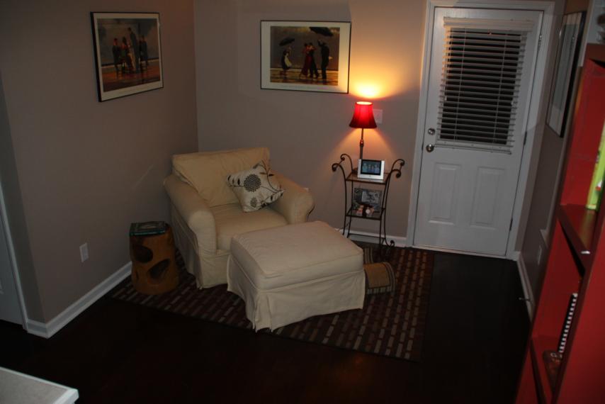
What nook?  Glad you asked.  See, off to the side of Allison's kitchen is this little space.

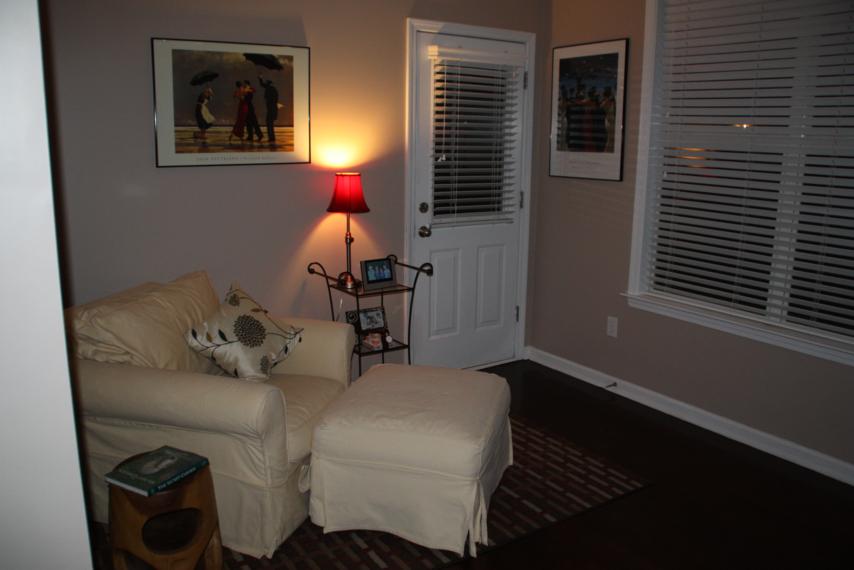
Cute and cozy, right?  The only problem is that this space wasn't getting used to its full potential.  Allison can correct me if I'm wrong, but I doubt anyone ever really stretched out on that big chair to relax, especially since the living room is just on the other side of the kitchen.

And you can see from this angle that the nook is equipped with windows that let in lots of good natural light during the day...perfect for a working environment.

I thought the idea sounded great and was on board with the plan.  Because the new work space would still be sorta in the kitchen, Allison wanted a piece of furniture that looked more table-y and not too desk-y.  We found plans online for a farmhouse style kitchen table and decided to try to scale it down to fit her nook.

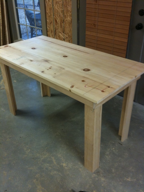
This was my part of the Nook Renovation.  I was in charge of making the table. With all the straight cuts, it was really pretty simple to make.  If I had bought the right sized wood on my first trip to Home Depot instead of having to make a return trip later, I would've been able to knock the building out in an hour or less.

Allison chose the color - white - and gave me a can of paint she found in her garage.  Our fingers were crossed that it was the same color as her trim and woodwork.

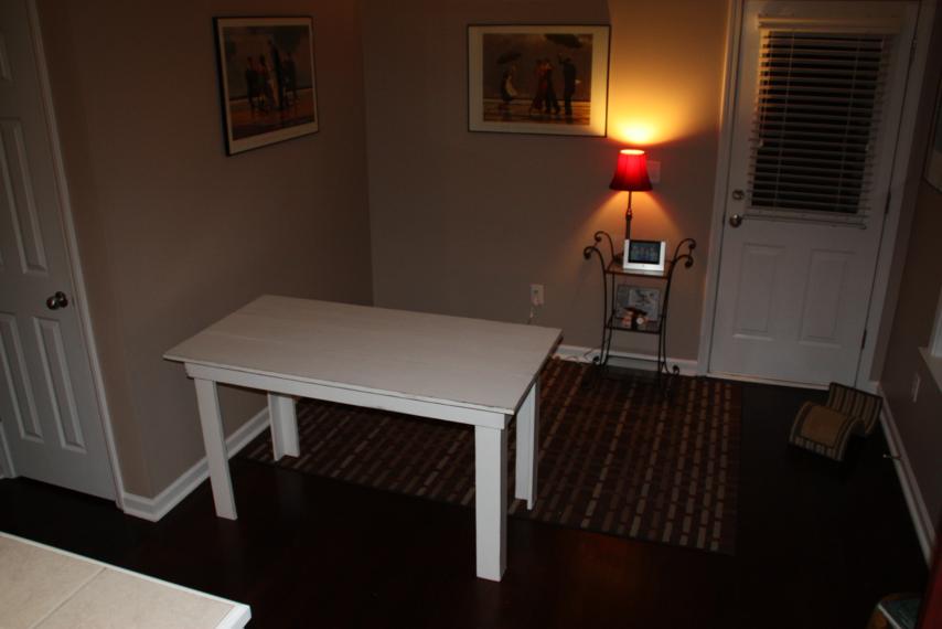
A coat of brown paint, three coats of white, some sanding, and one and half coats of polyurethane later, the table was ready to be delivered to its new home!  Doc was there to help with all the heavy lifting since Chris was out of town.  The big comfy chair got moved upstairs and in came the new white table.

Doc and I left it there just like that - naked and all by itself.  Decorating the area was Allison's part of the Nook Renovation.

Last Saturday, the Reno was complete so we headed over to see it.

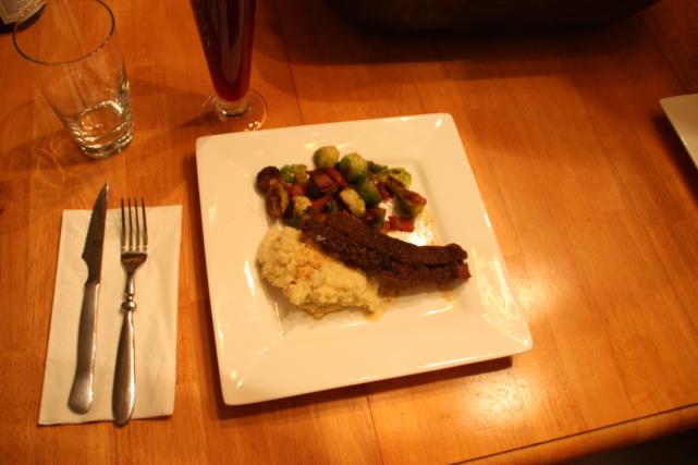
(And also to have dinner.  In my opinion, it was one of the best meals Allison's made yet...beef brisket, grits, and bacon and brussel sprouts.  It was so freaking good!)

(Then we had homemade tiramisu.  Just typing this right now makes me want to go back and eat it all over again.)

Where were we?  Right - the Nook Renovation.  Just a reminder, here's the before:

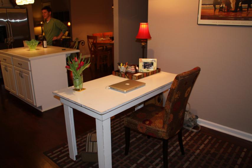
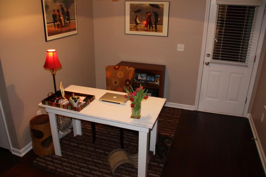
And here's how it looks now with all it's new work space accessories.

Pretty snazzy, dontcha think?  I'm loving the chair.  I would've never thought to go with a dining chair (I was picturing a wooden desk chair) but it makes perfect sense.  It is technically a farmhouse kitchen table afterall.

Just so we can all visualize how Allison spends most of her days, here's a view from her side of the desk, er table.  (Except that cutie in the background belongs to me.)

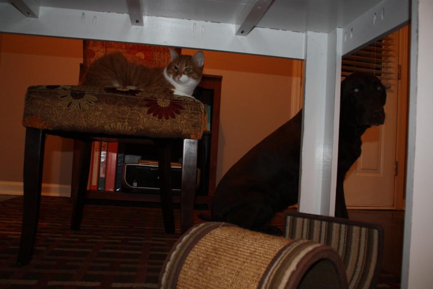
The good news is that the new setup seems to be both Porter and Grace approved!
Next on the ol' to-do list are a set of matching bookshelves to go upstairs with that big comfy chair.  I'll post pictures when it gets done!

Before and After: Hallway

Before I get to the hallway, can I just say that you guys totally rock!  Why? 1 - You actually read my nerdy post.  I completely expected everyone to just skim right over it. 2 - You shared your opinions on the issues. 3 - MOST of you sided with me.  Yay!

And Beth, I didn't even think about the fact that you teach keyboarding.  Duh!  I'm so glad that you confirmed that the correct answer is two spaces after a period.  As far as this blog goes, we'll carry on with double-spaces and extra commas.

Ok, ok.  Let's talk about my parents' hallway makeover!  We completed this project about a week or so ago, but I'm just now getting around to looking through the pictures.  The hallway I'm referring to is the one from my parents' garage door.  It leads to the laundry room, my parents' bedroom, and the kitchen.  And, until a couple weeks ago, it was the last of the wallpaper in their house.

My mom got to work before I was able to get good before shots.  Here are some I dug up in my archives so you can see what we were working with.

In this really bad, scary-eyed picture of Taylor, you can see the nice "sponged" looking wallpaper.

My mom chose the wallpaper years ago because she thought it would hide dirt.  This hallway sees lots of traffic since we all come in and out the garage door.

If you look past me and sweet Minnie in the picture below, you can get a full view of the wall.  The "sponged" wallpaper is on the lower portion, right below a sweet wallpaper border separating it from the teal colored walls.  And yes, that would be a gun rack hanging in the hallway.  We're from the south, y'all.

In the picture above you can also see the falling-apart garbage can of yore, the old white refrigerator, and the cabinets and countertops before their 2008 makeover.

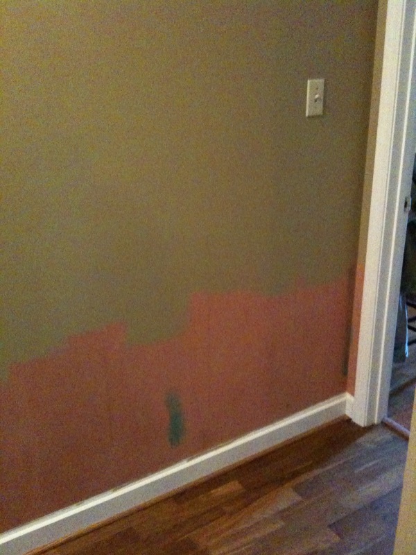
Good looking hallway, right?  By the time I arrived with a camera, my mom had already stripped the wallpaper off and painted the walls khaki.

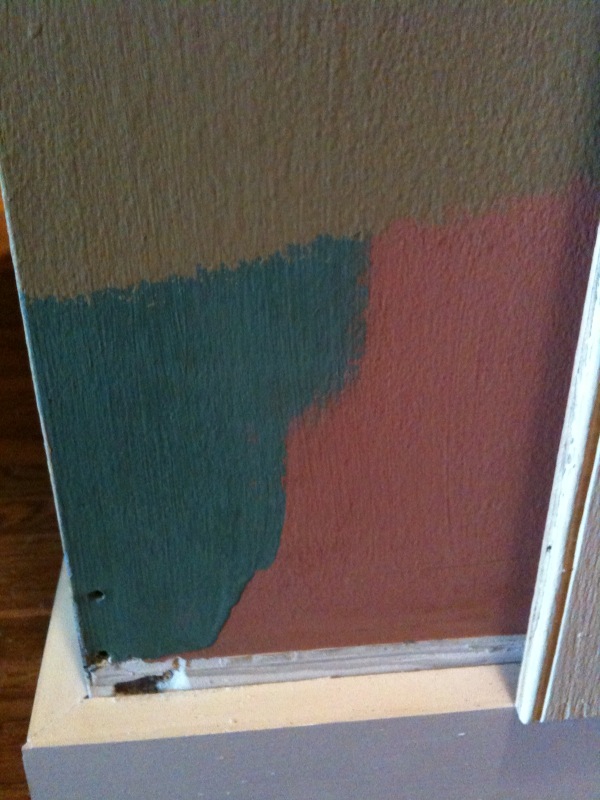
See that salmon color below the khaki?  That's what color the hallway was before the teal.

Here's the progression of the hallway in paint colors:  salmon to teal to khaki.  I think it's a huge improvement.

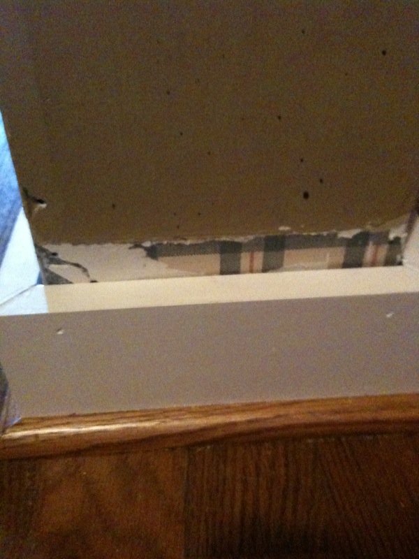
And as if those paint colors aren't awesome enough, check out this tiny remnant of wallpaper that coated the halls when we first moved in.  A nice country plaid...

When my mom was done stripping the wallpaper, my dad ripped off the old baseboards and quarter-round.  The ones in the picture above are new...that was his first step in this hallway transformation.

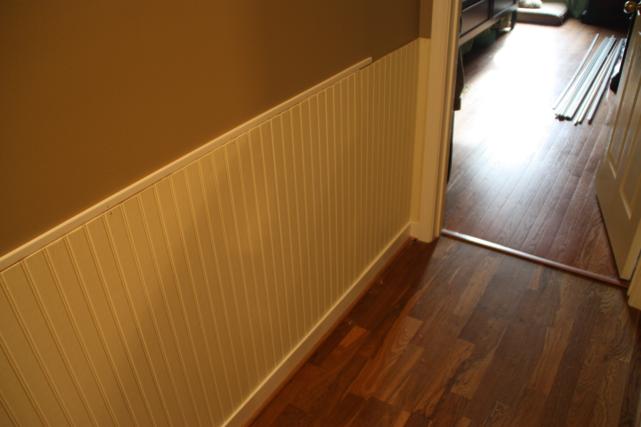
With the walls painted and the new baseboards and corner-round installed, the next step was to add sheets of beaded board.  We were going for a wainscoting effect, but definitely taking the easy route by using the sheets of beaded board instead of the tongue and groove planks.

My dad painted the sheets of beaded board a creamy color before we nailed them to the wall.  Just one less step we'd have to do in that tiny hallway.  (By the way, my mom was out of town during the majority of this process.  Dad did the bulk of the work but Doc and I pitched in a lot.)

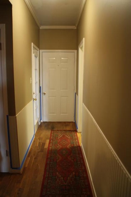
So here's how the hallway looked after the beaded board went up.  This view is from my parents' bedroom doorway looking at the back door.  The kitchen is to the left and the lit up room on the right is the laundry room.

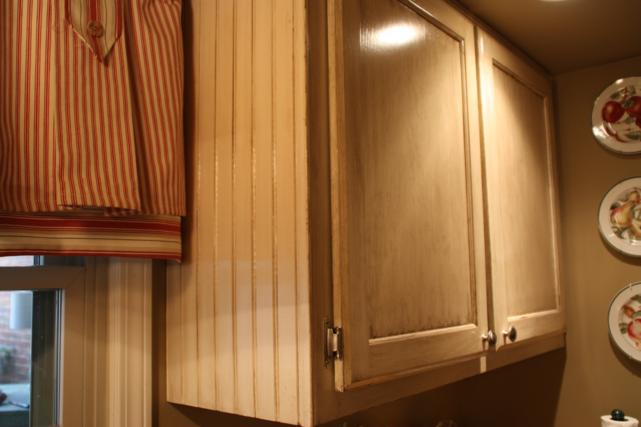
Remember how I said the kitchen cabinets and countertops had a makeover of their own in 2008?  The cabinets used to be a dark brown and my mom paid someone to come in a paint them an antiqued/distressed khaki to brighten up the kitchen.  This is how they look now.

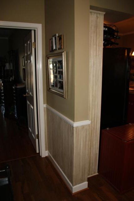
Why does that even matter?  Well, the new beaded-board in the hallway curved around the corner and bumped right smack dab into the painted beaded-board in the kitchen.

(New stuff on the left, 2008 makeover beaded-board on the right.)

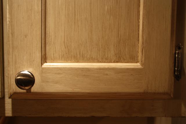
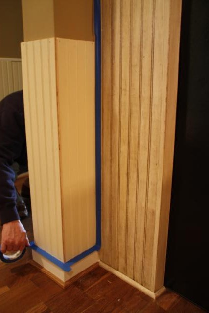
My job was to make our newly installed beaded-board match what was already in the kitchen.  Was I nervous?  You betcha.  Luckily, I paid lots of attention to the girl that painted their cabinets, so I tried to do everything like she did.

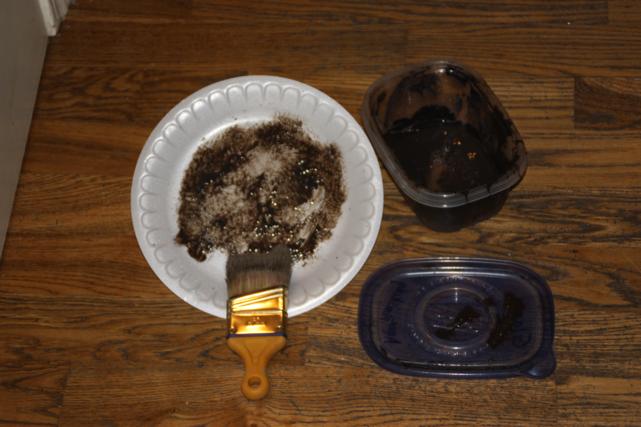
I mixed my glaze to match what she had used (yes, I kept some of hers - I knew it would eventually come in handy).

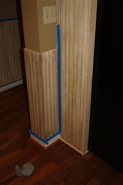
I took a deep breath and got to work.  I started in the corner where the two met so I could make sure I was getting it the right shade.  Here's the result:

Not too bad, eh?

I continued glazing while my dad followed behind me with a polyurethane.  We used water-based poly so it wouldn't turn yellow.

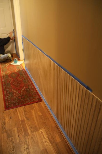
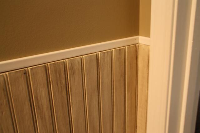
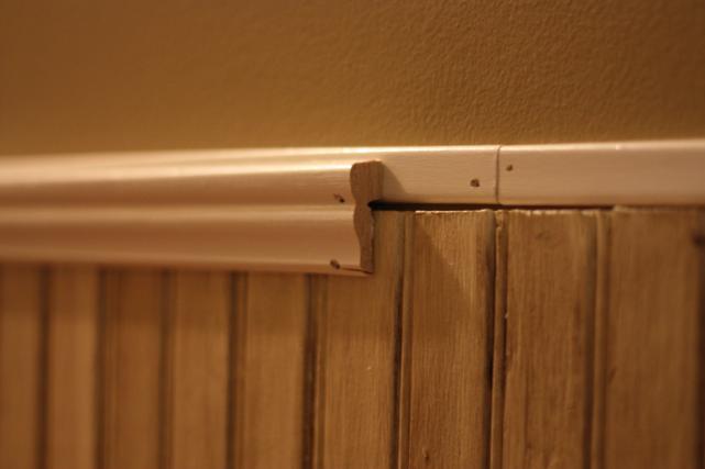
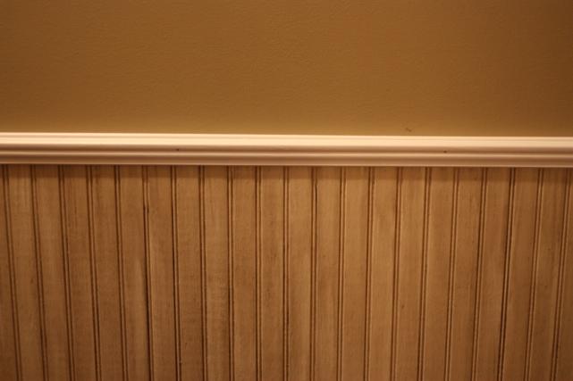
Next up we added this small piece of trim around the top.  We used a level to make sure we hung it straight, just in case we didn't have perfectly straight cuts at the top of our sheets of beaded-board.

Then we put up the decorative piece of molding.  This piece covered any gaps we had between the beaded-board and the smaller trim.

Here's how it looked after both pieces of trim were on.

The last step was to add another small piece of trim around the baseboard to hide the raw edge of the sheets of beaded-board.  No picture of this.  Sorry.

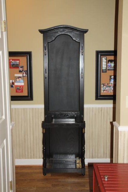
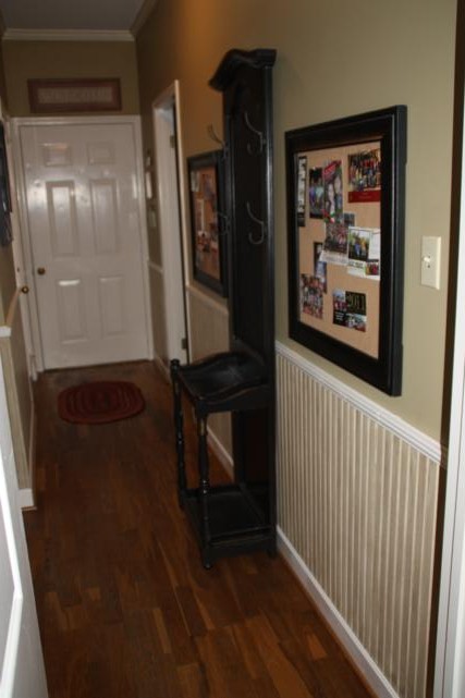
Actually, I guess the very last step was to redecorate the hallway.  Thankfully, I managed to talk my mom into ditching the gun rack.  Of course, that meant she needed to go in its place.  Luckily for her, I had already refinished the perfect piece for her hallway.

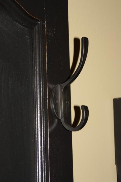
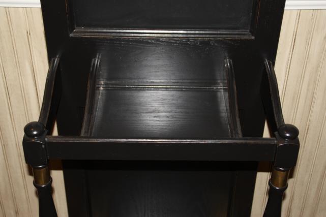
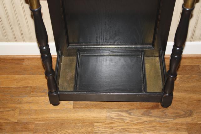
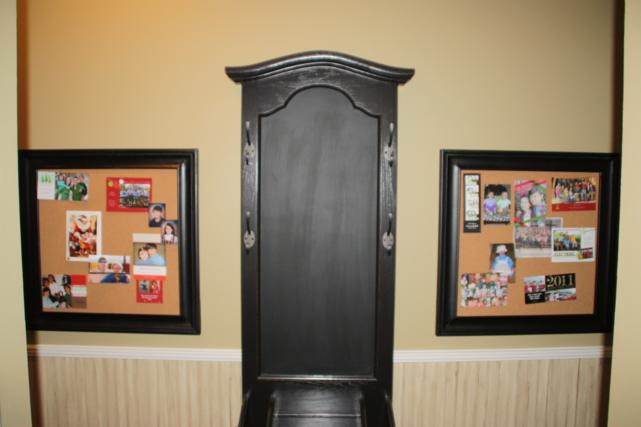
I bought this hall tree for $5 a little over a year ago.  It was stained oak and had a broken mirror and hideous white and gold hooks.  I painted the wood black, replaced the broken mirror with a chalkboard, and bought new black hardware to replace the ugly hooks. (My flash was on for the photos so it didn't photograph very well.  Boo.)

Hang your coat or hat on these new hooks:

Small shelf to throw your keys or purse on...the openings on either side of the shelf are where you stick your umbrella.

The brass plates at the bottom are where your wet umbrella can rest, and the shelf in between them is where you can put your wet boots!

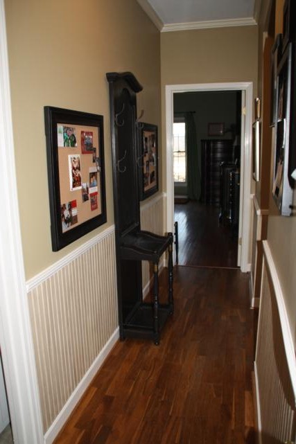
My mom decided this hallway is where she wanted to hang snapshots and things from her grandkids, and she wanted it to all be easy to change or add to.  She hung these big bulletin boards on either side of the hall tree, and they're hung low in case she ever wants to hang something else above them.

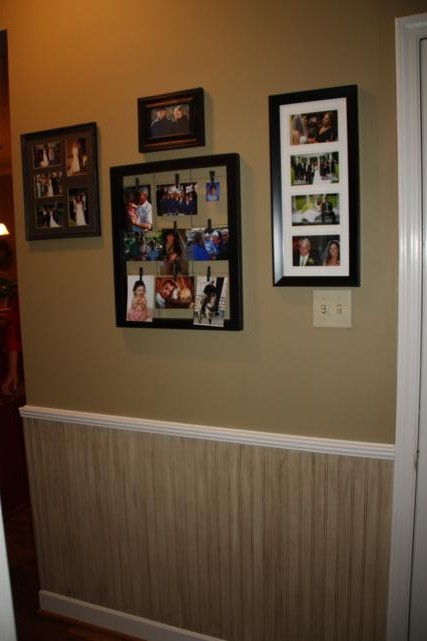
On the opposite wall is a collage of frames.  Don't worry, she's got another frame to hang on the bottom left in that empty spot.

And here you can see how the hallway leads into the matching kitchen.

So that's it for the hallway.  We can officially check that off our list of things-to-do.  I hope you like it, Mom, cause as far as we're all concerned, it's going to stay that way for a loooong time!

Spring Home Makeover

Finally, the house is done! (Ok, that's not true at all. Is yardwork ever done? But, the stuff we paid people to do is done so...good enough.)

The front door finally arrived this week. We aren't completely happy with the work (long story) so we're hoping for a big discount, but at least there is a door up. We have also been working furiously in our yard trying to get new plants and grass to grow. I'm excited to see the progress it all (hopefully) makes over the summer.

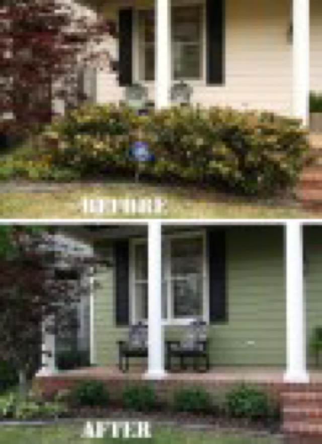
Let's jump right in and get to the pictures, shall we? First, our house before it all started.

And now, our house the way it looks today!

What a transformation! Doc and I are both very pleased with the green we ended up choosing. It took a couple of days getting used to it, but now it feels like home.

Here's a breakdown of what all has happened.

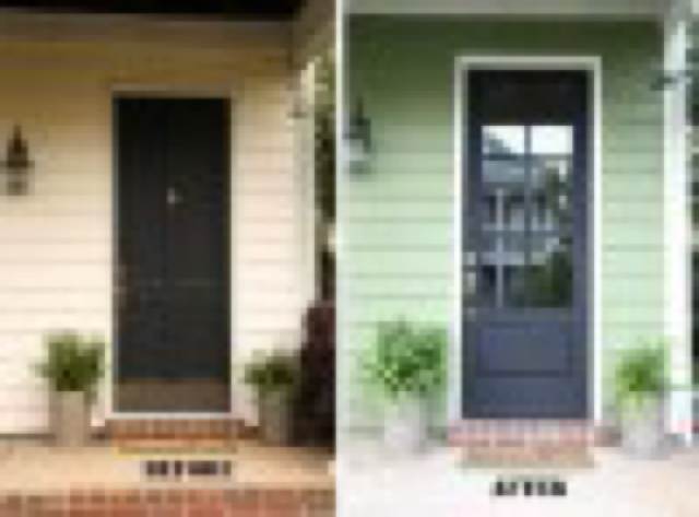
A) New creamy white paint on all the trim. B) Custom green paint on the body of the house. C) Balcony door painted black, along with a fresh coat on all the shutters. D) Adirondack chairs on balcony painted black. E) New front door with windows. We plan to add blinds soon so we're not always on display. F) Seven new Euonymus Manhattans planted - four across the front and three along the side. G) Hedges shaped and colorful flowers added to planters. H) Gardenia planted at front right corner - smells heavenly!

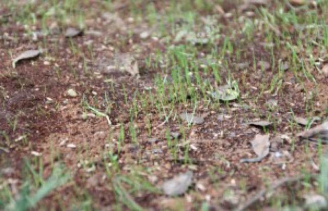
Other things have been done too that you can't see in these pictures. We bought an edger so we no longer have to be the overgrown-grass-on-the-sidewalk house. Doc has thrown down lots of dirt, sand, and grass seed in our low, bare areas. New baby grass is already starting to sprout.

We also purchased a new grill and washed all the cushion covers on our side patio. We're all set for a cookout!

Still to be done: find new throw pillows for the adirondack chairs up front, both upstairs and downstairs. They are green now but didn't really survive the washing machine. And, let's be honest, that makes for a little too much green going on.  I'm looking for some in a jewel tone, I think. Fuchsia? Magenta? I don't want orange because my flowers are pink. Yellow could maybe work. What do you think?

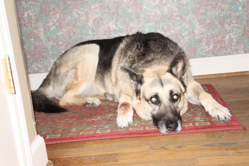
It is no coincidence that our guard dog is black and wears a green collar.

Here's side-by-side before and after of the house so you have a good comparison. I'm so glad its "done!"